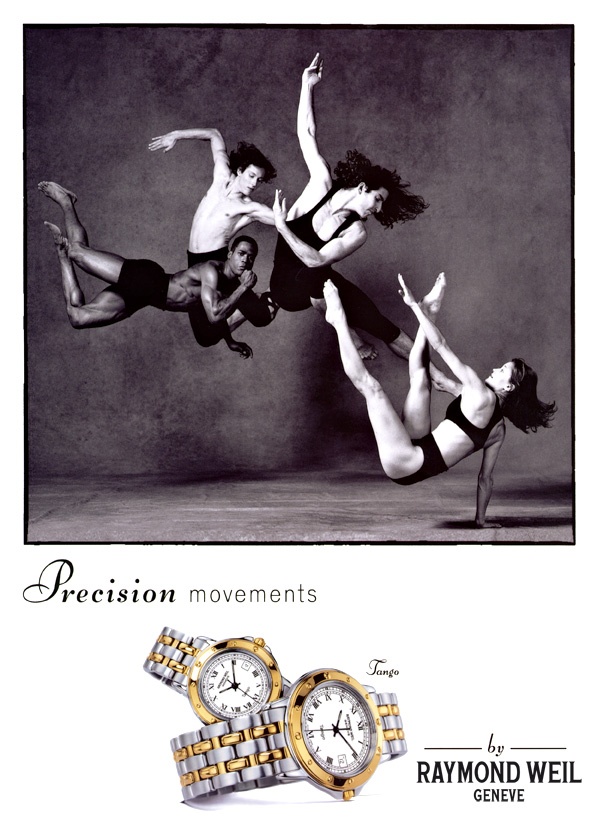
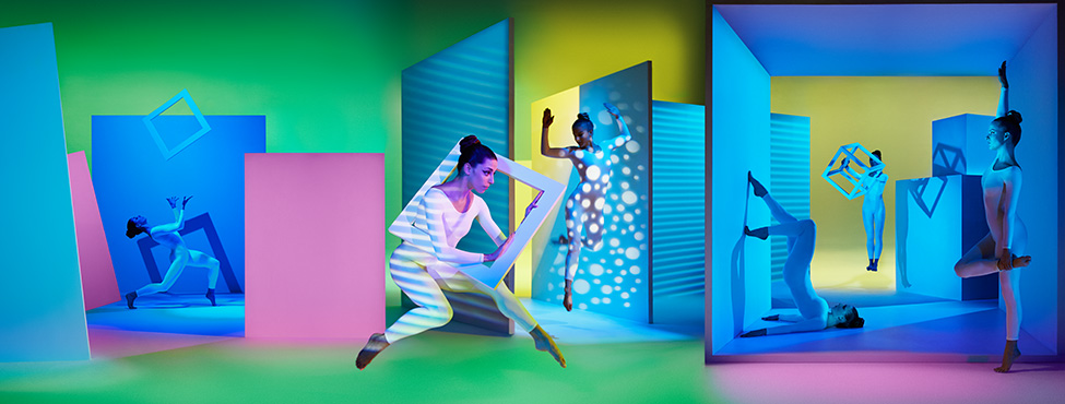
The first differences in the two campaigns include the first thing that jumps out, which is color. Another main difference is the fact that they both used dancers in different forms. The pantone campaign included the dancers working and blending with the forms, having the colors of the lighting reflect off of them. The Raymond Weil shot on the other hand has the dancers take the form of the watch, bringing them out and making them the main feature in the campaign. One of the main similarities is that they both heavily use the rule of thirds to enhance their campaign. The pantone one uses it to describe the transitions from their types of colors and to clearly define which objects belong in which area. The Weil campaign also uses it as but they use it to define movement throughout the image as a whole rather then purposely divide the campaign into different sections.
Vlad_Campaign Analysis 1
1 Reply