Category Archives: Campaign Analysis 1

Campaign Analysis

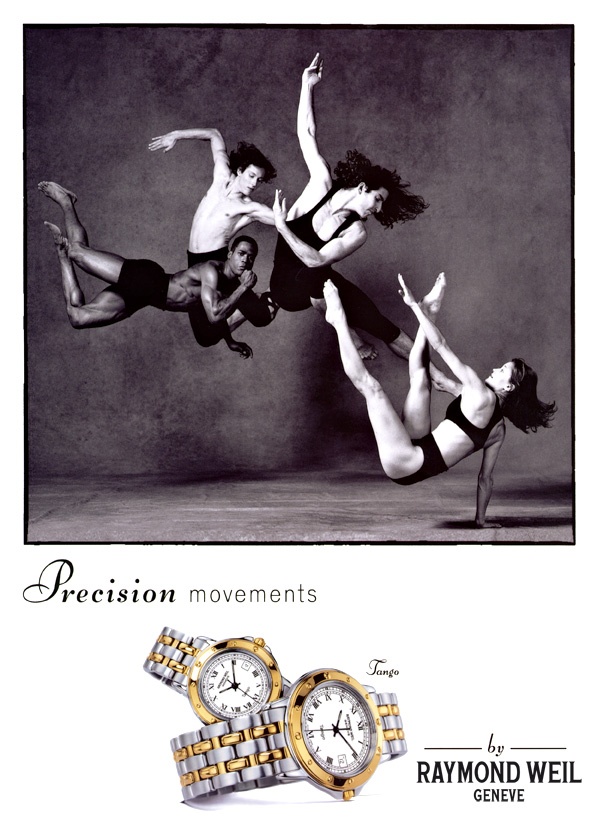
The ad for Raymond Weil uses high contrast and a central focus of subject matter which in my eyes could relate to a watch face. Lighting wise it uses a high intensity almost like one of the paintings of the gods in the air godlike, glowing, shimmering possibly a reference to materials of the product. Its set in black and white and uses the dancers as elements interacting with each other to create a perfect moment much like a watch. I believe they chose the black and white to show that they are a company that has been around for quite sometime and have perfected their craft with precision instruments in reference to the dancers. They use the models as a metaphor or even to symbolize the company itself its a representation of what they are and how they got there.

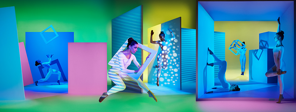
The ad for Pantone has a low contrast image and multiple models not just focusing on one part. There is a smoothness to the color its not so black or white but a lot of in betweens. This add uses the composition, lighting, and models to symbolize that their product is and interaction with color and the space it fills. It has multiple uses and shouldn’t just be focused on on thing because you can do so much with their range and  variety of color. Some thing fun, experimental, and up to your imagination. So they chose to represent there identity on the use of their product promoting that its and experience and an interaction of color that has any shapes and forms that is limited to your creativity.

Comparison Between The Two Campaigns

The Make It Brilliant Campaign for Pantone and the Precision Movements campaign for Raymond Weil definitely have quite a few similarities between themselves. For instance, they both use dancers and the motion of those dancers to help accentuate the product that these companies are trying to advertise and sell. They all both use dancers to help add the human touch that helps connect with the viewer and to give their campaigns a more authentic feel, to prevent them from coming off as condescending to an increasingly cynical and aware public. However, there are a few differences between the Pantone campaign and the Raymond Weils campaign.

Pantone, for example, used the motion of three dancers to help build a metaphor as to how light can flow, be rich and just flat out jump at you. While in contrast, Raymond Weil uses the motion of the dancers to help accentuate and metaphorize themselves as the cogs, gears and the arms of the face of the clock; helping the campaign add extra emphasis into the “precision” part of the product. Regardless of the differences, both of these campaigns achieved their goal, for lack of a better term, in a very stellar fashion.

Another contrasting comparison between the two campaigns is a pretty obvious one, the use of color. The Pantone campaign is full of the most saturated and otherworldly colors you can even imagine. The Raymond Weil campaign, however, focuses more on the black & white spectrum of color with the exception of the actual watches shown in the ad.

Compare and Contrast

The Campaigns both show a very unique style of creativity. In the Pantone design, this describes the creativity of color. The Dancers use specifically to compliment the colors and backgrounds. The lightening is very dim and shows a lot more shadows than the other design. The composition in the Pantone design, is more of a panoramic view. The view is very wide. There is also a lot of backlight. The metaphor in the Pantone Image explains a story of color and how it is shown in the seasons. The Dancers interact with the colors and background. On the other hand, The Raymond Weil design is more of a classic vibe. The black and white image shows a classic and almost elegant feel. The front light shows high key. The dancers are interacting with each other. It seems like the dancers are forming more of a watch. The Raymond Weil design explains a metaphor of movement and elegances. The dancers in this campaign shows off an interesting twisted feel of a clock. The female on the bottom right shows a familiar feel of a clocks arms. While the dancers behind shows how a clock is formed.

GrandeJ_Dance Photography in advertising

Comparing the two ads with one another. There are drastic differences between the two. The watch ad has more of a structure and solid approach to emphasize the way a clock and its gears work. It also uses rich basic black and white to further bring out exactness. The way the dancers are positioned in a way that mimics the hands of the watch too. As opposed to the clock ad, Pantone which has presented with an abstract approach which emphasizes the creative side of Pantone. The use of saturated color and lights and darks, different shapes, Pantone just gives off a creative geometric chaotic feel to the images.

Vlad_Campaign Analysis 1

The first differences in the two campaigns include the first thing that jumps out, which is color. Another main difference is the fact that they both used dancers in different forms. The pantone campaign included the dancers working and blending with the forms, having the colors of the lighting reflect off of them. The Raymond Weil shot on the other hand has the dancers take the form of the watch, bringing them out and making them the main feature in the campaign. One of the main similarities is that they both heavily use the rule of thirds to enhance their campaign. The pantone one uses it to describe the transitions from their types of colors and to clearly define which objects belong in which area. The Weil campaign also uses it as but they use it to define movement throughout the image as a whole rather then purposely divide the campaign into different sections.

Dance Photography in Advertising

Compare and contrast the ad for Raymond Weil shot by Lois Greenfield and the ad for Pantone shot by Sarah Silver. Both use dancers for advertising campaigns. Describe how the formal elements i.e. the lighting, composition, angle of view, as well as how the subject matter in each photograph creates the brand identity for each product. Make a minimum of four points of comparison between the two images. Then consider how do the two images use the metaphor of dance and dancers? How is it used similarly and how is it used differently?

Min 250 words.

0eb52bc43730d6442d60a0500636f634MIB_Triptych_V2