Monthly Archives: September 2016

Topic Four: Headphones

Brand Summary: I’ve chosen to use Skullcandy headphones for this particular project. Since the beginning of Skullcandy, they’ve always marketed their colorful, street-art inspired headphones to people who are physically active. This includes skateboarders, snowboarders, skaters, etc. With every product release, they release a plethora of colors which appeal to their demographic. Skullcandy makes both over-ear headphones and inner-ear headphones. Lastly, I’ve chosen their brand because I’ve been a Skullcandy user for nearly a decade now.

PSA Summary: Essentially, young adults are listening to music using headphones three times as much as older individuals. Also, young adults who report heavy headphone use also report more hearing problems.

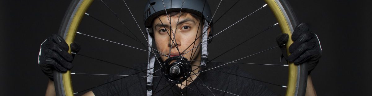
Image Ideas: To promote Skullcandy, my idea is to have a partner posing with the headphones and enjoying them. The subject must be “in the zone” and visibly smiling. Skullcandy’s ads are always vibrant and energetic, so my photography must reflect that.

Result: The lighting setup was tricky to perfect. My group had to use a large black board to block the light seeping from the ceiling lights above the computers. In addition, the camera settings were also a challenge to get right. I don’t have much experience using the light meter but I’m learning more and more about it with every class.

In terms of shooting the photography, I loved that we had the option to shoot in either a white or black background. I decided to use the black background for my hearing lose ad and the white background for the Skullcandy ad. This is simply because the different backgrounds convey different moods, tones, and attitudes.

Headphones and Hearing Loss

Brand Summary: Skullcandy is a brand that has a distinctive name that stands out on its own, but that’s not all it has going for it. Being specialized for Bluetooth, Skullcandy headphones allow one to  listen to music while having full functionality of their smartphone, all in one convenient unit. The audio quality is also a “treat” for the ears, hence the name of the company.

PSA Summary: People who use headphones regularly are experiencing hearing loss due to excessive volume, aging as young as 18 to 44, and the article urges regulation of use to preserve one’s hearing.

Intention: Provide emphasis on Skullcandy’s compact design and convenient features, in addition to its quality of sound. For the PSA, stress the importance of moderation in use so as to not cause irreparable damage to one’s hearing.

Image Ideas: For Skullcandy, photographs of my subject multitasking while “listening” to their music come to mind. For the PSA, images of the headphones half-on a person still struggling to hear a conversation manifest.

Results: Despite some troublesome technical difficulties, I think the shoot went well. The exercise in lighting ratios was juxtaposed very well with a practice in mood lighting. 1:1 ratio lighting was very flattering for an ad, and it would have complimented many products, not just headphones. The moodiness that more uneven ratios created, in addition to a dark background, definitely works well with a foreboding and cautioning PSA.

Topic 3: Health Care For All

After looking at various health care websites such as Fidelis Care and Aetna to name a few, I realized the Portrait photograph style was used. Images that is family related were used to showcase health care. Portraits of father and son, mother and daughter, husband and wife all with smiling faces, vibrant with life, happiness and contentment reflected on their face. Another aspect of the photographs used is the lighting factor that was used from different angles to achieve the desire effect to communicate a specific message that one should join that health group. The faces and body of the subjects were flood with light that allowed them to stand out. Allowing the on looker to really pay close attention to the image.

Communication Problem: Every image sends a message, thus I believe the image that is used to promote the Health Care For All company is one that shows vibrant, active life, happiness, contentment, and a brilliant smile.

Image Ideas: Portrait of a healthy, smiling, and overall happy person that reflects a life that is pleasant and enjoyable. Props can be used. I may or may not.

Results: I’m happy with the images. And I believe that my group was able to communicate the intended message. We played with various lighting technique such as Rembrant and Butterfly and was able to generate the effect needed to capture lots of amazing portraits.

Topic Three: Health Care for All

Summary: Firstly, the companies I viewed were Anthem, United Health Group, and Aetna. After scrolling through several health care company sites, I began to notice a striking similarity between them. All of the company websites contained extremely positive photographs. This includes people smiling, looking up towards the sun, and doing energetic activities. In addition, adults were often seen playing with their children. In terms of lighting, almost all photographs seemed to be very bright. This creates an enlightened feeling in my opinion.

Communication Problem: In terms of promoting Health Care for All, I believe the image must express a feeling of self-worth. The image should show an individual doing what they like to do, whether it be hiking, reading a book, painting, or even laughing.

Image Ideas: I’d like to capture an image of an individual happily reading a book. But my image idea will vary depending on props that can be used.

Results: My initial plan was to have a partner happily reading a book. This would radiate a feeling of joy, relaxation, and comfort. Nonetheless, it may look too much like a promotional advertisement for a local library more than a HealthCare ad. So in that case, I chose to use an image of my three partners. Considering they’re of various races, I thought this would describe “healthcare for all” perfectly.

Health Care

When I researched health care photos I found that they are very generic. A lot of white and shades of blue. Most health care companies try to seem diverse so theres a lot of group photos of doctors and patients. Then theres photos of doctors treating patients like checking their blood pressure or measuring them. For elderly health care there are a lot of photos from nursing homes.

I think the biggest problem with these photos is how staged they are. Medical assistants with the perfect hair and a wide smile while they write on a clip board.

I think that making these photos a bit more spontaneous will definitely suit the companies better. Like maybe catching someone off guard while they’re writing.

Topic Two: Health Care for All

Health care Photography

While researching Health Care Photography, I found one that stood out the most of what I would like photoshoot to consist of. United Healthcare shows diversity in all their photographs, not only do they show different lightings to display clean, professional, and organic visuals. There shots varied from family and individuals. While observing their images, I got a sense of support and concern with their clients. Knowing that this company is a professional health care that will take care of you. While others like Coventry Health or Assuring Health that didn’t make me feel a sense of security.

Communication Problem
I feel like it is important to show support and originality in the photographs. But with Health Cares like Coventry Health or Assuring Health they are just repeating the same things and mixing random images that have no concept to tie all together. For Coventry Health it shows parents and kids smiling, which shows its family based. But it still lacks diversity and is not as strong as United Healthcare. While Assuring Health displays images of family and random visuals like a  doctor writing on something or a close up of a hand touching the screen of a phone. This doesn’t grab my attention, it doesn’t seem personal but more formal.

Image Ideas
I think something that is important is to show that the Health Care actually cares! The images should be lively, fun, and also show diversity. It should show things that don’t seem stage. For instance, by working with colors and the correct diverse models we can have that consistency and show more of what a health care really does, who is it targeting and demonstrating the importance of the clientele. The lighting should be vibrant, clean, and also show emotional happiness. In result, shooting was harder than I thought. My group had a lot of problems with the lighting and especially since our background was gray. We wanted to depict a more active and natural images. Our photographs did turn out to be fun and lively, but as repeated it was the shadows and the lighting that made it a difficulty to produce a cleaner image.

Topic Three: Health Care for All


The three companies I looked up were AbbVie, Abbott, and American Addiction Centers, while focusing on their choice of photography I noticed some striking similarities. First of all, majority of the photographs had people, and some focused on environments. The photographs of people were well lit, giving the subjects a very warm and inviting look and most of the shots were either head shots or 3/4 shots. Also when the health care companies used photographs of people they used very energetic images, any image that had a multitude of people were quite engaging and looked very natural and full of life. If scenery was used, it was used in to ways, by itself or with people. The scenery would be something very peaceful to look at, being very easy on the eyes, when used with people, the people are usually in focus while the background scenery would be soft and blurred.

For a company trying to promote themselves as a health care company, certain key elements should be incorporated within each photograph. Each photograph should invoke a warm and inviting feeling, so that people would not feel, for whatever reason threatened or hostility to your company. Each image should also flow with energy and not be static or boring, to be able to catch people’s attention.

I would like my photographs to be a mix of some breathtaking scenery and some positively inviting looking photographs of individual. This blend would not only make costumer feel invited but I believe it will also leave them with a very tranquil feeling.

Topic 3: Health Care for All

1. Health care photography
Looking at the websites of health care companies United Healthcare, Aetna and Northwell Health, I found that there are two trends for types of photos used. The first category is photos of health care professionals, such as doctors working (doctors with a stethoscope, doctors looking at x-rays etc) nurses, and EMS personell. The other, more widely used category is photos of regular people, the people who would be considered patients. These photos typically show people being active, out in nature, exercising, giving an idea of a healthy lifestyle. The subjects are especially older, retired couples or families. There’s also photos showing happy people in nursing homes. Typically, the lightning is bright and gives you a feeling of positivity. The photos seem to usually have natural lightning.

2. Communication Problem
With the company being called Health Care for All, the images should ideally communicate diversity  – kids, families, young adults and older people, people from different backgrounds – everyone needs health care.

3. Image Ideas
With the studio setting, I think it will be important to use lights to make the photos bright and vibrant. The photos should show happy, healthy people living a healthy lifestyle. Props could be work out clothes, sports equipment (such as a football) or a healthy drink. People in the photos should look happy and full of energy. An idea could be for someone to jump in the photo.

4. Results
During the photo shoot, we focused on getting images of healthy, active people. We used props to help illustrate this, and bright lights to make a vibrant, happy, energized setting. I think we were successful in following our ideas and getting good and well lighted results.

Ad here 
Album with 20 photos here

Topic 3: Health Care for All

  1. The photographs of people look very happy, excited, and in a good mood. I have noticed by looking at three different websites; Aetna.com, UnitedHealthGroup.com, and Anthem.com that they mostly have photographs of people outdoors, or next to windows, usually using natural light. A lot of the images are very bright and clear.
  2. It should be communicated that people are very happy with the company and products. Family, children, adults, etc are able to use it and be satisfied.
  3. The photographs will look bright and clear. People being vibrant, excited, happy. The props I would be using will depend on my target. But, if I focus on Adults I would most liekly use books, glasses, ipads, notebooks, etc.

Results: Since I was unable to attend class when photographs were taken, I photographed a friend outside in daylight. The photo came out  clear and bright and my friend was smiling and happy. Overall I am happy with the results of this billboard campaign ad.

I ended up changing my image after reading professors comment. I had taken many images of my sister outside so I ended up using one of those. I feel like it came out much better than the other one I had posted previously. The reason why i chose the image I had before was because I didnt want to have a different image from everyone else. But, after your explanation it made more sense. Thank you.

Healthcare For All Summary

Photography: In researching images used by healthcare providers, I noticed that in terms of color schemes, there were a lot of whites and blues, and very rarely were reds involved unless they were part of a banner or icon invoking the imagery of “healing”, such as crosses and bandages. People, when they were involved in the layouts, were overwhelmingly positive and upbeat, and only ads serving as PSAs showed anything in a negative light to dissuade certain practices. On the subject of lighting, there were never harsh highlights or glaring light sources in the ads I saw, instead they used diffused lighting to create a calm, inviting image that was easy on the eyes.

Communication Problem: Health Care For All New York’s mission statement , to me, conveys a sense that the company is a stern benefactor for people under its protection. While on one hand, it’s a priority to show the calm, inviting side of a healthcare provider, it is also a priority to showcase the uncompromising service of HCFANY.


Image Ideas:
Smiling patrons with HCFANY’s added to the composition in post.

Results: The warm, happy and inviting aspect of healthcare ads got through a lot more than “uncompromising”, I would think. The photographs taken were all complimentary portrait shots, and some were even lit in classic photo studio styles such as Rembrandt and butterfly lighting. Even then I am pleased with the results of this week’s shoot, and I believe the group produced enough material for their HCFA ad. My subject having a band-aid on during the shoot was very fortuitous for me, because it went very well with the topic.