Author: Simonlei (Page 1 of 3)
Project outline/layout
- intro slide ( name and title of project)
- Introduction of artist Keith Haring
- introduction of his work andy mouse/ his pop up shop in NYC with anti consumerist works of art.
- Introduction of Andy warhol
- The many commissions of celebrity portraits from Elvis Presley to Marilyn Monroe
- Discussion of traditional art and design of both artists.
- Discussion of theories that these two artists fall under. Inclusion of underground and mainstream ideas.
One underground fashion trend that we all remember from the late 2000s to the 2010s were skinny jeans. For some who may not know tight fitting pants have been around for hundreds of years which can date back to the 1700s in Europe and England. But what I wanted to talk about specifically was the past decade as we saw the skinny jeans trend take over. I myself have fell victim to this trend as I remember going into H and M in middle school to pick out the tightest pants possible. During this time many people wanted to showcase their slim figure and there was no better way to do so then wearing tight pants. Now a days because the world is progressing in a more body inclusive society skinny jeans aren’t as popular as they use to be. Being seen as pants that body shame those who don’t conform to the tight fitting.
Steven Heller’s “The Underground Mainstream” Heller describes mainstream trends as “Mass marketers steal ideas from visionaries, alter them slightly if at all, then reissues them to the public as new products. This isnt anything new as the idea of repackaging and stealing ideas from no names are so prevalent within the business.
One of the possible designs that I want to discuss is street art graffiti, and I feel as street art graffiti is what I deem to be what I envisioned underground art is. Art that is created by talented people who are name and faceless. The dichotomy of this would have to be murals. Graffiti is a form of street art that we see everywhere in NYC. People tagging and spray painting art on properties. Although this is defacing property, its also amazing to look at. The creativeness and freedom in what is created can be explicit or just creative. Murals on the other hand has a more civil ideology. We tend to see murals of people who are influential on side of buildings in honor of them. Created to express love for those who inspire the world and create differences.
Heading into the future I believe that graffiti will get the recognition it deserves. In the past and present graffiti was seen as reckless and defacement of property, but I believe that people are starting to shift in opinion. We see companies incorporating graffiti within their brands and providing opportunities to arts to create for them. Businesses such as skate shops and clothing company see graffiti as an opportunity to have designs that aren’t tailored to the traditional definition of art.
https://ebookcentral.proquest.com/lib/citytech-ebooks/detail.action?docID=3443350&pq-origsite=primo
- The designers that interests me is Keith Haring. Another design trend im interested in is graffiti.
- What draws me to Keith Haring is the color, simplicity of designs and the different graphic styles and stories they tell. Im also interested in graffiti because of its nature of being street art. Its a creation of courageousness that has a style im a fan of.
- Im not sure which time frame in particular but im thinking Keith Harings 1982 Andy Mouse.
- We have discussed linguistics, systematic techniques and designing for a purpose.
- Josef Muller Brockmann and the grid and design philosophy, Walter Gropius and designing for a purpose to sole problems and to portray the events happening within the world, and Roland Barthes Rhetoric of an image.
- Currently I dont have a theory formulated for my choice of design.

Roland Barthes author of Rhetoric of the image
Panzani Pasta ad
- Linguistics can be seen right off the bat. The use of labels and captions within the ad on the products .
- The word Panzani not only is their name, but it shows us its Italian connection
- The pure image element its presenting is freshness. A return from the market feeling
- The pure image is also telling us of its convenience and essentially domestic preparation.
- Signifying shopping for oneself with an open net bag and a few items rather than a hastily packed bag
- The signifies are present through the visuals of pasta, tomatoes, peppers and the tri colors of yellow, green and red alludes to the Italinicity.
- The composition of the image is reminiscent of still life.
- Denoted images signifies the item as they appear in reality
- the photograph by virtue is perceived as a message without a code.
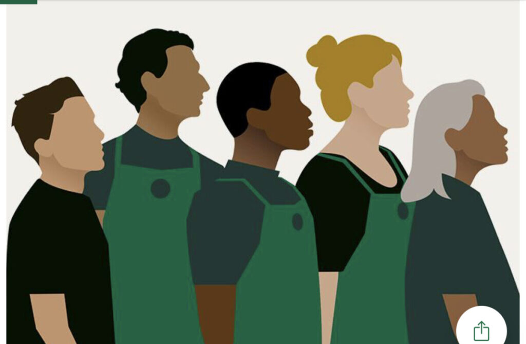
The ad that Shayne chose last week is my choice of discussion this week. Right from the start we need to identify which company created this ad. Without anytime its clear that it’s Starbucks. From what we can visually see is the diversity within the graphic. From their we can make the assumption that Starbucks wants their consumers to know that they are all for acceptance and diversity within their company. Additionally the various age ranges can be seen which we conclude is referencing their stance on ageism. Overall I believe that Starbucks hit on the points in where they were intended to land.
Language is a way of communication that is not only defined verbally but visually. Symbols and icons are graphic visuals that conveys a message via pictures. Although not everyone can read or speak the same language, having the use of pictures are universal and can be understood by everyone. Signs, Signifies and signified are all around us. The use of a stop light is a form of general communication, as well as street arrows. All forms of general communication that we tend to overlook because its built into our environment. Language plays a huge role in design. Its a job of a designer to create for the general public, and if what you are creating isn’t clear, the message behind the design wont be successful. As design and language are found to work well together, there are things that one can do that the other cant. Speaking on the universal language that design can reach, it doesn’t have any boundaries. design can contain many elements such as color, type, illustration and the list goes on. Language in the traditional sense are just words, which reaches a limited audience. In today’s culture we need a balance of design and language. Today’s world is centered around technology so much so, that we can use that to our advantage. Education and learning has shifted, communication via media and online. Many subtle forms of language that we may not think is language is helping us to connect our everyday lives.


Recent Comments