COMD3504 - Section OL69 - Spring 2022

Author: Maria Iacono (Page 2 of 3)

Maria Iacono – Assignment 7

So for my design I decided to take inspiration from the reading provided and took it upon myself to search for more of his work. I found a design with an eyeball and felt very inspired by that and so I started creating. For my design I took inspiration from the black and white brochure styled poster. It had a grungy almost paper look to it and I wanted to implement that into my design as well. As for the colors I wanted to stick with black, yellow, and red because those were really striking in his eye poster. His work almost looks slapped together but in a very intentional way and I wanted to continue that with my design.

Maria Iacono – Assignment 6

This design is heavily focused on type. It has a few design elements like the alphabet at the bottom and the darker orange rectangles on the side. Most importantly it sticks to the traditional grid system that’s known throughout typography. It allows the design to be structured and legible.

Maria Iacono – Discussion 6

Here is my essay recording link. I said in the recording that the design was created in 1970 but the diagram says 2008. Throughout my research it gave me different years in which it was created like 1970, 2008, and 2012. I just stuck with 1970 as it was stated that way on the MoMa website.

Also the link might have you download the recording but hopefully not!

https://drive.google.com/file/d/1Ij2BaZtp3dy7s6UHi8nZd-EihKbwhBsO/view?usp=sharing

Maria Iacono – Discussion 5

The design object I will be writing about is Massimo Vignelli’s New York City Subway Diagram. This is a map that can be seen and used throughout the city. The readings I will be using for this essay are Graphic Design Theory: Readings From the Field by Helen Armstrong and Course in General Linguistics by Ferdinand De Saussure.

Maria Iacono – Response 4

According to Gropius he believed that art should not be mechanized. In the reading it states, “Mechanized work is lifeless, proper only to the lifeless machine.” He believes that art should come from the spirit of the person and it shouldn’t be burdened by mechanized work or else “The individual will remain enslaved and society will remain disordered.” And so he ties this thinking into the education of art in the academy. It states in the reading that, “Lately the artist has been misled by fatal and arrogant fallacy, fostered by the state, that art is a profession which can be mastered by study. Schooling alone can never produce art!” Gropius believes that education alone cannot produce good art and artists. You have to have talent and the drive to be an artist because not all education of art can be taught by books. Actually creating a piece and having that experience is probably more educational. Although he doesn’t fully dismiss education in art. He believes it’s good to know but better to practice and produce art.

It was said in the reading that typography is very linear and hasn’t changed in quite a while. Whereas photography is that visual representation that the viewer can grasp onto. Combining typography and photography will create a visual understanding but also a linear/structural understanding to a design. Combining photos and type isn’t exactly a new idea and can be seen in many books and magazines today. When creating art with typography and photography it’s important to remember to not be basic. These two subjects combined can create many different pieces of art and it can be expressed in many ways like through collages and posters.

Artists don’t necessarily need to hop on the latest art trends and they can stick with what they are used to. However, it is important to embrace different art forms now and future ones that may come along. Artists should approach them with an open mind and try to not have judgment towards it. Because at the end of the day it’s all art and things are expressed in many ways. 

The academy should recognize that art cannot be solely taught through books and studying. It’s important for the academy to teach artists what the real world is like and if they’ll be ready for failure. It’s also important to teach students the different mediums of art like sculpting, painting, etc and actually have them practice with these mediums.

Maria Iacono – Discussion 4

Unlike Aleksander Rodchenko I believe art should be self expressed rather than giving it a use to society…

  • In my manifesto I’d make art expressive and something fun for the artist rather than having it be a burden.
  • It would be all up to the artist whether they wanted to lend their talents to society or not and it shouldn’t be forced. 
  • It’s about the freedom of choice and expression. 
  • Artists should would be respected more in my manifesto. It takes years for someone to perfect their craft and sometimes it is not taken seriously.
  • It’s also important for artists to put themselves first before they even think about contributing their talents to society. Breaks are needed and artists should not be overworked.

Aleksander Rodchenko takes the freedom away from artists.

Maria Iacono – Discussion 3

Although I never watched the Superbowl before I was able to watch one of the ads that played.  It was an ad for the Alexa featuring Scarlett Johansson. The basis of it was what if the Alexa could read minds and it actually turned out to be a funny and intriguing ad which are usually my favorite.

Maria Iacono – Response 3

There are three different manifestos written by three very different but very similar individuals.  Those people being Filippo Tommaso Marinetti, Aleksander Rodchenko, and El Lissitzky. Each of them wrote three manifestos known as The Futurists, Who Are We, and Our Book. Filippo Marinetti’s manifesto was all about the rejection of the past and tradition and it encouraged machinery, growth, the youth, and even violence. It was all about embracing contemporary ideas and being rid of tradition. Aleksander Rodchenko’s manifesto is about changing the aim of artists from doing more personal art to serving society as a whole. He believed artistic talent should be used constructively to benefit society. El Lissitzky also shared similar views on art and technology with both individuals. 

Marinetti’s manifesto brings up a few red flags. Although it is good to keep up with the times and to look ahead, I don’t think it’s a good idea to completely forget the past. “If it ain’t broke don’t fix it”, works in this case because not everything has to be modernized. It’s important to remember the way things were done in the past so we can maybe improve them for the future. Rejecting the past technologies is like pretending it never happened and it shouldn’t be that way. It also embraced violence which is a bad idea right from the start. Aleksander Rodchenko also has some interesting views on artists and their part in society.  Art is all about self-expression and he wants to strip that away from them to serve society even though that’s the very core of art. Lots of red flags from both these men.

Maria Iacono – Week 2 Response

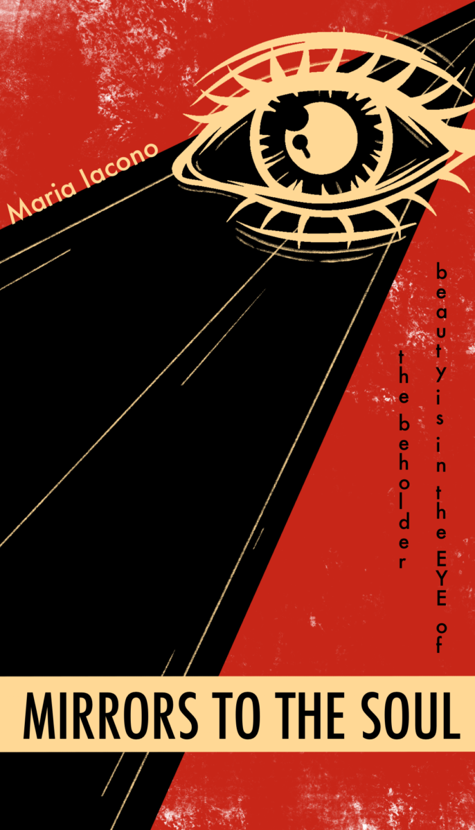
Language is something everyone has and everyone uses. There are so many different languages that people speak but yet there is technically no universal one that everyone knows. Luckily signs and signifiers bring people together universally and sometimes even in the form of graphic design.

Design gives people a universal language. When people cannot understand each other or things linguistically, design is the one thing that makes almost everyone understand. For instance many people understand that a big red circle with a line through it means “no” or “cannot”. Or that a person on a big yellow sign means walking. Communicating through symbols and signs can be another form of language, that being the language of design. Signs, symbols, and icons create a sense of connection and it allows everyone to speak a global language.

I found it interesting in the reading that it says, “The linguistic sign unites, not a thing and a name, but a concept and a sound-image…the latter is not a material sound…but the psychological imprint of the sound.” I never thought of language in this form before and in the reading the combination of a concept and a sound-image is known as a sign. It touches in the reading that sound-images are “Apparent when we observe our own speech. Without moving our lips or tongue, we can talk to ourselves or recite menatally a selection of verse.” In a way that is almost a universal language as well. We all think, we all have thoughts and we talk to ourselves in that psychological language.

Language and design relate to one another in today’s culture because when people dont understand something in someone else’s language, design steps in and becomes everyone’s universal language. Designers use a visual language which is one of the most effective ways of learning and understanding. Things like certain fonts, colors, and shapes start visually communicating to a person. You can almost immediately understand something when that something is visually represented. You can see all signs of visual symbols such as a stop sign, a pizza place sign, and even the street light. People automatically understand that yes this is a pizza place, or yes this is where i have to stop. All of these things visually communicate to someone in some form or another.

« Older posts Newer posts »