COMD3504 - Section OL69 - Spring 2022

Author: Angela Iacono (Page 2 of 3)

Angela Iacono-Assignment 7

Angela Iacono-Assignment 7 2022

I created this design inspired by Marshall McLuhan, from the book The Medium is the Massage. Throughout the book there are multiple pictures of hands, whether that be a hand with a ring on it or extreme closeups of a person’s hand. So hands were my main inspiration for these this design as well as a monochromatic color palette. I created a collage of hands and including the sayings, “it’s all in your hands”, “2022”, and my name Angela Iacono. I would describe the work seen in the book as bold and eye catching, I know I use dainty fonts and lines to create this design but I created bold shapes using the squares and rectangles to have the hands interact with them.

Angela Iacono-Assignment 6

created by Angela Iacono

I provided a design that I created using the grid. Each reading really emphasized the importance of the grid in new typography. It states that in Josef MĂĽller-Brockmann, Grid and Design Philosophy, “the will to cultivate objectivity instead of subjectivity, the will to rationalize the creative and technical production processes, the will to integrate elements of color, form, and material” and I believe this design follows those credentials. There’s elements of color, it’s creative but technical because it follows a grid that I created and it’s about neutrality over emotion. The design showcases history of the designer and then next to it a typographic design using his name, his initials, and various different keys from the keyboard. I really like this design because it is simple and focuses on the creator of the typeface and then uses that typeface to create a typographic design.

Angela Iacono-Discussion 5

created by Robert Madden

I will be writing my paper on the Lake Placid poster for the 1980 Winter Olympics, which was created by Robert Madden. This poster is 25×18 inches and features 5 of the same hockey player as well as the Lake Placid Emblem created by Robert Whitney in the lower left corner.

Type: Poster

Medium: Offset Printing, printed by Barry & Wilson, Lake Placid

Dimensions: 25 x 18 inches

Angela Iacono-Assignment 4

In the Gropius Bauhaus, Walter Gropius states that, “Schooling alone can never produce art…art depends on the talent of the individual who creates it”. Gropius believes that attending school and studying art can not produce art or can not be the only thing that makes you produce art. He is not denying that school is essential for learning the basics and foundations of art and design; however, it is more about the individual and how they create. School doesn’t carry all the answers and even though it’s important it’s not exactly essential. This belief of art not being taught but being explored through the individual is a common theme for all these authors. These authors also embrace the modern and fast changing world like seen previously in the other manifestos.

 László Moholy-Nagy combined typography and photography to create a new form of art called Typephotos. This artwork saw type in a new way, type became a design aspect and wasn’t just about reading and comprehension. It sent a message through photographs and collages of typography. Moholy-Nagy created a new form of art that gave type a new meaning in design and in the world. That typography and photography can combine together and create designs that are beyond semantic understanding.

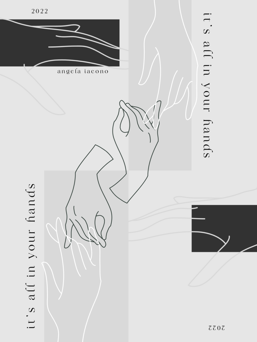
Language and communication in art and design play a significant role in comprehension and overall message of the art or design. It combines the use of technology and art to communicate new ideas.

Art will continue to grow and expand into new forms. Artists should learn and adapt to the future art forms. There will be new technology, new ideas, and more people looking to make design a career. In order to succeed you must adapt. Artists should understand new art forms, practice those new art forms, and if wanted master the future art forms.

I think “the academy” should continue to teach artists that you cannot learn art from just reading and looking at a book. That school, although helpful, isn’t going to guarantee success. You need to produce art that you are proud of. Quality of art cannot be taught or learned and that is true. If you do not have true talent or passion for art then nothing is going to come of it no matter how much you train and study.

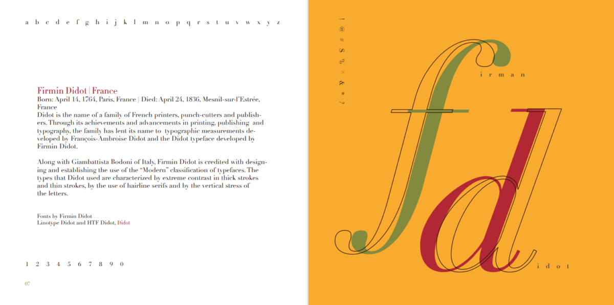
Herbert Bayer is a graphic designer and was known for experimenting with typography at the Bauhaus. He was focused on using a minimalist approach in design and minimalism was a big focus in the Bauhaus. San-serif type was popular in the Bauhaus because it eliminated the use of serifs and kept things clean, simple and minimal. Although I may not know about relevance, I think that experimenting with different typefaces and themes is essential to understanding all of typography. You can be partial to San-serif typefaces but the use of other typefaces is also very interesting and is worth exploring.

Angela Iacono-Discussion 4

Here is my designer manifesto

  • Designers should put themselves first. I know it is important to always have the client’s best interest in mind and to put aside your own wants and needs however, without putting yourself first you will probably experience burn out. I think it’s important for designers to focus on themselves because they are the ones creating, coming up with ideas, dealing with client’s needs, and doing all the work and that can get stressful.
  • Designers should express themselves through their work. Unlike Rodchenko, I believe artists should use their skills for themselves, to create more personal designs or art, rather than solely using their skills for society. Designers need to express themselves, this will allow them to develop a style and something they are known for. Self expression gives the designer identity. Now that doesn’t mean ignoring the client’s wants and needs but to allow yourself to push your ideas and to show individuality.
  • If you’re only designing for others and not yourself it must be sad. I am an artist, I draw and take commissions. People then tell me what to draw and I get paid and they receive their art, it sounds great and is however, people constantly telling you what to do/design not creating your own art is draining. So, also design for yourself because it will make you happier.
  • Designers need to take breaks. Taking a break to recharge your batteries and relaxing shouldn’t make you feel guilty for not working. It is okay to kick back and relax and watch some tv or play video games or do whatever you want. Taking a break is important and if you don’t you’ll most likely be exhausted by work and possibly start resenting it. I know I would.
  • Don’t compare yourself and your work to other designers. It does more harm than good.
  • Adapt to new changes in technology in order to grow

Angela Iacono-Discussion 3

The super bowl ad I chose was the Irish Spring ad. I thought it was really funny and it was very clear as to what is was referencing, which was the Wickerman and Midsommar. Both of those horror movies about cults were the inspiration for this commercial and I think it worked really well. They danced around the Irish spring bottle at the end, which was entertaining and funny in my opinion. I also understood the concept immediately, which I think is important for ads especially super bowl ads. This was definitely the most entertaining ad along with the Guy Fieri flavortown ad for BudLight.

Angela Iacono-Assignment 3

The Futurist Manifesto written by Filippo Tommaso Marinetti, is all about rejecting old ideas of the past and embracing technology. It was all about encouraging machinery, the youth, and the fast growing world at the time. In the Who Are We manifesto written by Aleksandr Rodchenko, he explains that he wants art to have more of a purpose to society rather than it being self-expressive. That art and your artistic abilities must be used to benefit society and not for yourself. The use of design for society and other people is even prevalent today. Our book written by El Lissitzky also has similar ideas about art and technology. Each author embraces technology and the fast changing world around them. They believe that younger artists should learn and grow with their environment and reject past ideals. Technology has had a huge impact on the way people design and if you didn’t embrace it or adapt you wouldn’t be able to grow or learn. The authors want you to learn from the future, from technology and from things around you and come up with new ideas to impact the world around you. 

When Marinetti states, “We will glorify war—the world’s only hygiene… We will destroy the museums, libraries, academics of every kind, will fight moralism, feminism” it’s very problematic in my opinion. You can embrace technology but still be fond and learn from things in the past. Why would you destroy history and take such extreme actions? You cannot grow or learn and improve if you do not look at the past/history. History teaches us how to improve and without learning it we wouldn’t have all this great technology that Marinetti embraces. I think his views in general are problematic considering he was a facist and associated with Mussolini in Italy.

I believe that Rodchenko’s idea of art having more of a purpose to society than to yourself, although sad, is still relevant today. Many people create art for other people and don’t create for themselves. Many people use their skills and knowledge for society. I believe this is sort of sad and confusing because you are always expressing yourself through art and to have the mindset of not doing that is sad. If you’re only creating art for other people you can get burnt out and tired. Creating for yourself and self expression is important in any designer or artist’s life.

Angela Iacono-Assignment 2

Language is a way people communicate. Words and sounds make up the language and are conveyed through voice and/or speech. What often distinguishes a proper language from other forms of communication is that language is about words, sounds, and letters whereas other forms of communication solely rely on the message that is being sent. Language is universal and is something everyone has, it can be different from design because design is more inclusive because it is something everyone can understand. Not everyone speaks the same language but design communication can allow everyone to understand something despite that barrier. Symbols and icons are related to language because they connect people together, often without saying any words. Symbols and icons are easily recognizable. Examples can include emojis or emoticons, how the red hexagon is associated with the Stop Sign, and various traffic signs and lights. In the reading it explains that, “The word symbol has been used to designate the linguistic sign or more specifically, what is here called a signifier”. The symbol is a signifier, which means that you are acknowledging its existence and giving meaning to the sign. Signified refers to understanding and grasping the concept, meaning you understood the sign, you grasped and signified the meaning and existence of the sign, and then you have finally signified or understood the concept. An example can be the color red. Red can symbolize many different things and has many different meanings and interpretations in different countries. Red is the sign, it can signify love, it can signify anger, and it can signify luck. All those different signifiers can be signified and understood by different people. Language plays a strong role in design, specifically in typography and things like magazines. Design unites all kinds of people from all over the world; it is actually the universal language. Design and language will always work hand in hand and in today’s culture you can see how important it is to understand the world and people around you.

« Older posts Newer posts »