Project 3 Step 4 Deliver Michael Desmangles
1 Reply


by Michael Desmangles
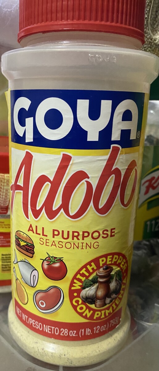
My first choice was the Goya Adobo All Purpose Seasoning
The reason I chose this packaging is mainly because there is so much going on with the design that it looks like a jumbled mess. There are a lot of mustard yellows mixing with the block of blue for the logo mixed that are competing for attention with the food illustration at the bottom. The Adobo type is also taking a lot of space as well forcing all the illustration to be pushed to the bottomWhat should be the main focus is whats the brand the name and the purpose everything else is secondary.
My second choice was the Skippy Creamy Peanut Butter.
The reason I chose the Skippy peanut butter is because the design of the peanut butter face can be a lot neater and also have the sense of fun and excitement while also giving the information that is needed. The Blue color and yellow are clashing with the brown peanut butter. Plus the red outline on fuel the fun is not working in my opinion. When people are looking in shelves the main thing that is important is what kind of peanut putter rather than the massive skippy logo. The skippy logo takes up too much space and doesn’t leave room for the graphic that is wedged in the corner.

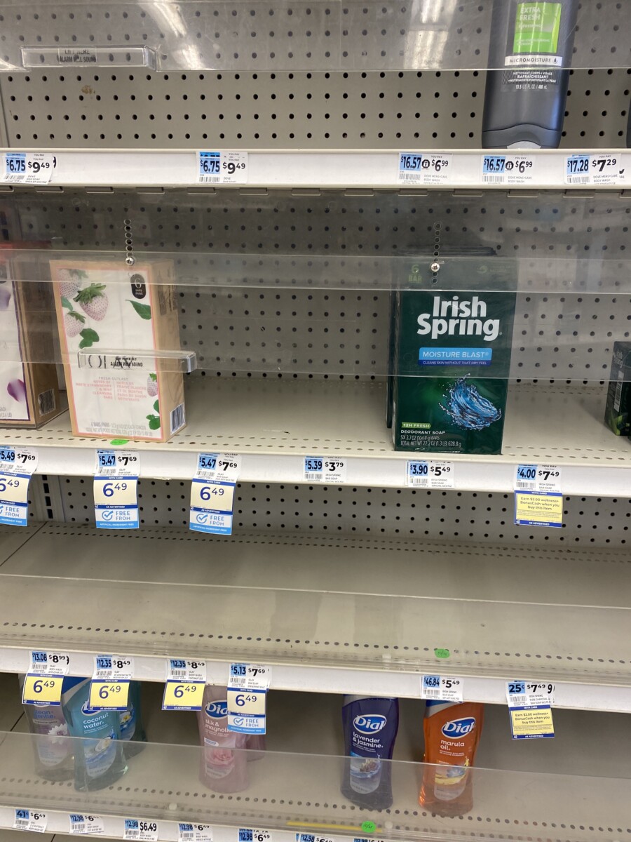
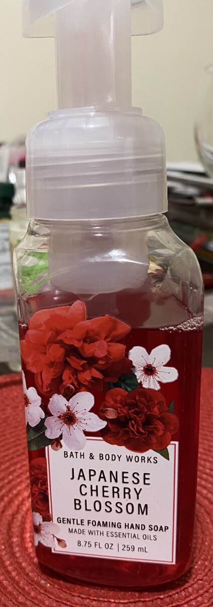
My third choice was the Japanese Cherry Blossom hand soap.
The reason why I chose the Japanese cherry blossom was mainly because I wanted to provide a different take on the hand soap. The dark pink mixing with the dark pink flowers gets loss and the red border around the type boss is unnecessary. This hand soap in particular is very popular so I wanted it to stand out in shelves above the rest.
The OpenLab is an open-source, digital platform designed to support teaching and learning at City Tech (New York City College of Technology), and to promote student and faculty engagement in the intellectual and social life of the college community.