This agenda provides a detailed outline and gives a clear vision of the day’s class.
Topic
Create a voice with text
Goals: Persuasion
Objectives: Create a point-of-view
Critique
text compositions
Discussion
Midterm
grades
progress
Add meaning and tone
Goals: Explore typographic meaning
Objectives: Reinforce the meaning of your text
-
- Explain your influencer to your peers
- Use text to convey meaning, feeling, tone
- Convey the excitement of contemporary design
- Your poster must be purely typographic.
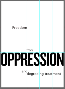
Hierarchy 101:
Typographic hierarchy can be signaled with one or more cues:
line break, type style, type size, rules, and so on.
remember
Don’t be a slave to the document:
For example, the name does not have to be at the top of the poster.
Instead of making one big text box, break up the content and move it around the page.


2. Using systems: https://arajshree.cargo.site/Responsive-AR
Activity
Begin your next step
Introduction to creating a poster
Goals: Explore typographic meaning
Objectives: Reinforce the meaning of your text
Poster: 11 x 17, black and white
Posters should instantly communicate:
Does your audience know what you are trying to communicate?
Audience:
Your peers, classmates, friends, family
What are we communicating:
Explain your influencer to your peers
Convey the excitement of contemporary design
Your poster must be purely typographic––
Your manipulation of text evokes meaning or “flavor”
Choose a typeface that honors your designer
What typeface does your designer use?
What typeface evokes a similar feeling to a typeface your designer uses
Remember what we have learned this semester
Use hierarchy to determine your focus
Use proportion to determine the optimum position for your focus
Cluster your type around one of the “hot spots” for emphasis
Use alignment to make other items relate to your main hierarchy
Use scale for emphasis, make huge scale changes for dynamism
Use figure/ground to “mass” your text and white space
Use emphasis
Instead of letting your type appear randomly in one big text box,
break it into phrases and place position it for emphasis.
Our culture reads from left to right
Place your white space:
• on the left for feels like breathing room
• on the right to look like something is missing
Manipulate the page
For example, a title does not have to be at the top of the poster.
Manipulate your reader to explore the entire page
examples

Poster Requirements
Size: 11 x 17
Your poster must be purely typographic:
No colors, shapes, and lines
A viewer should be able to easily understand your text.
Consider your typographic hierarchy.
remember
Use alignment
Align several different items to one gridline
Align with the edge of the type, not a random letter in the middle
Your letters, not your text box, must touch the gridline
Mass your white space
make sure you have a large group of white space
Do not center your text or your white space
check that you do not have the same space above and below
what is centered?
equal amount of space above or below your text
equal amount of space to the left or the right of your text
schedule
step one: First draft, structure and type
step two: Second draft, image and color
step three: final presentation:
Review: To create a new InDesign poster page

1 Open Indesign size: 11×17″
NO facing pages
Pages: 1
Columns: 5
Column gutter 0
Margins: 0
2 When open go to Layout > create guides
Rows: 3
Gutter: 0
You now have your grid
3 Put a 1 point black rule around the entire document
Inspiration/reference
Homework
due 3/23

