Contents
Lecture
Design Assets
Specifically:
Style sheets are a catalog of the assets in a project. While at most design firms and agencies these assets are hard-wired by IT on the direction of the creative directors to avoid any errors, it’s a good idea to make a style sheet of every project as reference.
They contain logo usage, fonts, colors, and often the grid and page layouts. The use of a design style guide (another expression for Style Sheet) provides uniformity in the application of graphic elements and the formatting of materials.
Text hierarchies
Text assets are the different types of text whose treatment falls under text hierarchies. Headlines, sub-headlines, captions, folios, pull quotes. All have to be designed and have a designated style that must be maintained throughout the project.
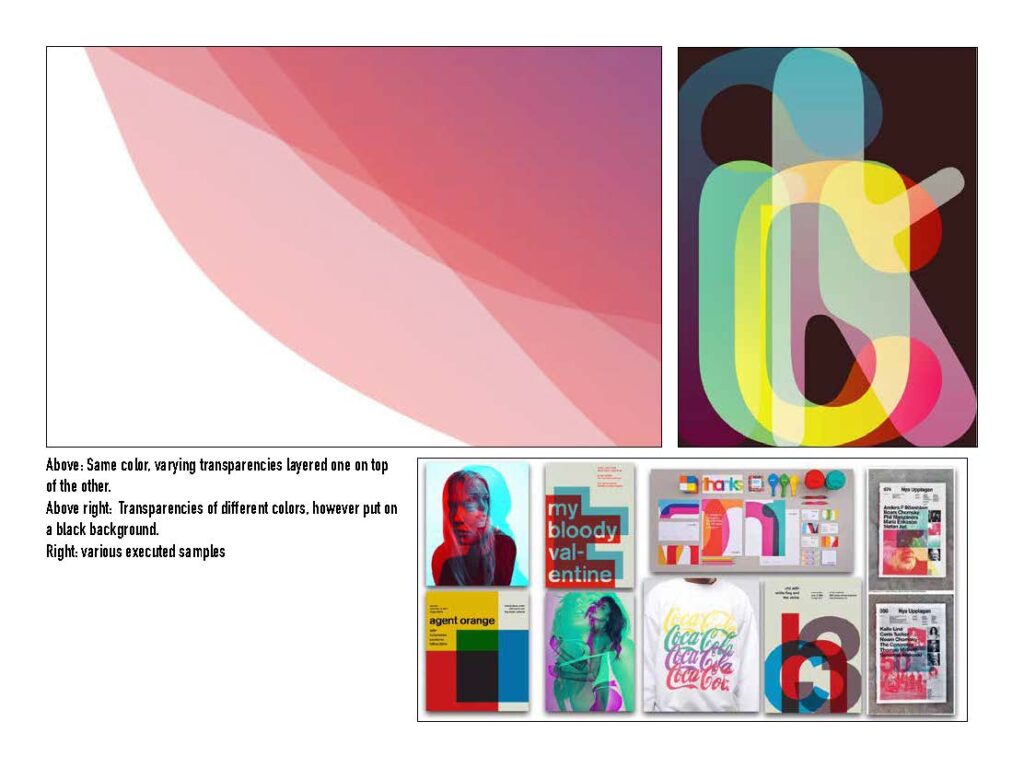
Color guides are often included in the style sheets with their process and hex values to retain accuracy. For your purposes, making a grid of colors in various transparencies and their interaction with black provides you with knowledge of how colors interact, both onscreen and in print.
Graphic elements are (usually) vector graphics that appear in the project, such as a logo, icon or webding. Graphics like shopping carts, gears, social media logos are examples.
Image assets are photos or digital illustrations. For screen, they are small, in RGB format and 72 dpi. For print, they carry a resolution of 300 dpi, are either greyscale or CMYK and are to the actual size they will appear on the final printed piece.
Technical
- Review the proper specification vocabulary: Headlines, paragraphs, BF, Ital, etc.
- Talking about careers in communication design
Preparation
- With the grid you designed, organize your assets on your style sheet.
- Look at the following links which show style sheets. Some design firms specialize just in designing style sheets.
- https://venngage.com/blog/brand-style-guide/
- https://laurabusche.com/visual-branding/brand-style-guide-examples/
Session 1
- Set up a document for your poster with designated layers for text, color block, graphics, etc. Begin to design the poster according to the stylesheet you assembled.
Homework
- Finish two treatments of the poster, resulting in three tight design sketches.
Session 2
- Color Guide
- Individual guidance on grid assignment
- Quick presentation of grid mock-ups
- Color transparency discussion

Homework
- Taking the advice from the critiques, modify poster design.
Resources
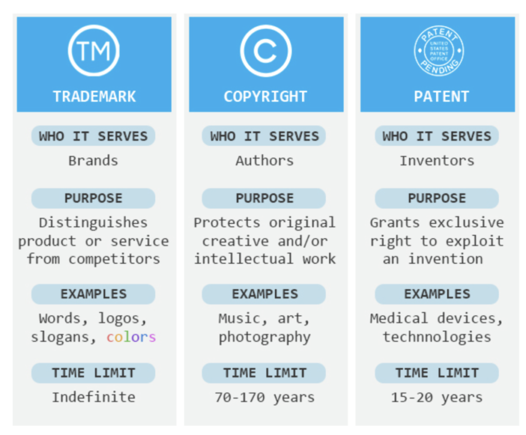
See how strongly companies identify with their color branding: https://digitalsynopsis.com/design/trademarked-colors/
and

Some thoughts about how to start thinking about your career as a designer.
a) Will you be a creator or an initiator? Both are central to working as a professional in the communication design industry. Sometimes, a creator could be an illustrator, a designer, a font designer. Sometimes, someone who would seem to be a creator, is often thought of as a support production service, such as a photographer, video maker or ad designer (can you imagine?!?),
An Initiator would, in certain circles, be called a producer, a creative director or a copywriter (again, can you imagine?!?). In many commercial applications, an initiator is often a highly creative individual who can express their ideas both visually, verbally and with exemplary writing skills.
So, thinking ahead, thinking about whether one wants to comes up with great ideas, or bringing them to life.
Watch the following three videos:
How to become a photographer:
How to become a film director (remember that a film director also directs commercials, music videos, and, in the future, internet motion content)
And, depending on the trajectory of your career, you might be fortunate enough to go to a fine art graduate school and decide to make a stand as a fine artist. See the video below on how to get gallery representation, at the core of credentials for an artist. Know that commissions are few and far between, although the internet has made opportunities easier to find.


Recent Comments