Students design a series of posters and social media postings for a art gallery show (PET PEEVES) .
This project Introduces the use of a typographical grid as well as the importance of visual hierarchy. Why use a grid? Why follow a format? What are the differences between a grid and a layout?
Through visual hierarchy we will explore scale, proportion, negative space, color and legibility and other essential topics of design and typography.
Project 3 lectures and assignments are covered in classes 20 to 30.
Poster 1. The Typographical Grid – Black and White
Poster 2. Visual Hierarchy (pt. size, SCALE, Placement, Alignment, Black and White, Variations, Compositions)
Poster 3. Color and Texture (Color and legibility/ Foreground-Background relationship)
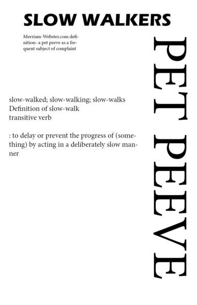
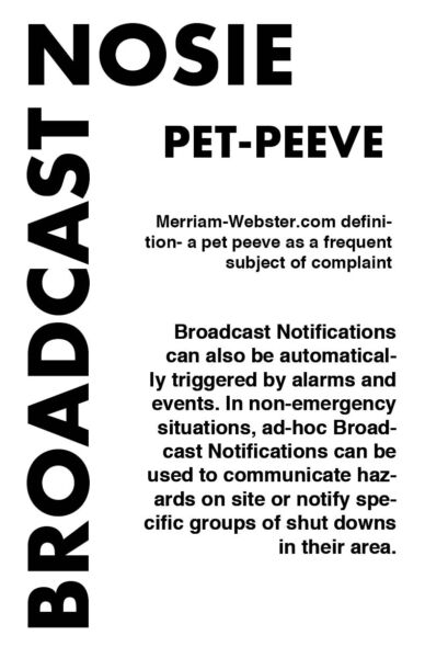
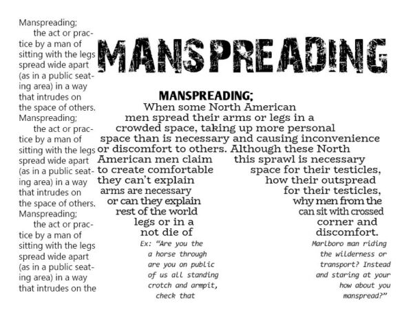
Posters must be 11×17 and include the following text:
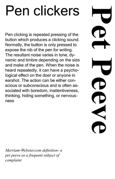
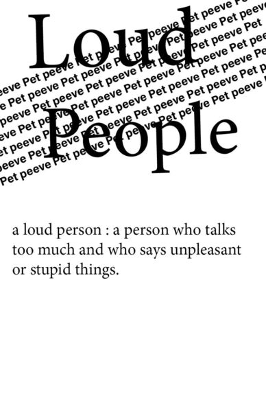
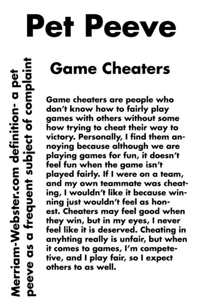
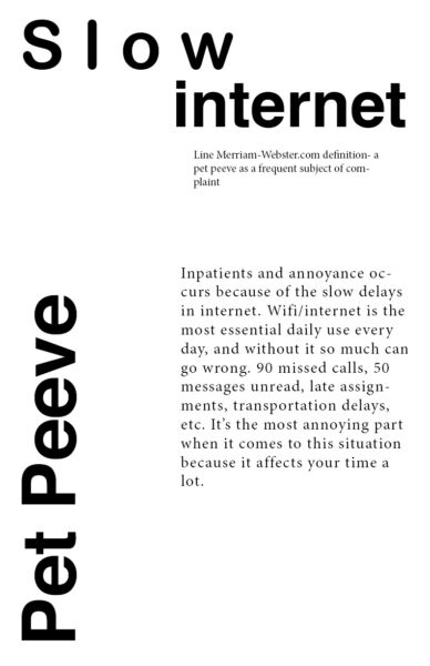
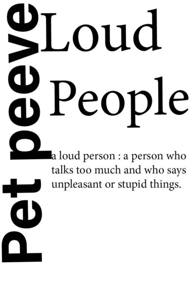
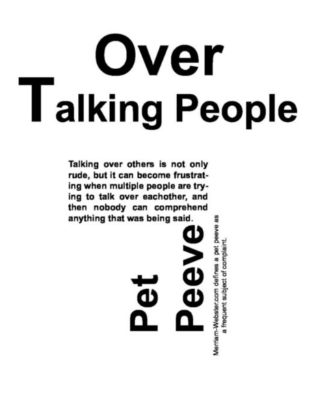
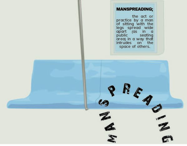
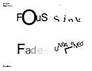
• Pet Peeve
• Merriam-Webster.com definition- a pet peeve as a frequent subject of complaint
• Title of your Pet Peeve •
Your paragraph explaining your pet peeve
A successful poster communicates its message directly and powerfully through visual impact, an intriguing message, typography, color, graphic image and text combinations.
Posters that get lost in the crowd or fail to communicate their message are usually ones that try to say too much, do not have at least one eye-grabbing feature or look too much like everything else.
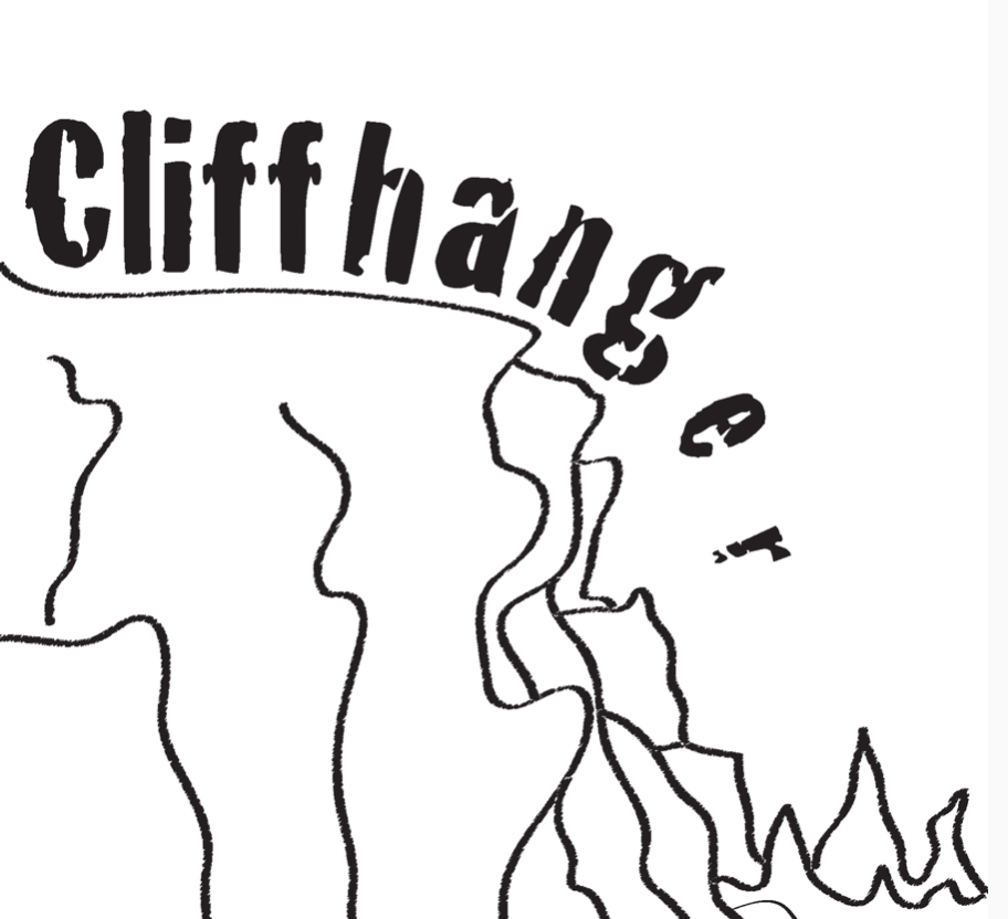
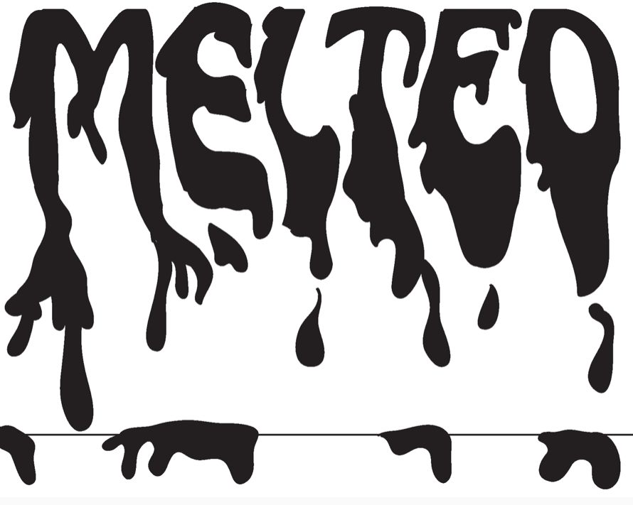
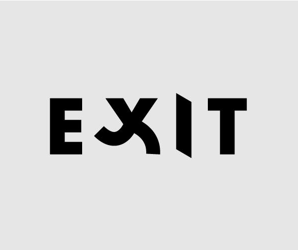
TYPOG Typography Poster: or Typographicposters.com
Start with the principles of typography, design and composition.
Second think about the poster’s purpose, goals, and audience. Is the message clear.
Third think of design as poster, is it effective, is will it stop the viewer?
Elements: Line, shape, form, color, space, texture
Principles: Identify any uses of scale, contrast, repetition or pattern
Contrast: Typography lives off contrast. It can be achieved in many different ways. Using contrary fonts or colors. Does it lack contrast?
Grid: Identify if there is any use of grid
Hierarchy: Is the emphasize on the right words or letters?
Does main type form an “image” or design element, only on second glance you can see text?
Legibility: Typography helps convey message.
Does the typography stands on its own, as the main design element? Is the type legible
Use of Fonts: Does font used fit concept or what is said?
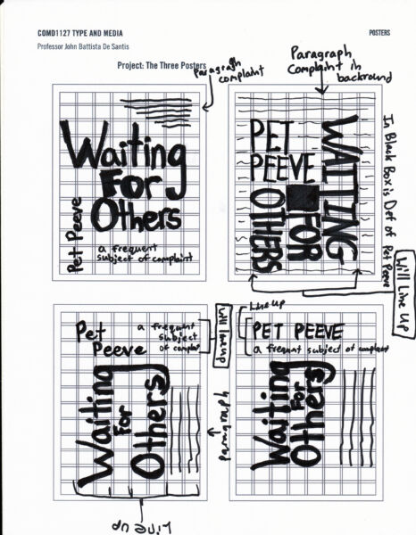
– You should try and sketch ideas
– Select one tight sketch/concept to develop and print out larger. We will review them in class
– Bring in project physical folder with sketches, any research and reference related to logotype concepts.
Design a minimum of 4 thumbnail concepts. These should be quick sketches that highlight a concept/idea.
Size of each sketch should be no smaller than 5×7
Choose the best concept from your thumbnail drawings and create a initial draft layout
The following techniques can help the creative process.
Research & Discovery
Reference: Do online research
Get a job folder to place all research, sketches reference and related items.
Create electronic casebook file with sketches, show research, reference etc. Can be a PDF or Word doc.
Sketching and Conceptualizing
Do a brainstorming activity and idea to generate ideas for your design concept. Using your research, graphic and conceptual sources, begin designing.
Create a minimum of 5 thumbnail concepts. These should be quick sketches that highlight a concept/idea.
Rough Draft
Choose the best concept from your thumbnail drawings and create a tighter draft layout 11×17 Bring print outs and native files to class.
Production
Final size will be 11×17.
FINAL Deliverable
Present your layout and description. Explain your work; research and concept as related to research and your design choices.
Uploads to Class site
A. Create blog post with category: Project 3
Name the post “lastname firstname project 3”
B. Insert a digital file of project layout saved as a .jpg
Name layout file: “lastname_firstname_p3jpg”
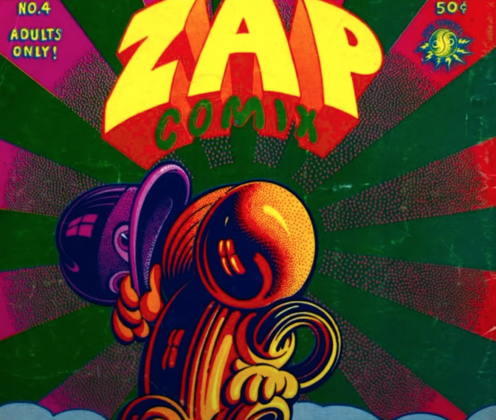
Michael Bierut Yale Posters Rocco Picatello FIT Poster Series
(pt. size, SCALE, Placement, Alignment,, Variations, Compositions) Black and White
(Color and legibility/ Foreground-Background relationship)
https://inkbotdesign.com/colors-and-typography
https://color.adobe.com/create
https://collection.cooperhewitt.org
Typographic Poster Designs A curated gallery of posters from around the world
Graphis Posters The Best of International visual Communications
ReferencePoster Pinterest board
Rocco Picatello FIT Poster Series
The Shakespeare’s Globe Theatre identity | Communication ArtsCommunication ArtsThe Shakespeare’s Globe Theatre identity | Communication Arts
Reference
Poster Pinterest board
Michael Bierut Yale Posters
Rocco Picatello FIT Poster Series
https://collection.cooperhewitt.org/exhibitions/68744915
http://www.typeroom.eu/article/guide-brilliant-poster-design-johnson-kingston
The OpenLab is an open-source, digital platform designed to support teaching and learning at City Tech (New York City College of Technology), and to promote student and faculty engagement in the intellectual and social life of the college community.

