Category Archives: Discussions
Consuegra_Pamela_TT_Depero
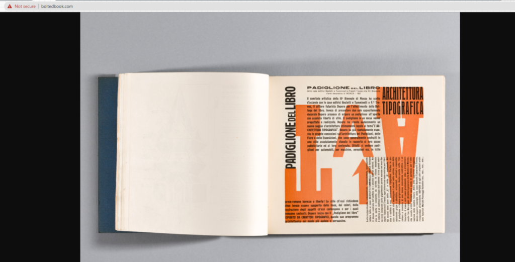
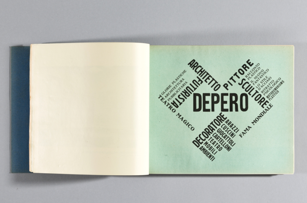
The First image places the words in an eye catching shape. This secures the attention of the audience and is a very creative way to use type. Technically it is a type within a type. The second image uses overlapping layers to contrast letters and different colors helps to differentiate between the background and overlaying text. While one of these is neater than the other I feel they both work in terms of aesthetic and uniqueness.
Barshtein_Andrew_TT_Depero
What I like about these is just how much the text forms into a cohesive structure. The first one uses various fonts and weights, the bolder weights acting as more of a skeleton for the lighter weights on the outside. For the second one, I like the way the text wraps into a sort of triangle or pyramid, pointing to the text on the left. The text on the left is also laid out very neatly into columns. The word “meccanici” acts as a sort of support or rest for the list of words to the left of it.
Rojas Jesus_TT_Depero
Williams_Kayla_TT_Depero
I really enjoy these pages. I like how the words in the first page kinda goes along with the image on that sent at the top. And it just seems like typeface used works so well with the image. For the second one, I enjoy the simplicity of the typeface, how it was sans serif and bolded, yet put onto a full blue background. It’s so simple, yet it makes the page more easier to read and understand.
Wu Chailin_TT_Depero
Hernandez-Garcia Yamileth_TT_Depero
The one that has the most dynamic usage of font and layout would be the one on the left because there’s a usage of space being used and the words being demonstrated are visible to read and are not hard to comprehend. The color overall is really bright and catches attention more than the one on the right.
Found Alphabet 10/20
Hernandez-Garcia Yamileth_TT_RP
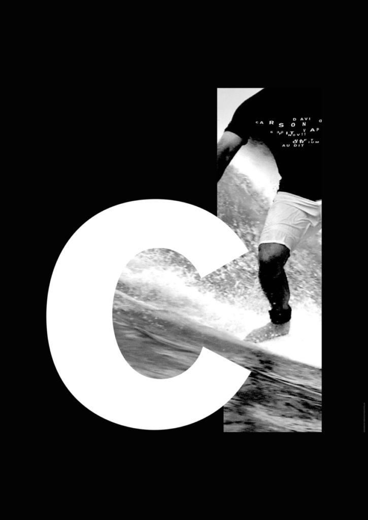
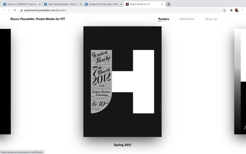
From both of these posters, the one that did not work for me was the one with the letter h blended in the colors of black and white and grey. The small words being expressed diagonally across the h are too small and the colors within the sentence are too light to read. Overall, with small size font and long sentence with a light grey color does not fit well with the overall design.
Rojas_Jesus_TT_RP
De La Cruz Tommy_TT_RP
De La Cruz Tommy Found Alphabet
Hernandez-Garcia_Yamileth Found Alphabet

Letter A 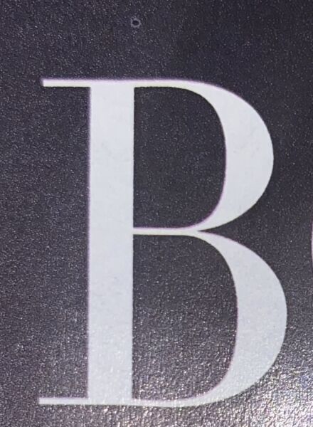
Letter B 
Letter C 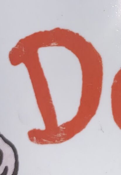
Letter D 
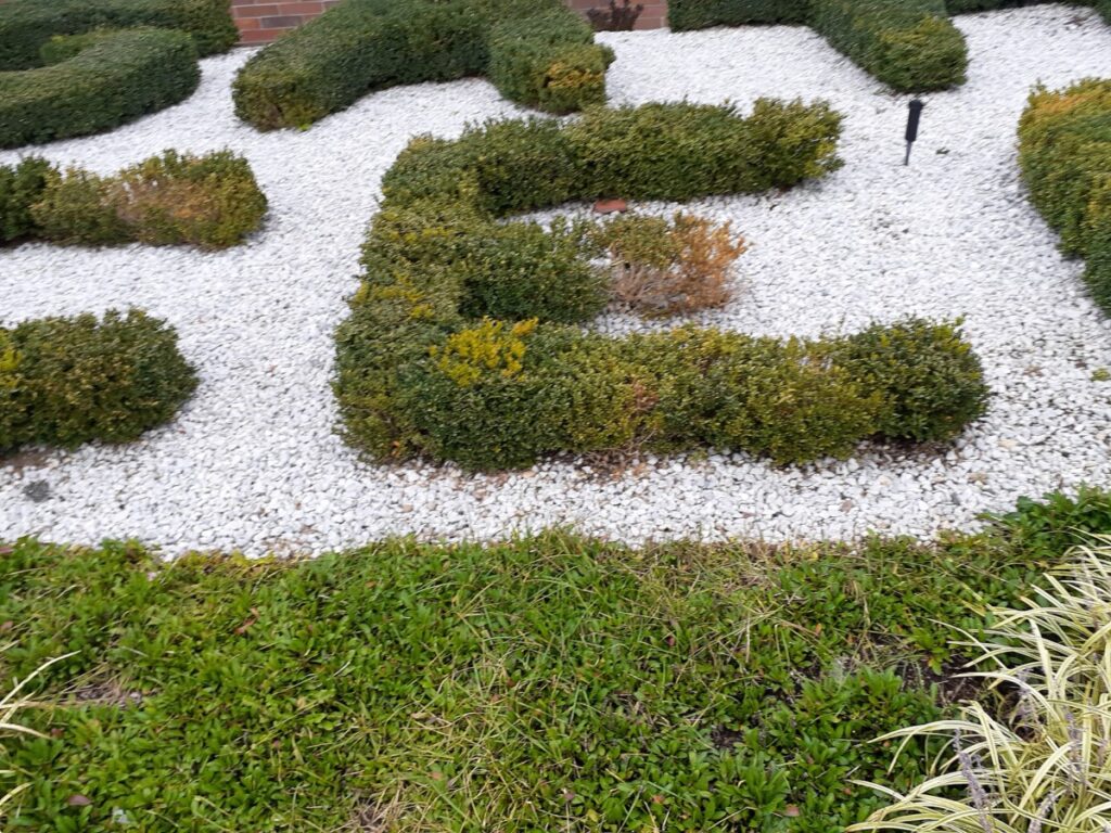
Letter E 
Letter F 
Letter G 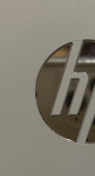
Letter H 
Letter I 
Letter J 
Letter K 
Letter L 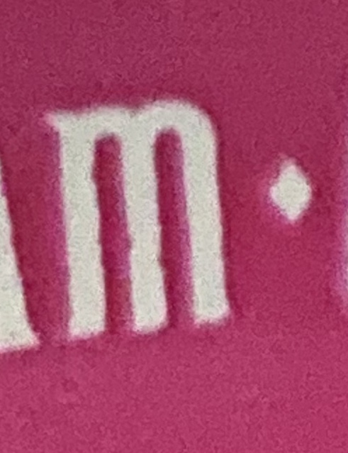
Letter M 
Letter N 
Letter O 
Letter P 
Letter Q 
Letter R 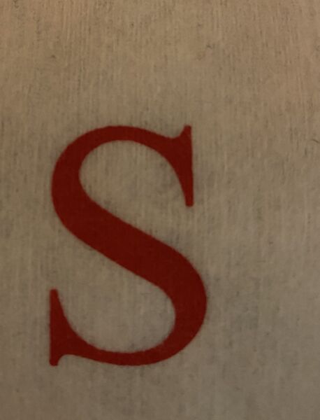
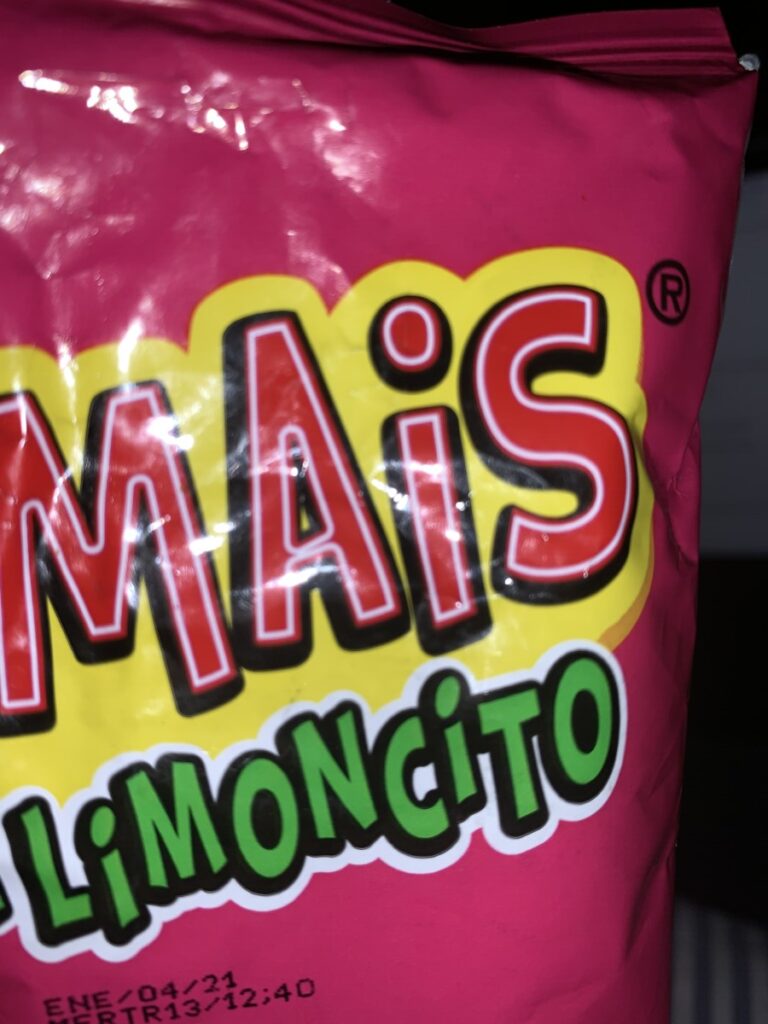
Letter S 
Letter T 
Letter U 
Letter V 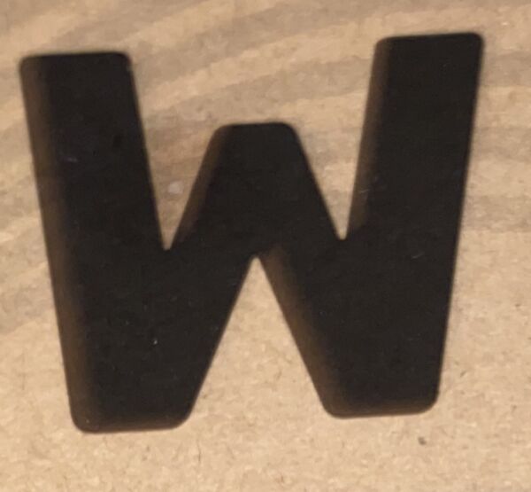
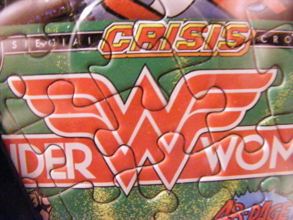
Letter W 
Letter X 
Letter Y 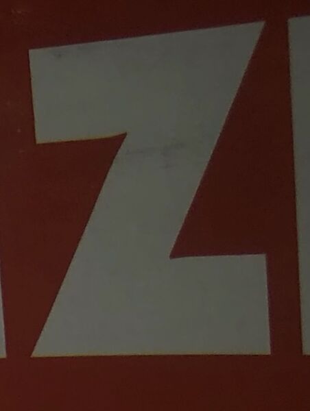
Letter Z 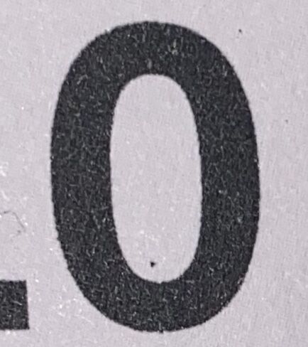
Number 0 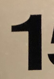
Number 1 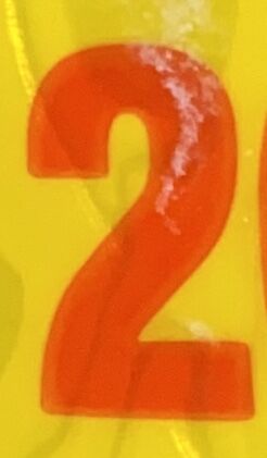
Number 2 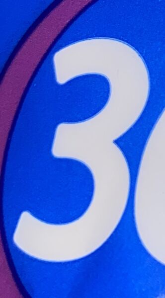
Number 3 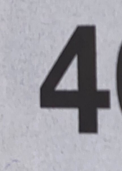
Number 4 
Number 5 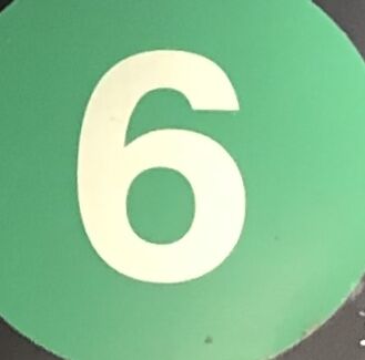
Number 6 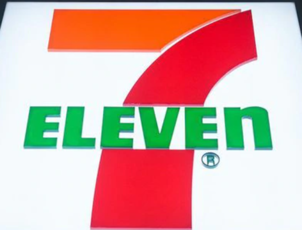
Number 7 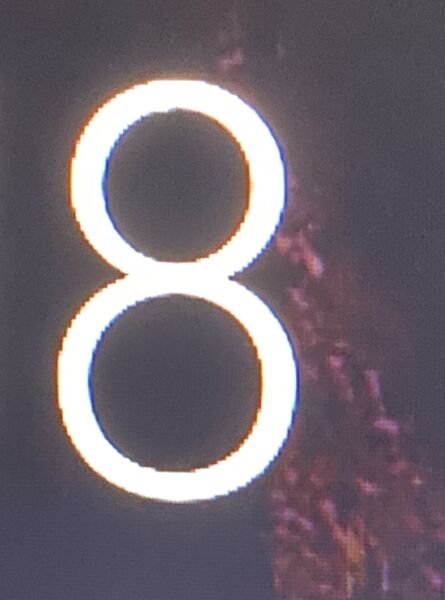
Number 8 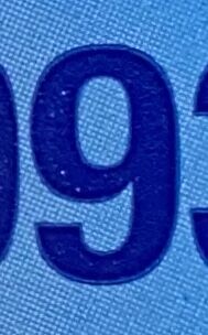
Number 9
De La Cruz Tommy TC-ET
Ni Wei _Scher”
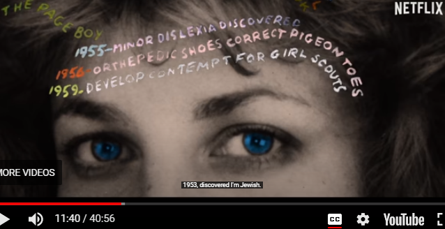
Ni Wei_TT_scher
DeLaCruz_Tommy TypeTalk_Scher
DeLaCruz_Tommy_Expressive_Type
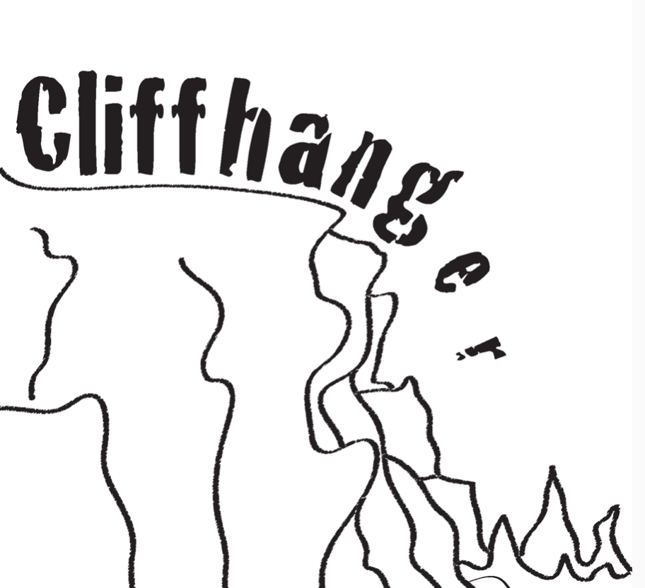
Research 1 
Research 2 
Research 3 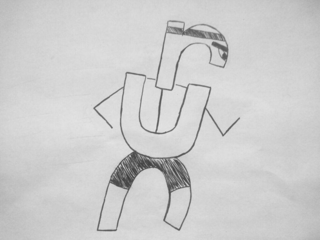
Expressive Type (Run)
Barshtein Andrew_Scher
