Rojas Jesus_Scher
The OpenLab is an open-source, digital platform designed to support teaching and learning at City Tech (New York City College of Technology), and to promote student and faculty engagement in the intellectual and social life of the college community.


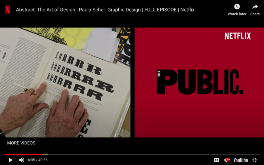
Paula was making a logo for a theater and she wanted a logo that felt new yorkish that was loud. She likes American Woodtype because it’s powerful. Personally, I understand what she was trying to achieve with the different weights in the logo but I don’t like it because I don’t think many people will understand it and just see how uneven it is. I feel like half the logo is the same thickness and the other half is another and I just think they don’t fit well.