Desirée Alvarez | COMD 1100 | Fall 2020


License

© 2024 COMD 1100 Graphic Principles 1 Spring 2021
Theme by Anders Noren — Up ↑
Desirée Alvarez | COMD 1100 | Fall 2020
© 2024 COMD 1100 Graphic Principles 1 Spring 2021
Theme by Anders Noren — Up ↑
The OpenLab is an open-source, digital platform designed to support teaching and learning at City Tech (New York City College of Technology), and to promote student and faculty engagement in the intellectual and social life of the college community.


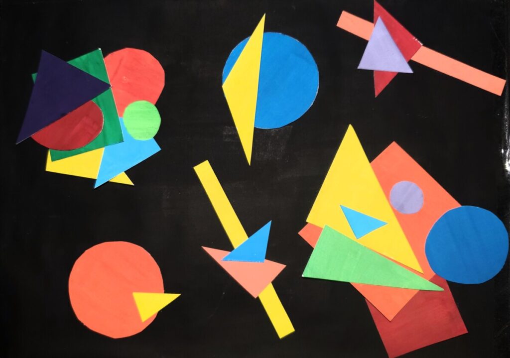
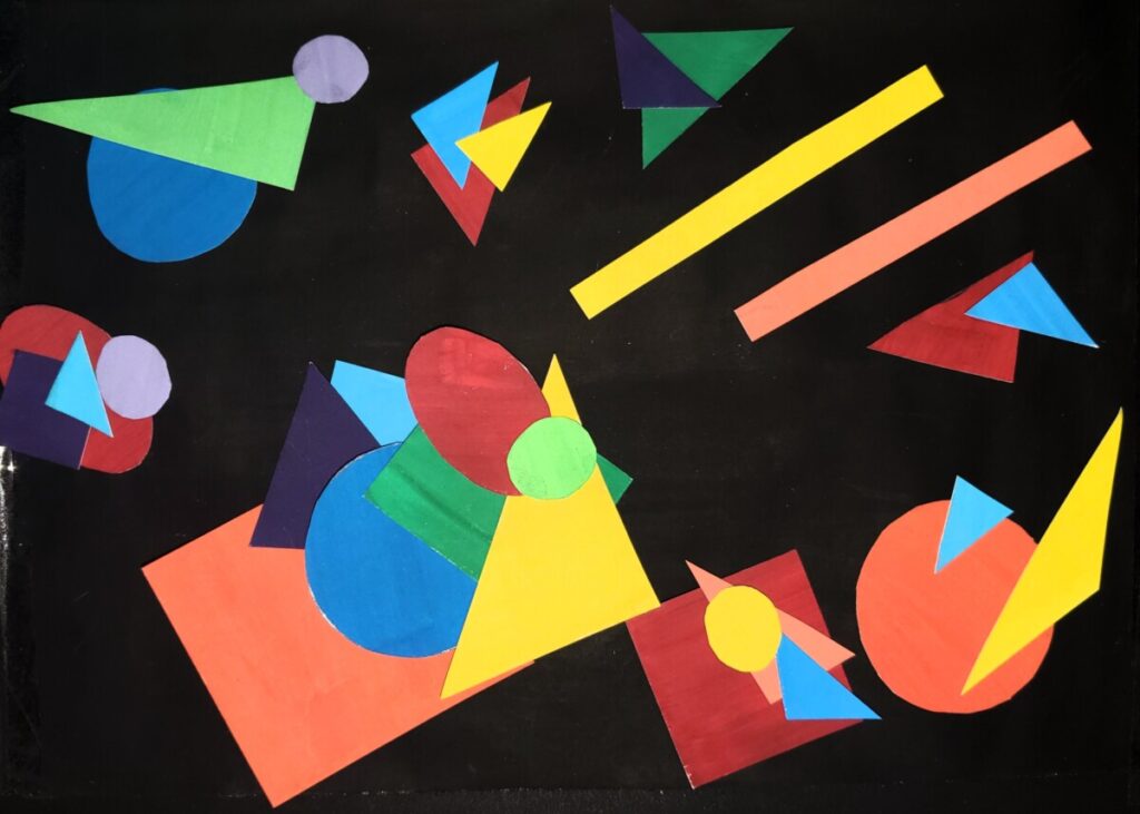
Wow first off I want to say these are so clean and amazing! Moving forward I want to say I love the overall hue and luminosity of the colors especially in the collages with the black background. The lighter colors definitely pop out more with a darker color in the background. I feel like the most dominant color in the collages for me is orange it really pops out. The collages are also complementary they have colors like red and green which are opposites on the color wheel. Also on each of the shapes, there seems to be a lot of saturation the colors are very bright and pure. I like the overall content and composition of the college. The shapes remind me of a cluster of stars but with shapes and are the main focal points. The use of geometric shapes in the collages is great. The collages have a lot of highlight areas where it includes the color yellow. Overall great collages and emphasis.
I like your design also how you choose to go with one white background and a black background . I like the geometric shapes you went with and didn’t just cut up random shapes. Also with the balance of Colors you went with there isn’t just random colors repeating themselves. I like the dominant and sun dominant colors you went with it really makes your aft piece stand out . I can also see where the near complements are especially with the green there’s some light greens in there and different varieties of green in your piece .
I love the combination of different geometric shapes rather than pairing the same shape together. When the same shapes are near each other they are in different scales or sizes, thus making the composition more interesting and playful. All the hues you chose are saturated, which in turn adds vibrance and life to your artwork. I also like the use of pairing secondary and primary complements together. Although there are sections that have many shapes overlapping, there is no visual hierarchy, therefore creating unity and harmony. There is an asymmetrical balance that captivates my attention and convinces me to further look at all areas of your work. I think the black is a perfect way to add contrast and make the colors pop out instead of fading into the background.
I love how the colors of your designs look more saturated on the black background compared to the white one where they look more like muted colors. I also like how the geometric shapes are overlapping each other. The primary, secondary and intermediate triads of colors look amazing because they are complements of each other. The yellow color looks like the accent color of your abstracts designs because it’s the brightest. The patterns and repetition of the shapes make the overall designs look well put together.
The shapes in here are both organic and non-organic. The colors are complementing
each other along with contrast which makes it to pop. There’s some type of harmony in the artwork with the focal point being one of the colors which is orange to me and it seems to be dominant as well. And you used the primary triad colors the most also. Many of your shapes are overlapping, but there isn’t any hierarchy, help bringing in the harmony and unity in the art.