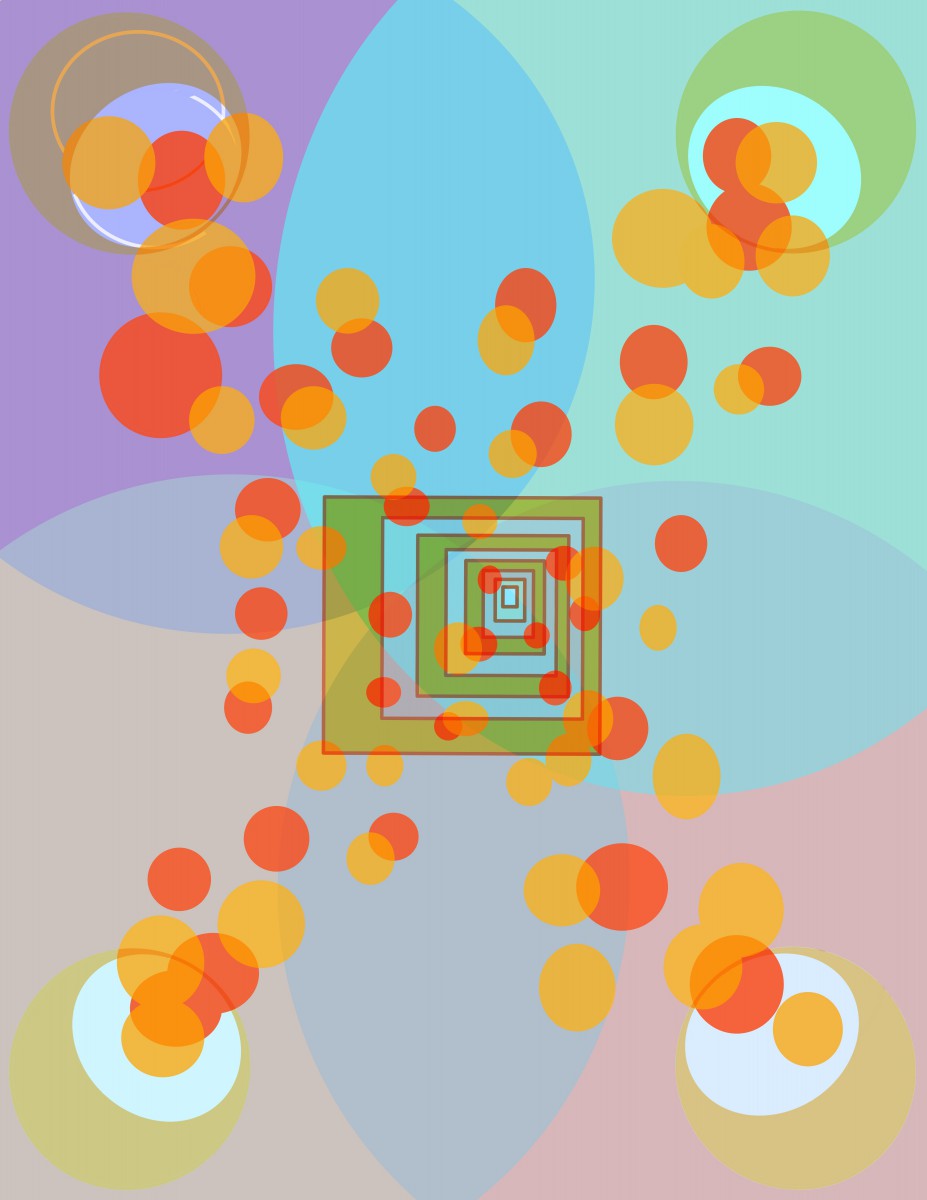
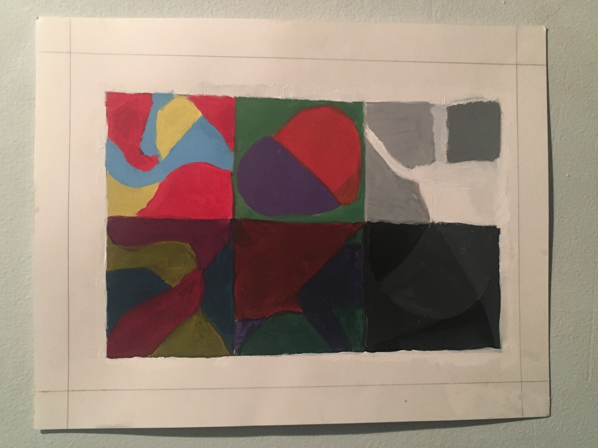
“Dark and Light Colors” project was one of the easiest projects ever. As you can see this includes a lot of hue, tints and shades. And this gave the painting a sense of value and textures. Both sides dealt with primary and secondary colors which was to show each side with tints and shades giving the image a good look. This was also to see how the mixing of the colors could effect the image.
Challenges i faced when doing this project were very minor which was trying to get the right shade and tint of color. How to structure the project overall. And also, the paint itself. I had to constantly start from scratch because the light paint would end up on the dark side and vise versa. But overall what I learned when doing this how to combine secondary, tertiary, and primary colors and how to separate the three. I enjoyed working with the paints and just the learning itself. I also learned that it’s more than just combining colors it’s also about being able to explain the idea behind the painting.
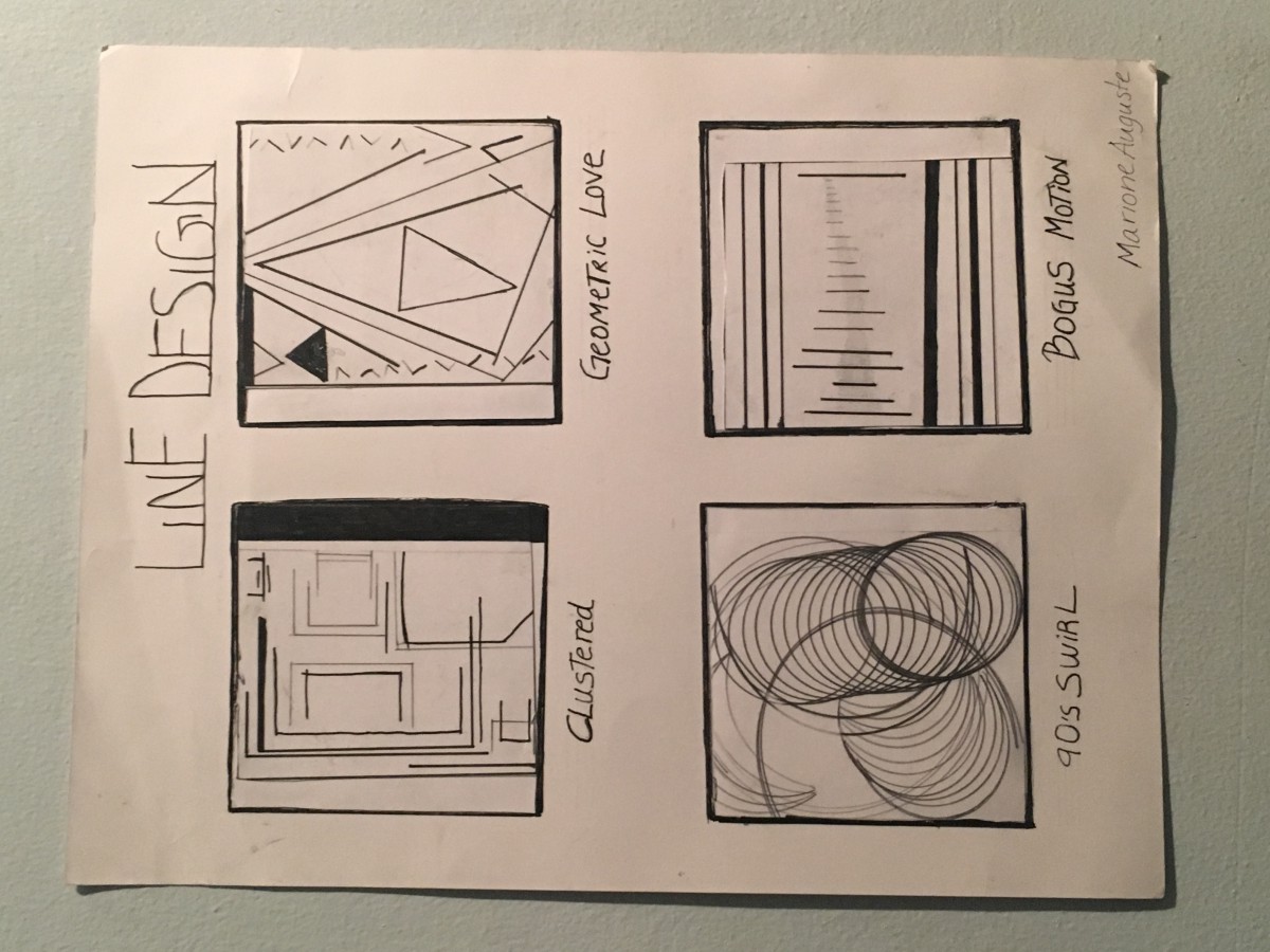
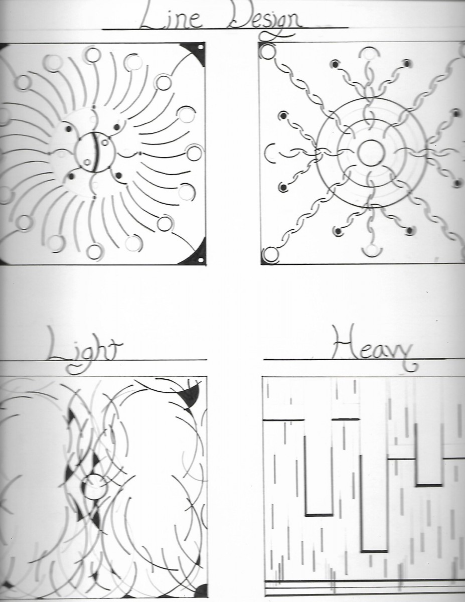
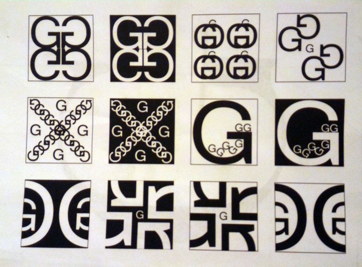
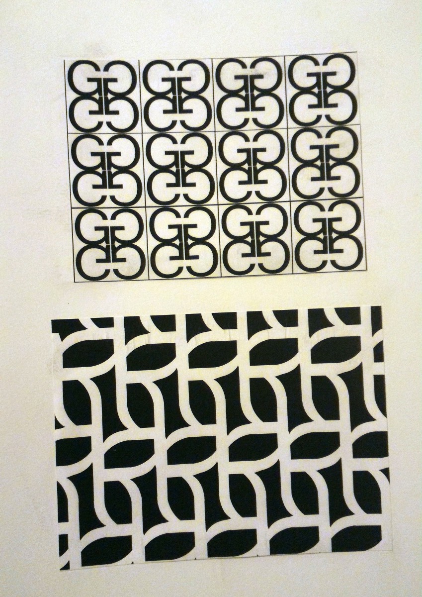
“Line Design” project was the first project I ever did and I absolutely loved how it turned out. The goal was to make a abstract piece which is what I did. As you can see we were given to make our own pieces with the given shapes which were: lines, circles, squares and triangles. With those I created an abstract piece, also giving the image a little sense of negative and positive spacing. Every shape was given a name as well, with “Clustered” I was thinking of crowed places and how it made me feel as if I was in a box which is why I did that form. “Geometric Love” the idea I got from that one was relationships in general it’s always a cycle when one fails sometimes it becomes a continually thing sometimes it’s a good thing but it’s always a triangle. “90’s Swirl” it was because the circles made me think of the 90’s and the little toy we played back then. Last but not least “Bogus Motion” was just a random thing that came to mind, but I was also thinking of music waves but in lines.
I faced minor challenges when dealing with this piece because I already had an idea of the few things I wanted to put on he image. So I just sketched out those ideas and chose the best ones I believed were the best ones and places them on the paper. Another minor challenge of mine was how draw the audience attention I didn’t want them to just look at the image and pass by I wanted them to interpret what I was going for with this piece. I learned that these shapes can give any artist an abstract image.
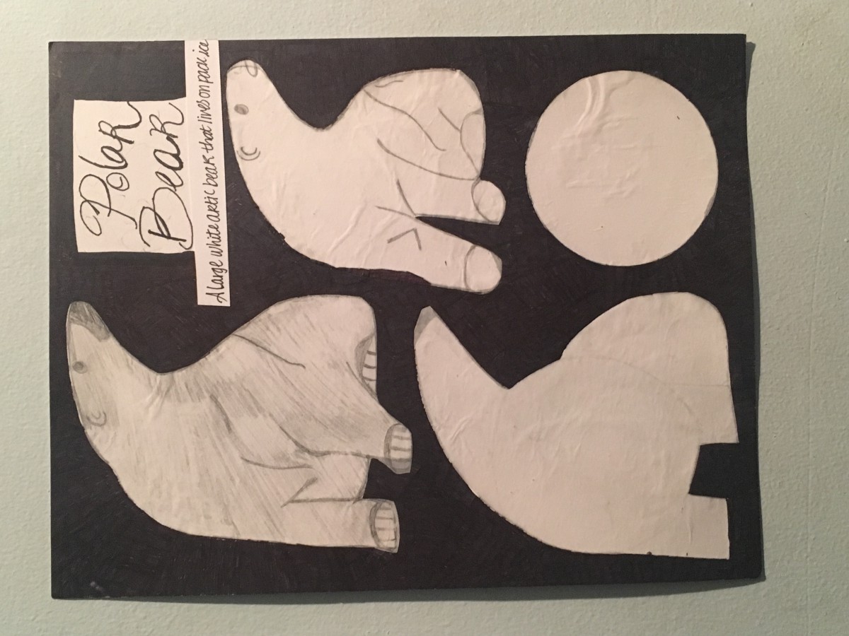
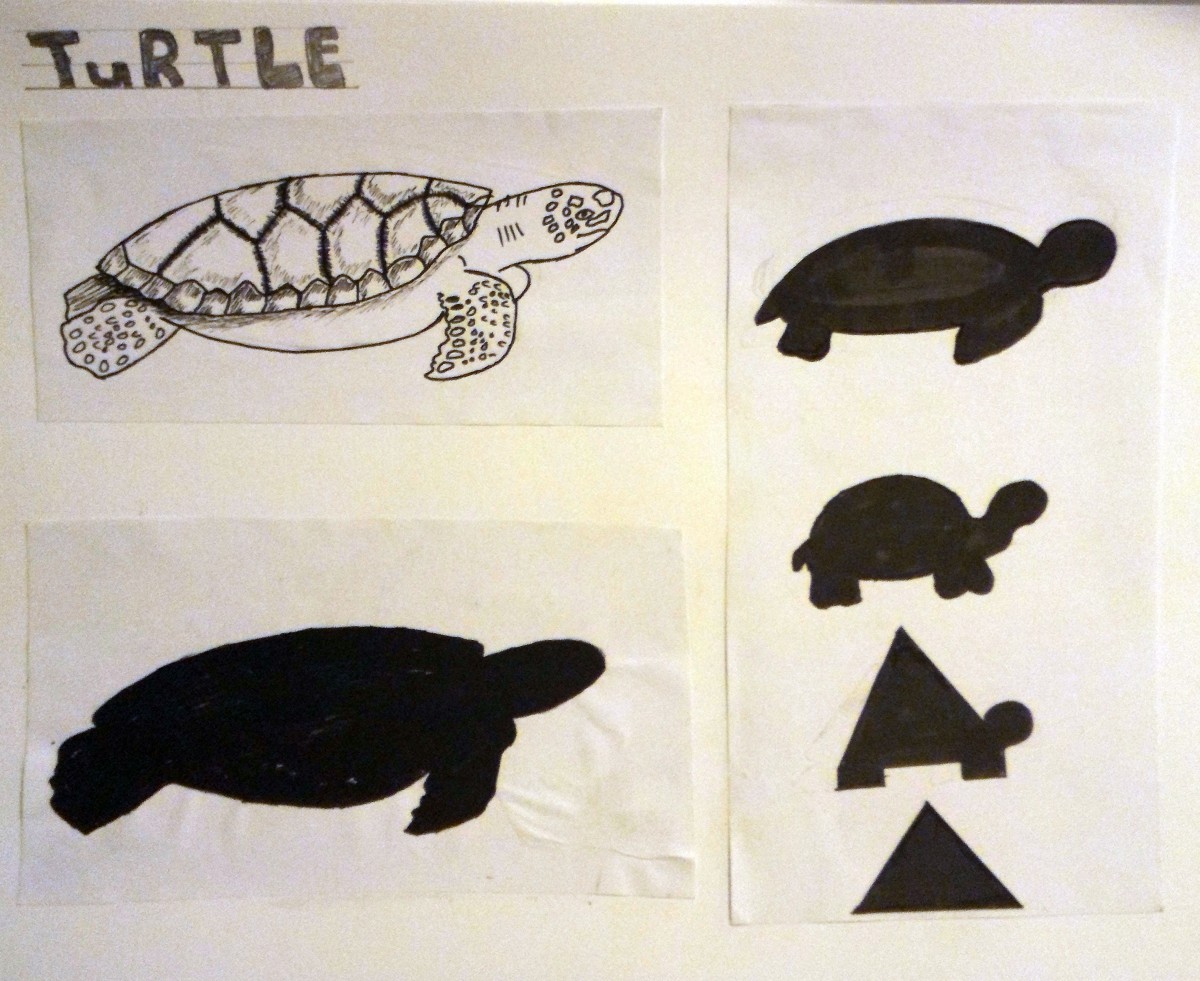
“Negative and Positive Space” project was a fun project for me as well. This project dealt with nature and we had to choose something of that sort. So after going through a lot of different animals I finally came across a polar bear. Since this was a negative and positive space piece it made my image more creative because instead of the white on black it turned out to be white on black. So I had to choose a polar from an angle in order to see the animal from a different perspective. Also, we had to work backwards which made the work more exciting ! So which ever form of nature we chose we had to also choose a shape that wouldn’t make the audience know right away what image were drawing.
I faced minor challenges when dealing with this project which were how to draw the animal, but I managed to push through and make it work. What I learned was how to draw something backwards to beginning, it was a fun experience for me and it helped me think from a different view.
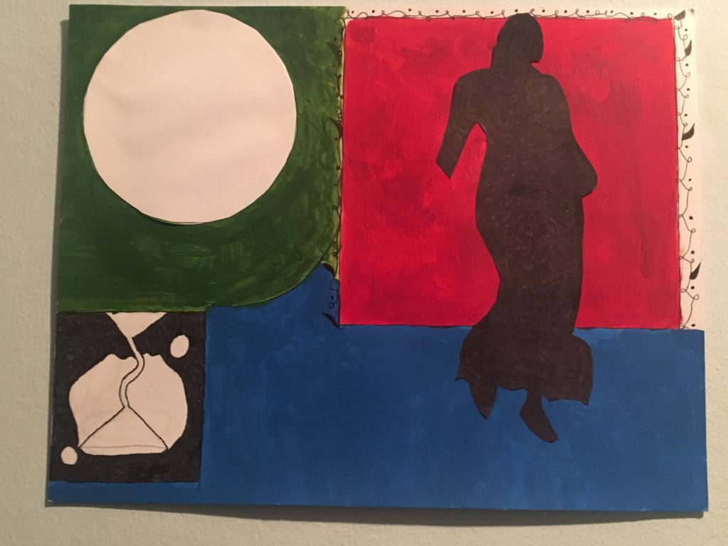
“Flag Design” was my favorite ! I enjoyed dealing with this very last project so much. So my flag to me meant a lot of things. First starting out with the colors; the red and blue represents the color of my country which is Haiti and it meant a lot to me to put it as the color background because its how I born and raised, the colors are running through my blood daily it’s a big part of my life. Where as for the green to me it means life and everlasting. Moving along to the images, “the giant circle” represents black power, black empowerment, and black people. I put a circle for that because I felt as if that’s where society expects us to be placed; which is a giant bubble. The whole of the black community works hard and society expects us to just keep quiet about our success and shuts us down. The “upside down martini glass” represents time that we wasted and or the time that’s passed us by. Lastly, the “black silhouette lady” represents the fashion world; its know for its all black wardrobes in Manhattan. Its all black or go home !
What I learn from this project was a lot which was, that there are no right or wrong answers when creating your own piece. We all have different interpretations on what something so simple as a color means to us and our culture. I also learned that every interpretation coming together could create an attractive piece; and that negative and positive space could deal with colors too. Challenges I faced mainly had to deal with the paintings itself, I didn’t know what colors to go with first and when I started painting i was afraid that it’ll ruin the piece. Also, with the objects I was going to use was a bit confusing for me because I knew what they meant to me but I couldn’t display the message out to everyone else. So I went for more simple yet understandable images that I could explain.