Project Description
For this paper, we were tasked to select a logo and study it’s history. This includes who made it, it’s different versions, where it is seen, what the logo means, it’s typefaces and colors and several images of the logos. I chose DC comics.
Logo History Paper
Christian Macias
Professor Bauer
Logo History Paper
December 12, 2021
The evolution of the DC Comics logo has gone through many iterations since the company’s inception in 1934. DC Comics is known for their insanely huge comic book universe. Some of their most famous characters include Superman, The Flash, Wonder Woman, Aquaman and many more. They have written and illustrated countless stories of their superhero adventures, their accomplishments, dilemmas, defeats and victories against foes such as Lex Luther, The Joker, Two Face and so on.
A company this big and influential has to have an iconic logo, and they do, but it has gone through a handful of iterations since the creation of their first logo in 1940. This logo, although simple. has three main components that’ll make its way through to the present in almost every version of the logo following the first one. These components are the presence of a circle encasing the “D” and “C”, “D” and “C” remain capital and “D” and “C” are represented with serif typefaces.
Below is an image of the first logo, a circle in a donut shape, with a bubble, san serif typeface reading “A Publication” and “DC” in the center with a serif typeface. Black and white, very simple.
In 2 years, 1942, DC came out with a new logo and a new hero, Superman. They redesigned the logo for Superman’s debut slightly. Below you will see that “now it featured ‘A Superman Publication’ in the same rounded sans-serif. As for the ‘DC’ monogram in the middle, its contours were refined and strengthened, and the lettering gained a delicate black shadow” (1000logos.net).
When we jump to 1970, their logo takes a very sharp turn. DC decides to make the circle black with an image of Superman flying over the circle. Below that circle is a yellow rectangle with a black stroke. Within the yellow rectangle is “DC SUPERMAN” in a san serif typeface with the text colored in black. This change in logo though did not last long, it had a brief stint.
The next logo in DC’s journey is one created by graphic designer Milton Glaser in 1976. “Glaser is well known for conceiving iconic graphics and artwork immortalized in popular culture, including DC Comics’ famous bullet logo, which was used by the comic book publisher from 1976 until 2005” (Liu). This logo has been nicknamed the “DC Bullet”. It is a big white circle, with a smaller black circle placed on top of it, and at the center of that black circle is another white circle. Glaser took a blocky typeface and used it for DC and placed it at a 45 degree angle within the smaller white circle in the center. Along the black circle are 4 white stars that are placed at a 45 degree angle, at the top, bottom, left and right of the “DC”. This logo is iconic and instantly recognizable and was used for the longest amount of time compared to any other versions of the DC logo.
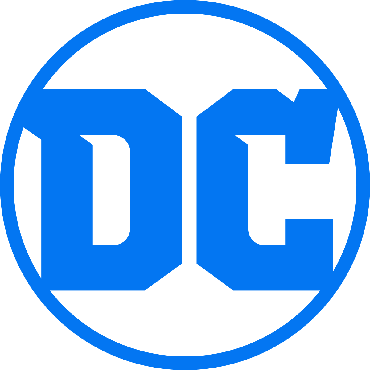
The most recent logo has been used since 2016 and was designed by a design studio named Pentagram. This logo shows a white circle with a light blue stroke. Within the circle are the letters “D” and “C” in capital, with the same color as the stroke surrounding it. The two letters are in a stylized, bracketed serif typeface, seemingly paying homage to older variations of the logo where a serif typeface was mainly used. The typeface is very angled, with no curves to be seen, giving it high contrast with the surrounding circle.
DC Comics has created stories throughout the years about characters that we all love and hold close to our hearts. With every comic book corner, every website, every t shirt, tote bag, packaging for toys that this logo is plastered on is a reminder that they were the ones who created these stories for us to enjoy. It is one of the most iconic logos and every time you look at it you instantly picture Superman flying through the sky, shooting his lasers out of his eyes, or Batman in an ally stopping the criminal from taking a woman’s purse. This is the power that DC Comics’ logo has, they trigger memories instantly. That is a very successful logo.
Comic Book Cover, https://www.dccomics.com/comics
Website, https://www.dccomics.com
Toy Packaging, https://www.amazon.com/Pop-DC-Heroes-Batman-Laughs/dp/B07JH5TTF5
T-Shirt, https://www.amazon.com/Batman-Comics-Logo-Shirt-Stickers/dp/B07MZ8RBT2
Works Cited
Liu, Narayan, and Narayan Liu (1724 Articles Published) Narayan Liu (/Nəraɪʌn Lɪʊ/ in IPA) is a contributing features and news writer. “Milton Glaser, Designer of DC Bullet Logo, Dies.” CBR, 27 June 2020, https://www.cbr.com/milton-glaser-designer-of-dc-bullet-logo-dies/.
“DC Comics Logo.” 1000 Logos The Famous Brands and Company Logos in the World DC Comics Logo Comments, https://1000logos.net/dc-comics-logo/.


