
Be sure to lay the groundwork
Before a person will be willing to convert, she needs to know what the benefits will be. Present your call to action, then make a benefit statement, telling her what she will gain by taking part.
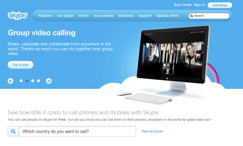
Look at Skype’s site. They identify the need—in this case Group video calling—then they give you a benefit statement to motivate you to try it now.
Offer a little extra
Sweeten the deal to encourage users to complete a call to action. Offer an incentive, like a free download.

Limit the number of distinct actions
Keep your CTA focused. Put up too many and the user becomes confused. Limit the number of actions a user can take and you raise the chances he will choose to follow the most desired route.
Create a sense of urgency
A CTA should be perfectly clear when it tells the user what to do. One way to boost that clarity is to use active words such as:
- Call
- Buy
- Register
- Subscribe
- Donate
All of these encourage users to take an action.
Also, you can set a time limit.
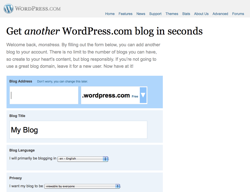
Position the call to action well
Make sure your CTA is prominent and central in its location.
Don’t fear the white space
It is not just the position of your call to action that matters. It is also the space around it. The more space around a call to action the more attention is drawn to it. Clutter up your call to action with surrounding content and it will be lost in the overall noise of the page.
Use an alternative color
Color is a great tool to draw attention to your CTA, especially if your site has a limited palette.
Make it big
The bigger your CTA, the more attention it will likely receive. However, you do need to balance the composition.
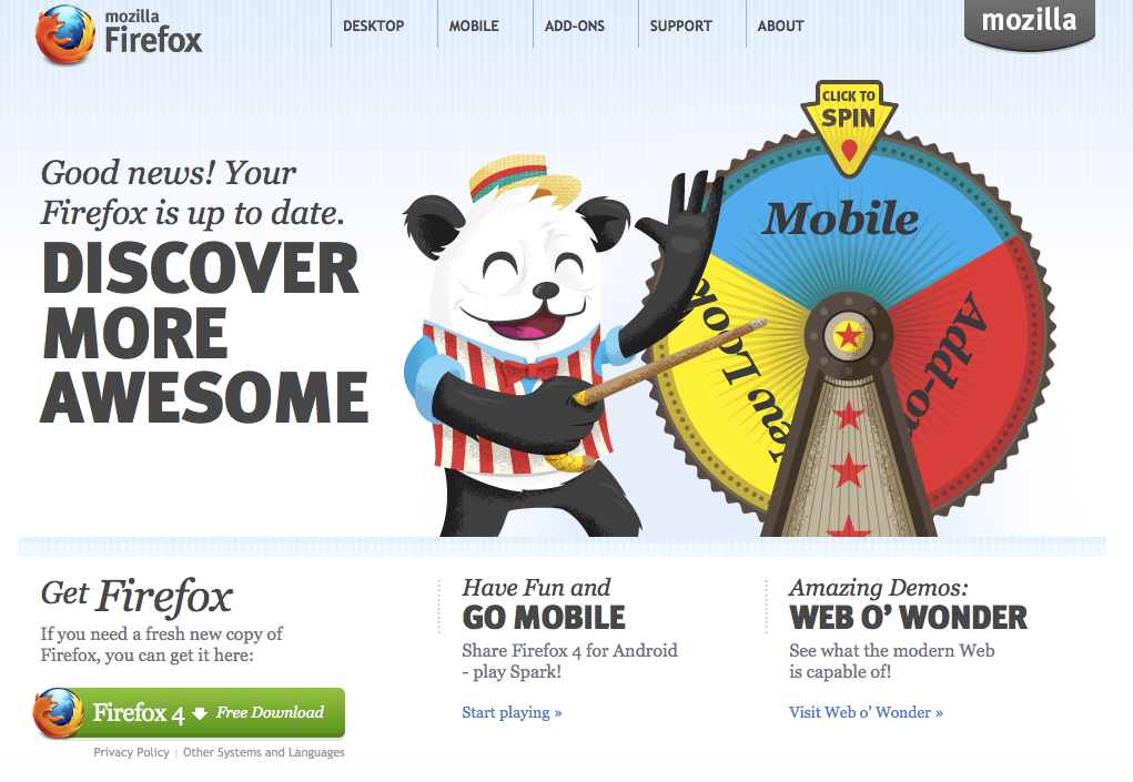
Have a call to action on every page
Your CTA should not be limited to the landing page. You can drive that message home throughout the site. In fact, you need to provide conversion exits everywhere you can. If the user hits a dead-end, she will probably leave without responding to your call.
Carry the call through
Be sure to consider what happens once the user does respond to your CTA. The rest of the process needs to be clear and as carefully thought through as the call to action itself.
One particular word of warning – if you require users to provide personal data about themselves, resist the temptation to collect unnecessary information.
Marketing people in particular like to build up demographic information. Although I can appreciate the value of this, it brings a danger users will drop out of the process.
Articles used to write this lesson
10 techniques for an effective ‘call to action’ | Paul Boag | January 22, 2009
Web Design Trends: Call To Action Buttons | Lee Monroe | December 15, 2008

