On March 6, 2012, I took my very first trip to the AIGA. The trip was very decent and it was actual a good experience. We went to see the 50 Book Cover Exhibit of 2010. During the trip, I have seen the various book covers on display and they were all different in various ways. Out of all 50 books, the 3 covers that caught my eyes were colorful, as I like color and it kept my eyes on the covers the entire time I was at the museum. The covers we’re so amazing that I wished I could’ve taken it home and add it to my book collection.
869 New Uses For Old Things
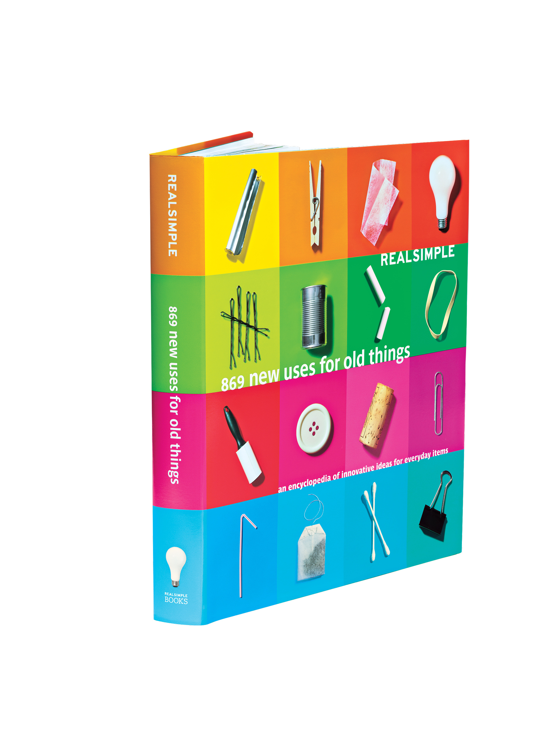
Author: Real Simple
Design Firm: Real Simple
Collection: 50 Books/50 Covers of 2010
While I walked around the museum looking at the exhibit for the book covers, the colors and the photography of simple objects on the cover attracted my eyes, and my attention. I couldn’t stop admiring the cover. The book is about using old objects in different new ways, like using a rice strainer as a flour shifter for baking or a paper roll to organize the electrical cords. The color blocks that are in the order from the color wheel from reds to greens to even the blues were put together perfectly in my opinion. The font for the text is simple and it goes with its colorful background and it’s easy to read.
Helvetica & the New York City Subway System

Author: Paul Shaw
Designed by: Abby Goldstein, & Paul Shaw
Publisher: MIT Press
The second book, Helvetica and the New York City Subway System, was the first book I looked at when I entered the museum. I love the way the numbers and alphabets is put in the ascending order. The book is basically about the subways in New York City and its history. The author uses a unique “subway symbol” as a font style to show what the whole book is about. The colors on a black background look very simple but yet attractive in a way which wouldn’t confuse the reader/audience.
Themes of Psychoanalysis
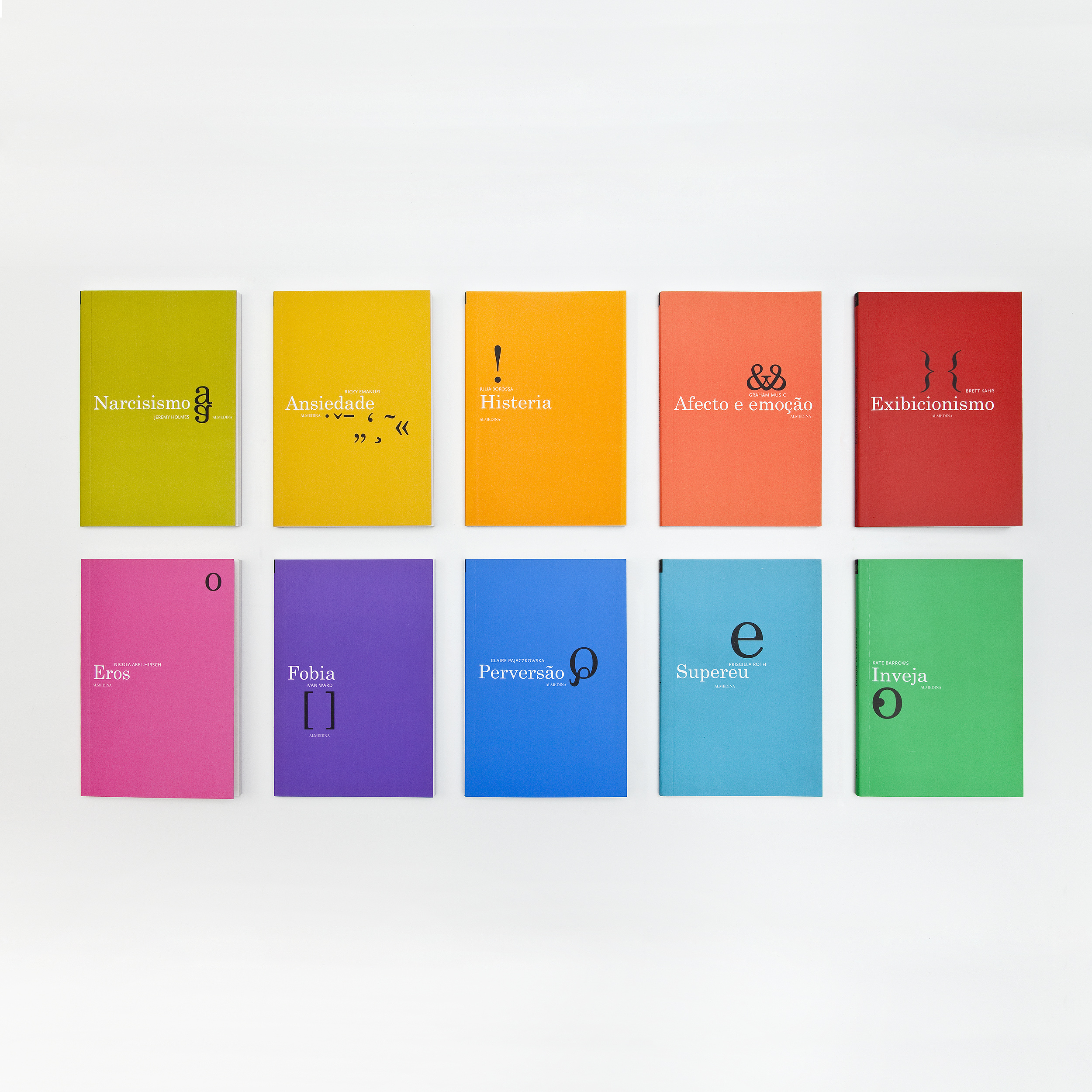
Location: Coimbra, Portugal
Design firm: FBA. – Ferrand, Bicker & Associados
Collections: 50 Books/50 Covers of 2010
Last but not least is a book series in the Portuguese version about psychoanalysis. The book series is a mixture of solid colors and a specific symbol for each book (i.e. Orange solid color with the ampersand symbol [&]). I love color and I really couldn’t stop admiring the series even though it’s in another language from another country. I love how the designers of the book just used simple black font style symbols that decorated the solid colored books. I do not speak or understand Portuguese, but if I was in Portugal and I see this book series on the bookshelves, I would check it out.

