Goodness gracious professor Goetz! I am in love with what I just saw lol. I feel like my eyes were closed but now they are open. I feel that without this class I would have never ventured out to watch these kinds of things because I could be doing something work or school-related or something fun. But that is just it, this is school, and work-related and most of all fun! I forget that as a designer it is also important to listen and hear from senior designers instead of just heading to Pinterest. This was an amazing watch and I hope to continue watching things like this in the future.


I am honestly sorry about my webinar post being so lately uploaded but honestly, this last semester is kicking my behind professor hard lol. But before I go on a tangent let me get right into the webinar I just watched.
The webinar that I saw was titled “Burger King Redesign at Brand Talks Connected. It was uploaded to Monotype.com which is one of the sites that you recommended to us, professor. There were two speakers who were senior designers at Jones Knowles Ritchie (JKR) whose names were Jackie Rodríguez and Daniel Stettner. They both took turns speaking for different parts of the presentation. The presentation was broken up into three parts, 1, “why are we doing anything?” 2, “what is the context for doing anything” and 3 “timelessness”. They went on to answer these questions.
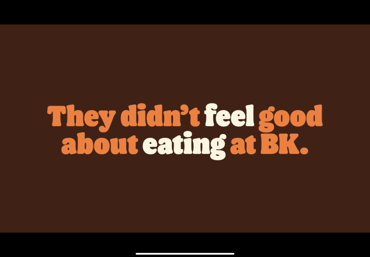
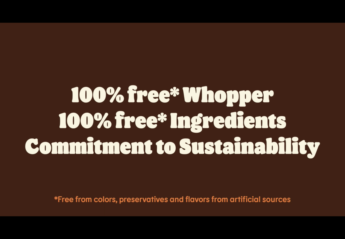
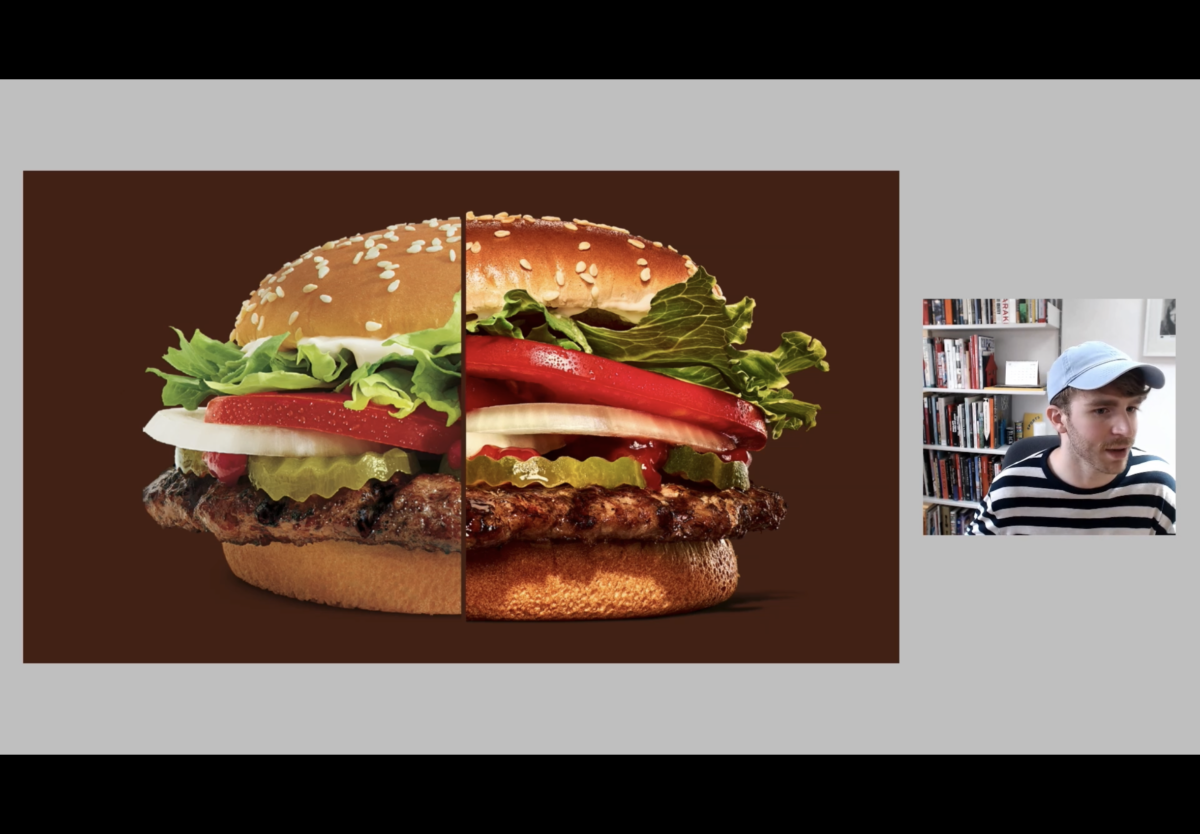
In part one, Burger King reaches out because they have a problem. Their problem, people just don’t feel good eating their food. Burger King tried to tell their consumers of their new improved direction regarding their food and business which was the food was now free from colors, preservatives, and flavors from artificial sources and their commitment to sustainability. People care about this, but they just weren’t buying it. So, they turned to JKR for help as they thought design could help solve their problems. Speaker Daniel said something powerful around this mark which was something along the lines of sometimes you just cannot change people’s perspective by just telling them alone. I believe show don’t tell works well in the scenario.
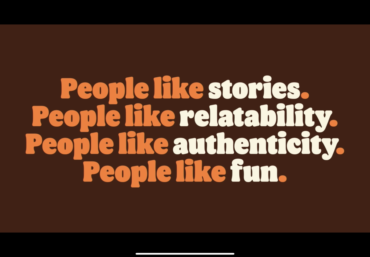
Burger King’s goal was simple, we want people to crave our food again. So, the team went to work which leads me into part 2. Part two was about context. What’s going on in the world in the terms of design and consumerism. The answer was brands were trying to connect to their consumers and their communities more. Ads were more human-centered, fun, and told stories. The JKR team found that brands that followed this when trying to engage their consumers were often successful. People didn’t want to be sold something. They rather feel something instead. I agree with this as if a product or service makes you feel something you are more inclined to engage with or in it.
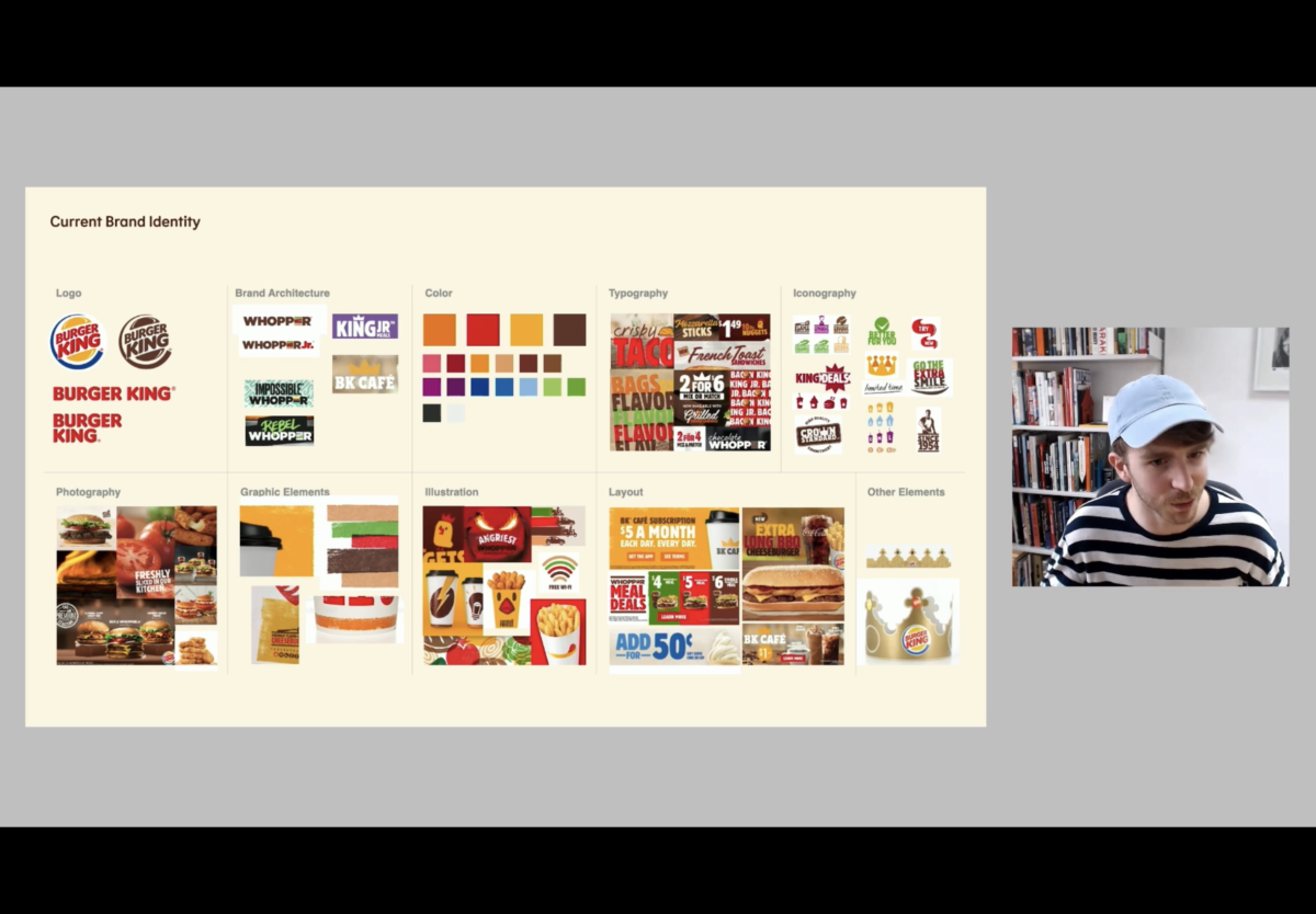
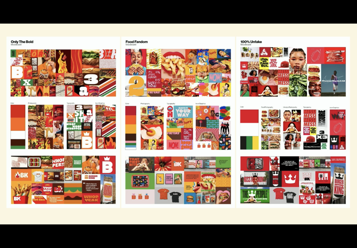
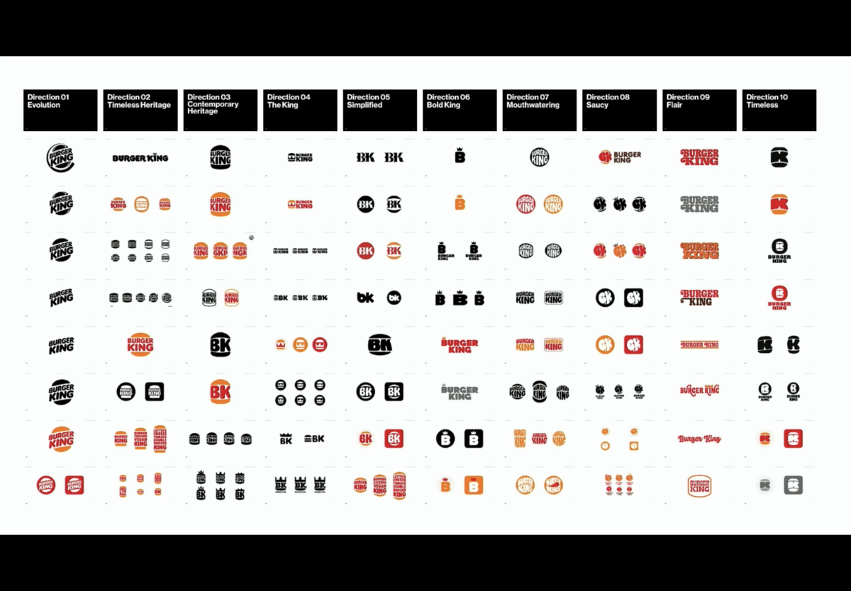
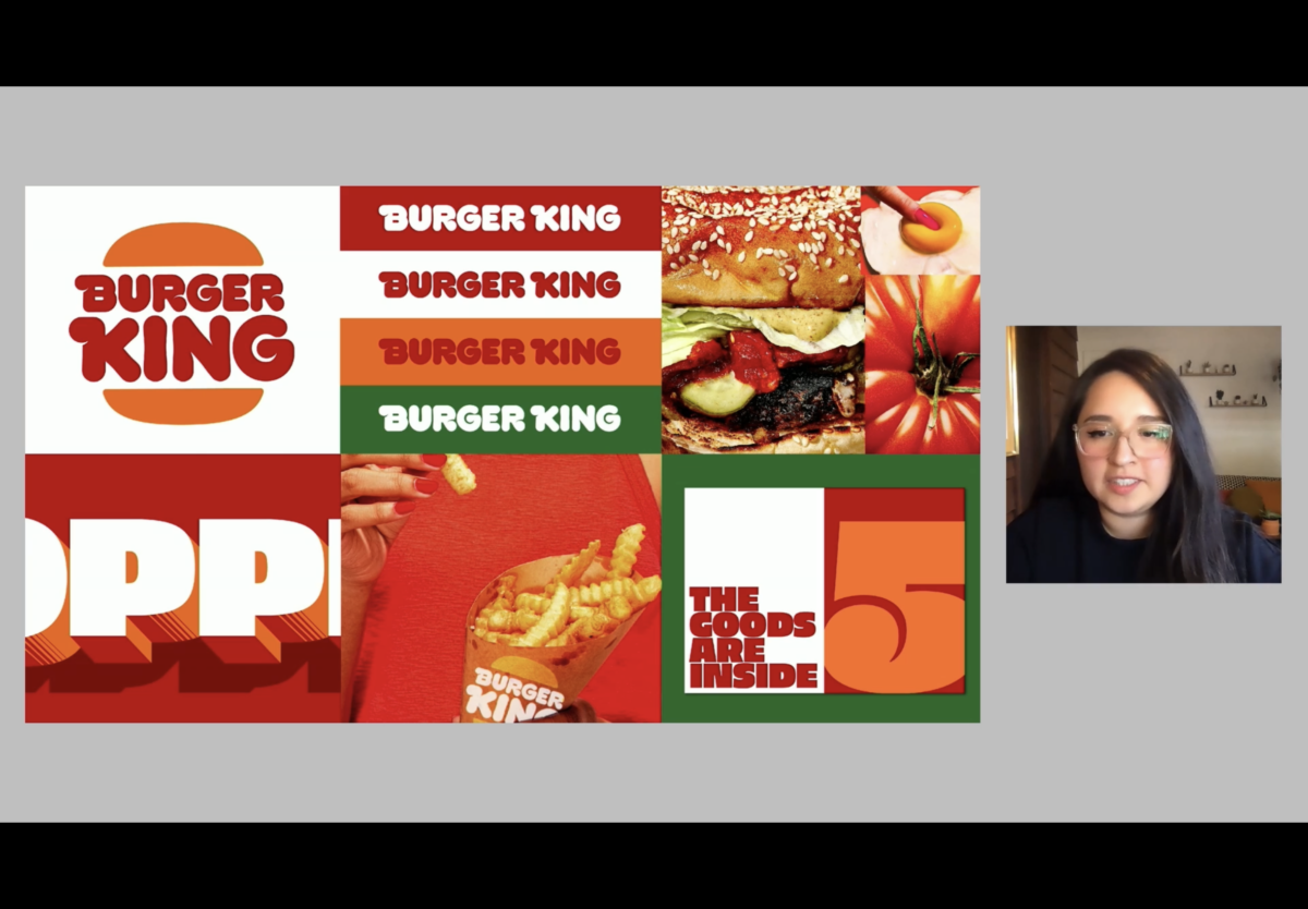
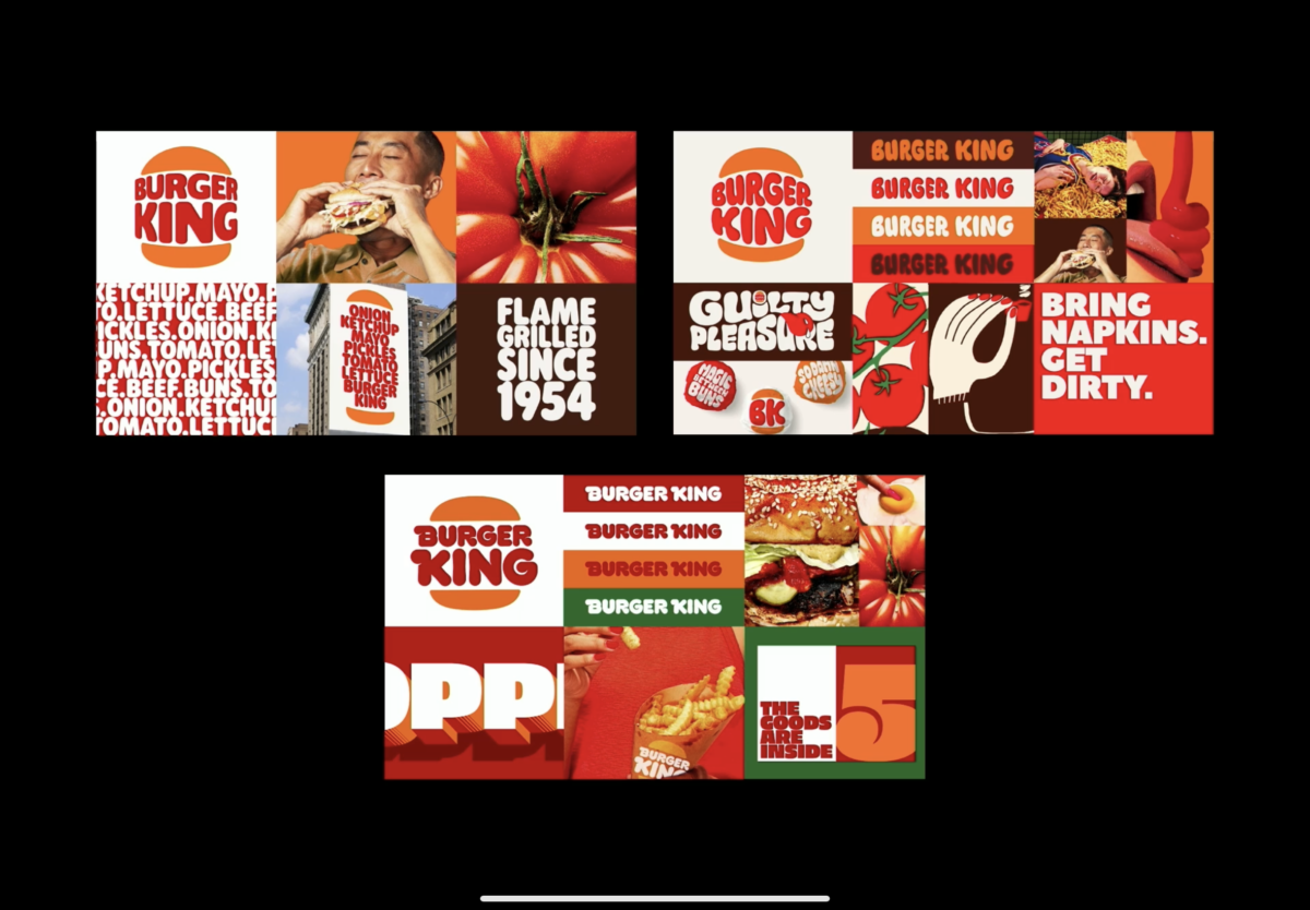
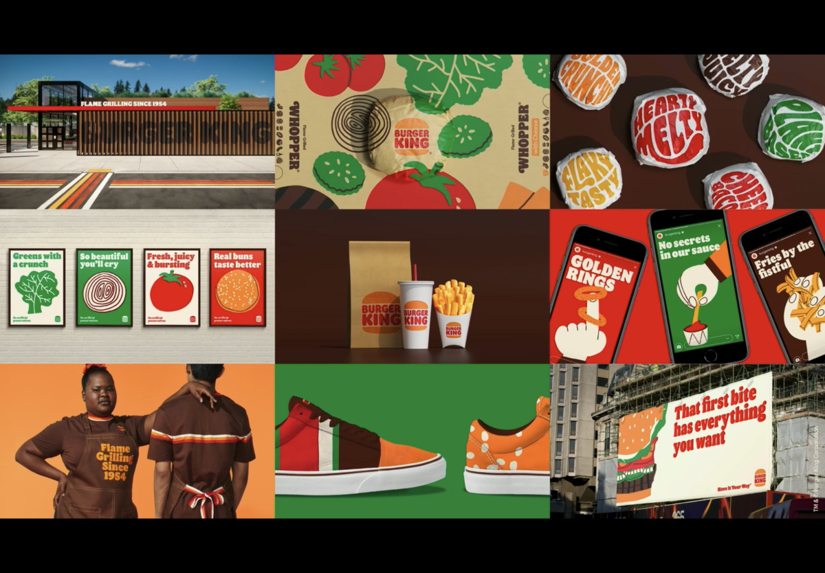
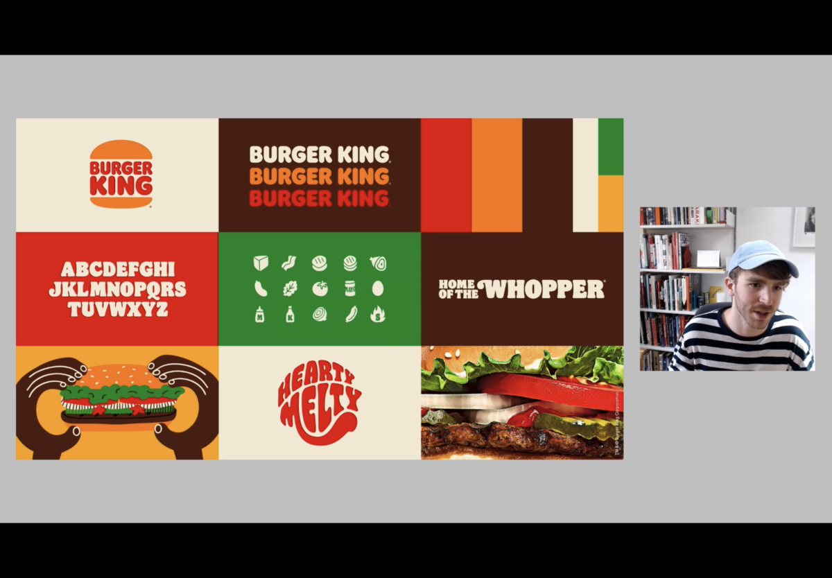
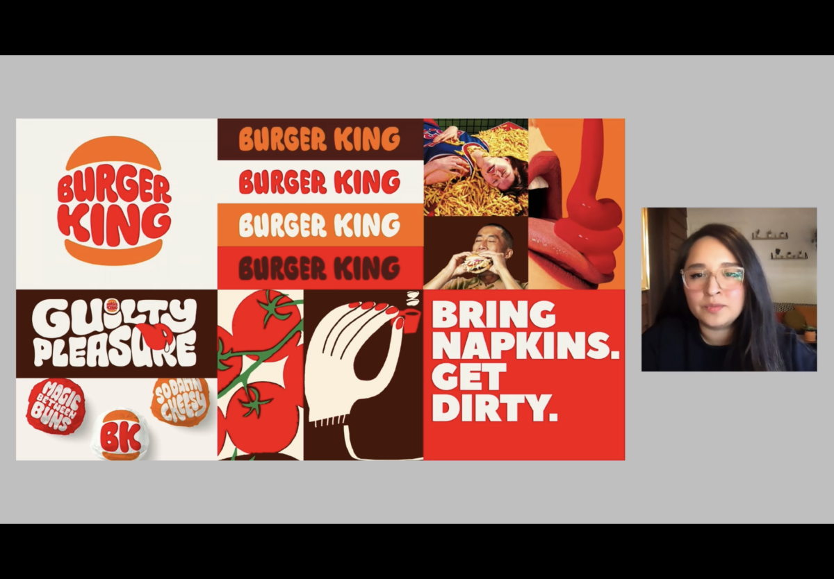
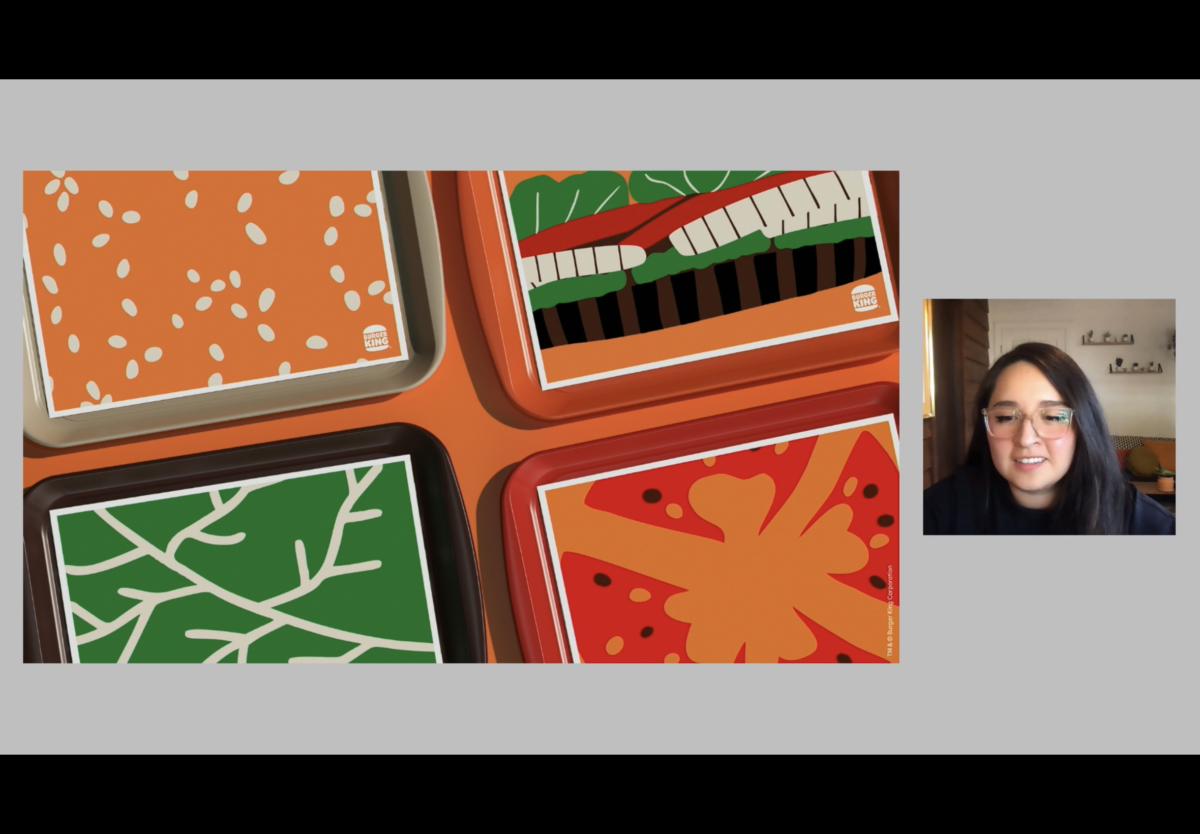
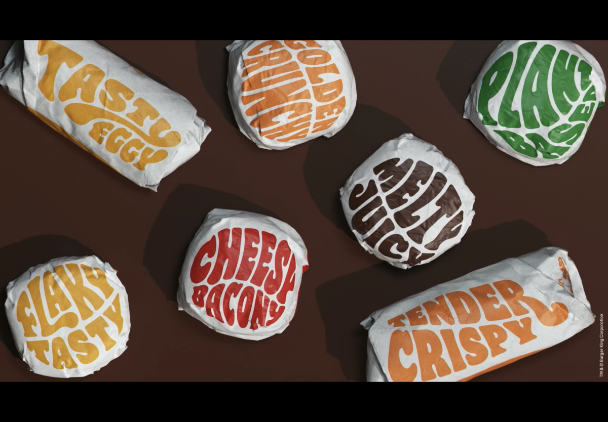
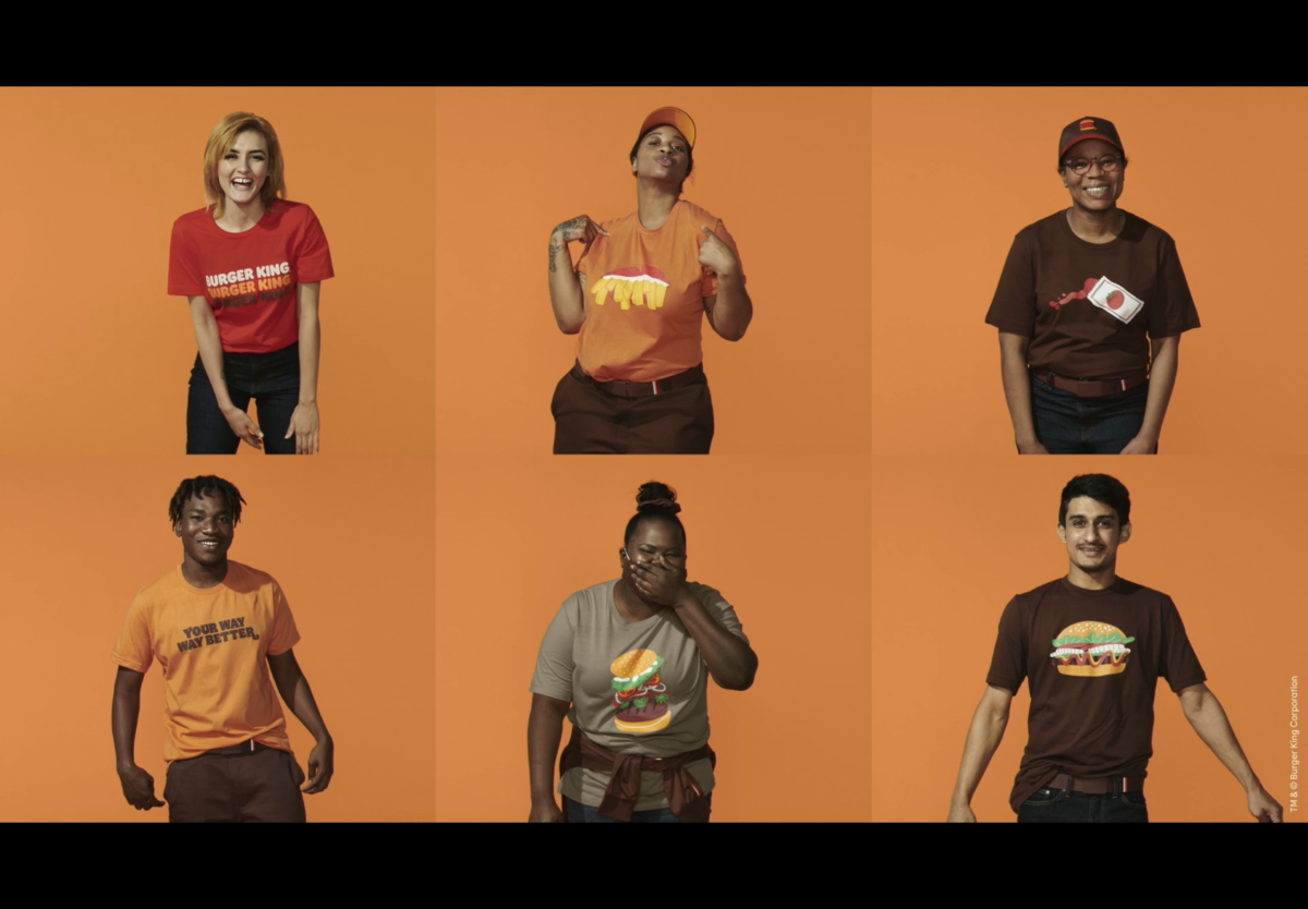
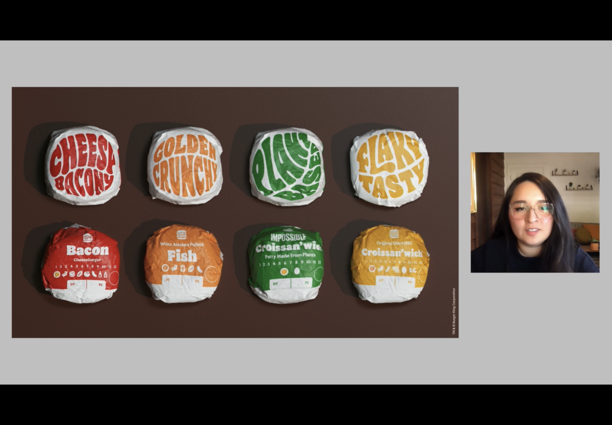
Finally, let’s talk about part Three. This was about finding the perfect balance of new meets new. What I mean by that is this part was dedicated to executing the solution which was to create an identity system for Burger King that communicates change, gives the opportunity to feel something, looks nice but most of all is timeless and will last them for years to come. This company did just that and so much more. I was starstruck by how attentive, thoughtful, and gorgeous all of the design work was. I feel so inspired by everything I saw. All the illustrations, logo process, mood boards, posters, typography, color choices, animation, uniforms, packaging, iconography, and even the inclusion of real Burger King employees in the presentation were all so unbelievably beautiful and tasteful. Note: The burger king employees were modeling the new uniforms. Also, the uniforms were designed by a fashion designer not them as were the illustration.
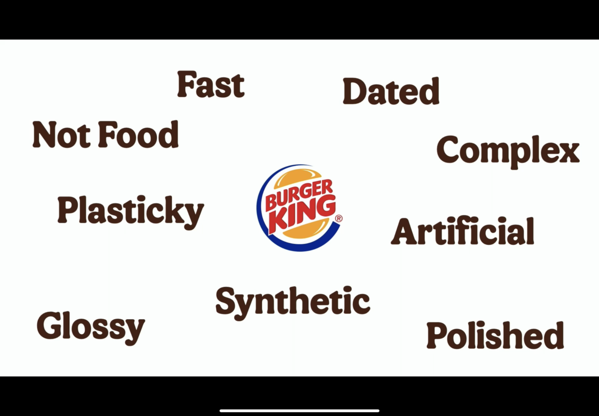
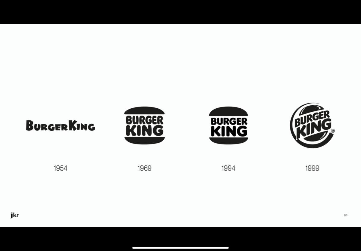
In conclusion, this is probably getting a bit long, but I had a lot of fun writing it and I usually hate writing lol. I will end this off with two pieces of information that I found really interesting in the presentation. 1, That the design speakers thought the burger king logo with the blue line looked like a gas station logo and that burger industry logos shouldn’t be glossy and include blue with the food.
Ps. I looked into JKR and found out they won an award for this branding campaign! It was labeled 2021’s most successful branding campaign by fastcompany.com. Honestly, it made me want to work for this company in the future if possible.
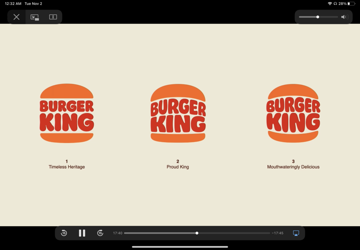
P.P.S. The new Burger King logo is a previously used logo that was revamped. They found that this was their most successful logo in the past and thought why throw away something that works already.
Thank you and that is all. The link to the webinar can be found below.
https://www.monotype.com/resources/videos/burger-king-redesign-brand-talks-connected

