

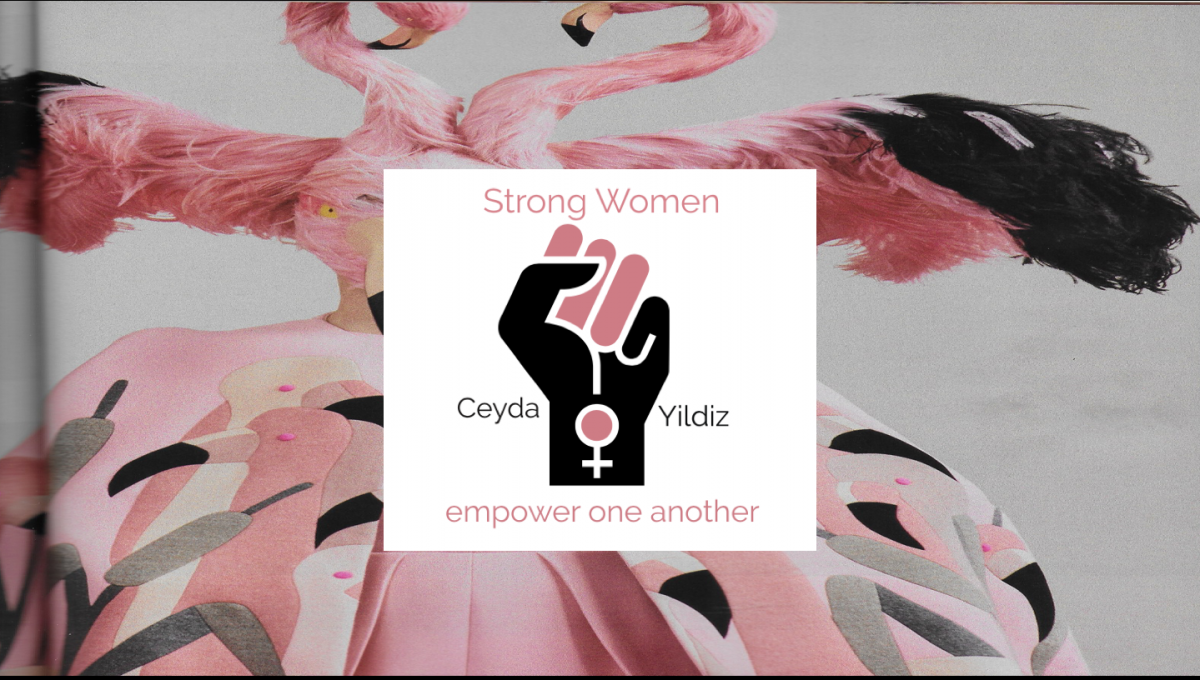
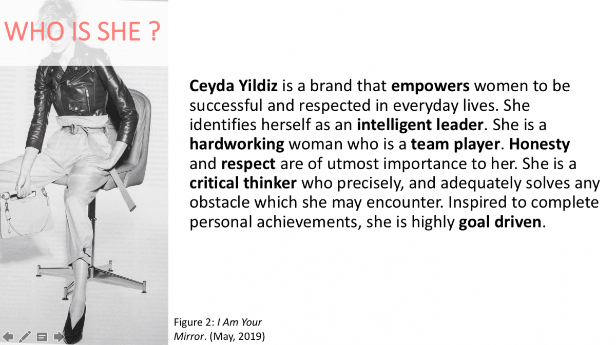
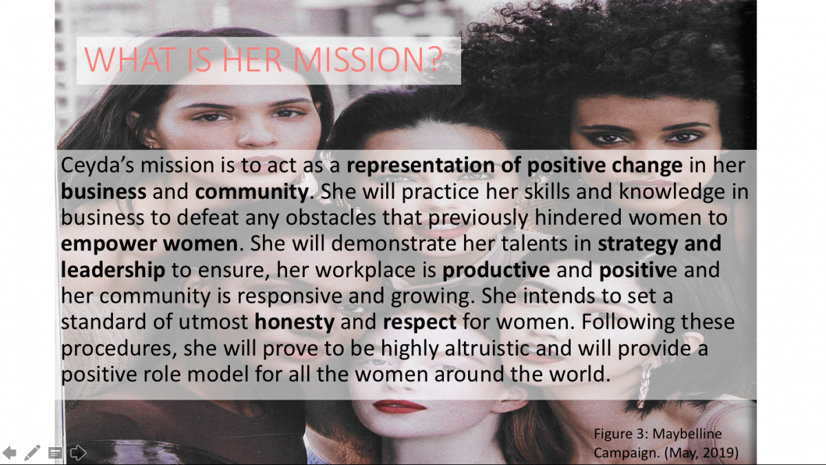
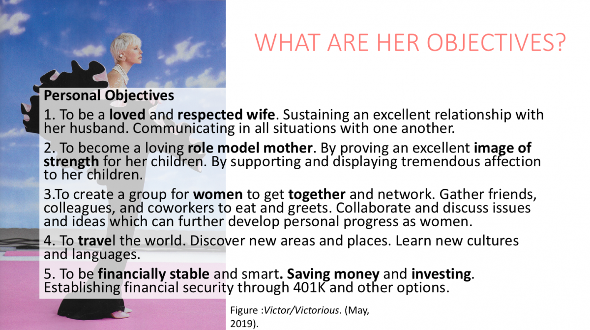
Author: Ceyda Yildiz
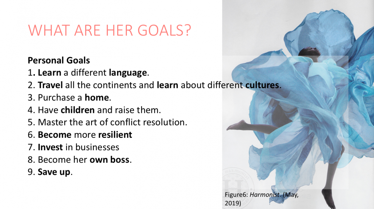
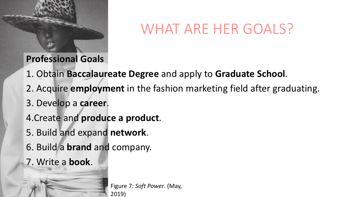
Personal Brand Image / Mission Statement / Goals and Objectives


Fashion is Cultural Heritage (Example of writing skills)
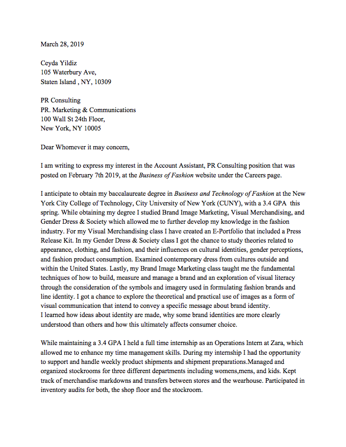
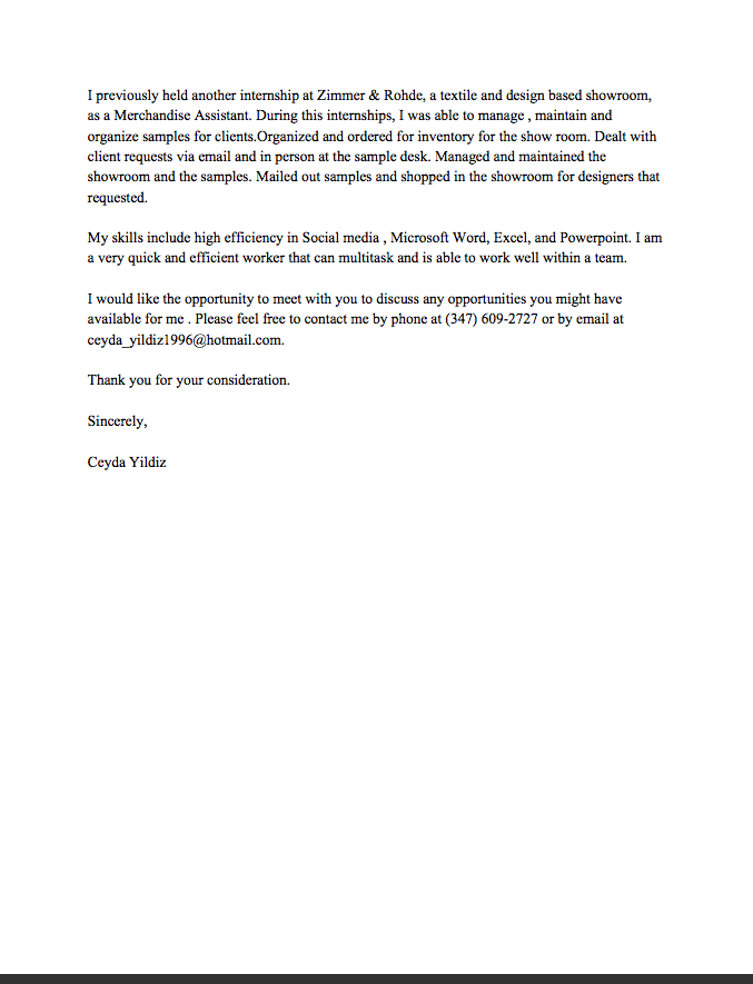
Cover Letter
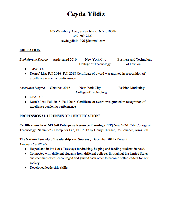
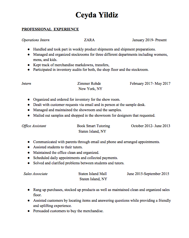
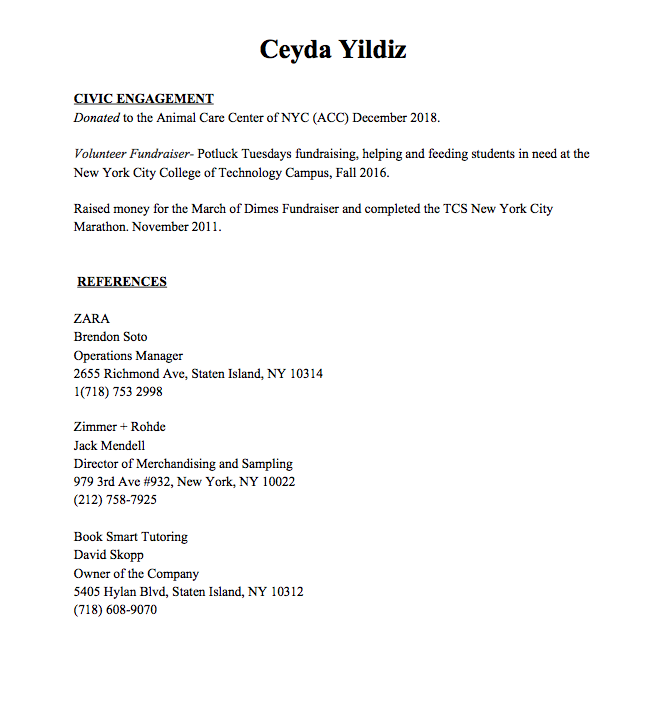
Ceyda Yildiz’s Resume

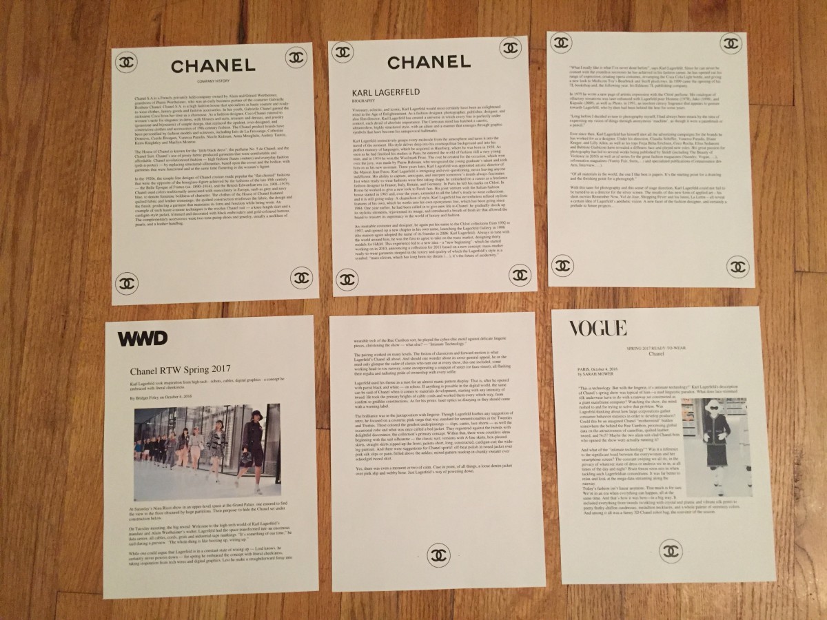
Press Release Kit


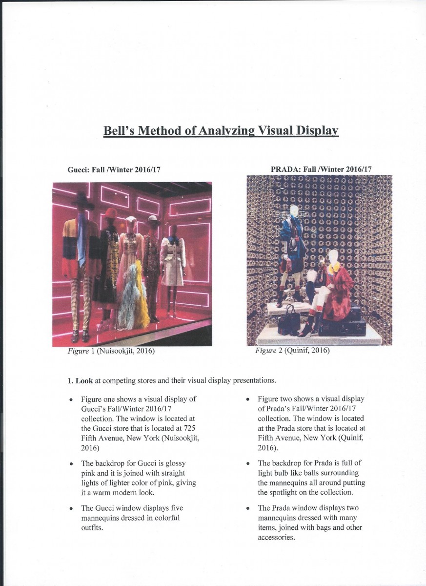
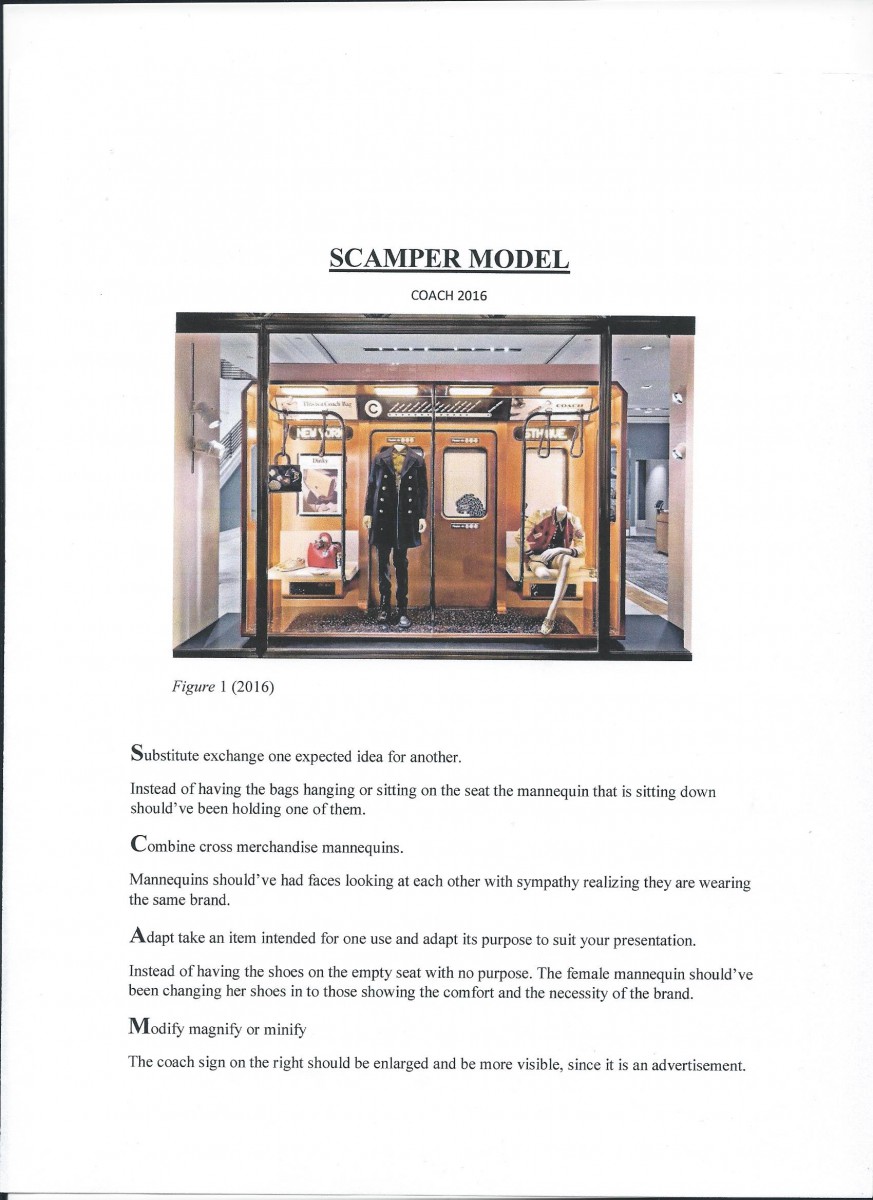
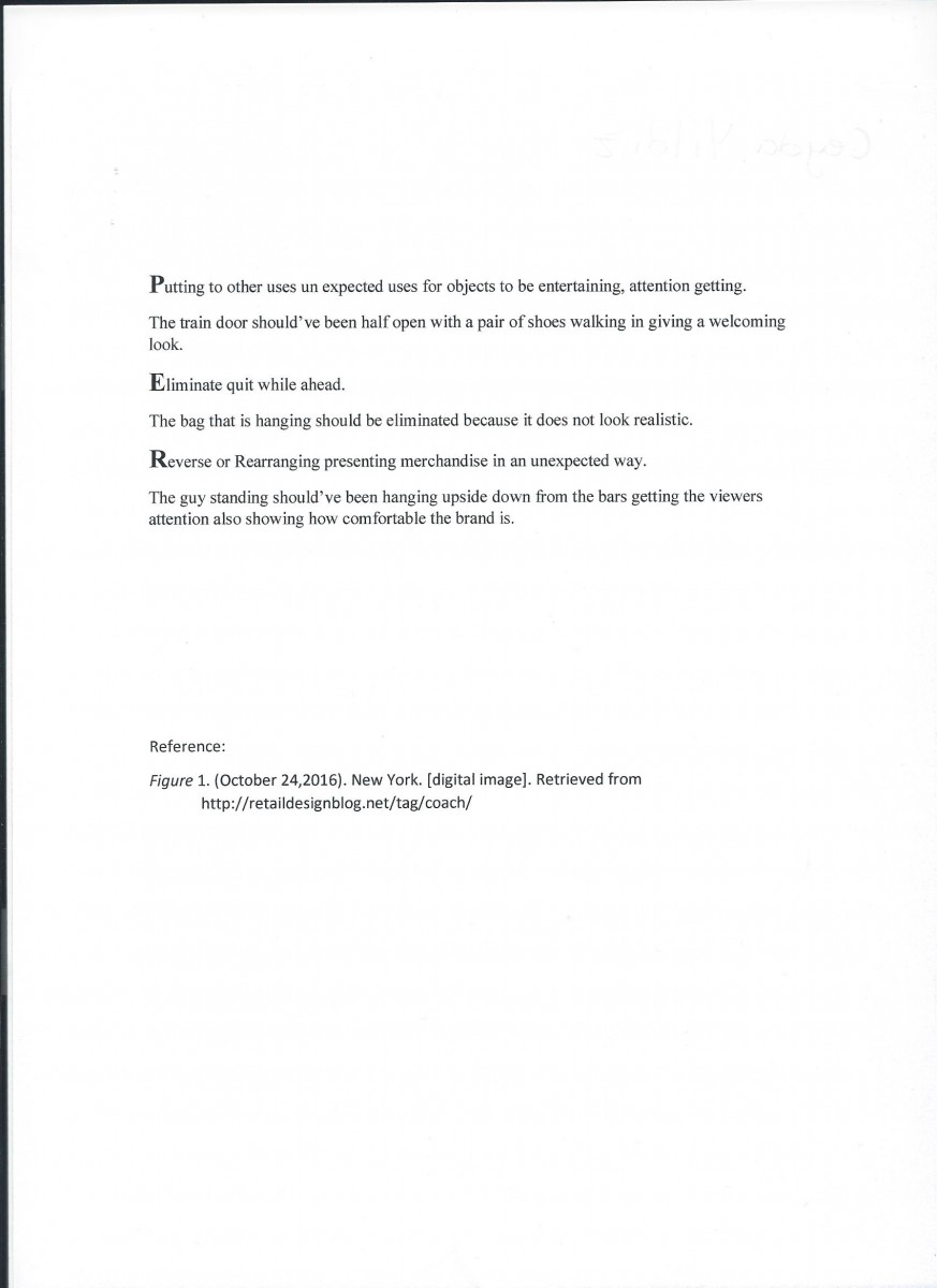
Scamper and Bell Method

Color Wheel


Elements of Design
 Elements of Design Applied on Pablo Picasso Girl Reading at a Table 1934 & Window Display
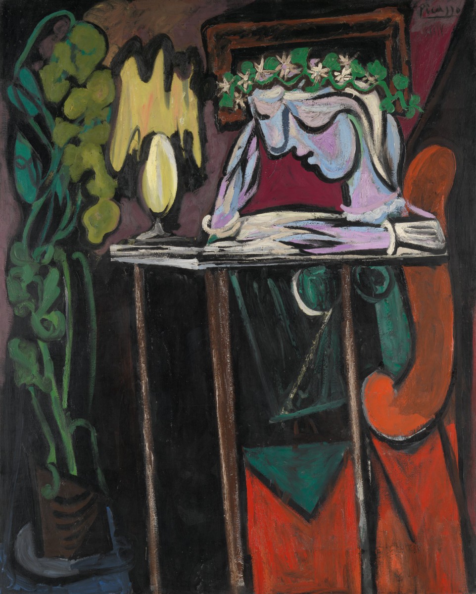
Figure one Girl Reading at a Table by Spanish born Pablo Picasso (1881-1973) was a painting of Picasso s mistress Marie-Thérèse. Picasso was an artistic genius. His creative styles transcend realism and abstraction, Cubism, Neoclassicism, Surrealism, and Expressionism. Voorhies (2004) study found the following:
By the early 1930s, Picasso had turned to harmonious colors and sinuous contours that evoke an overall biomorphic sensuality. He painted scenes of women with drooping heads and striking voluptuousness with a renewed sense of optimism and liberty, probably inspired by his affair with a young woman (one of Picasso s numerous mistresses) named Marie-Thérèse Walter (1909 1977). Girl Reading at a Table from 1934 uses these expressive qualities of bold colors and gentle curves to portray Marie-Thérèse seated at an oversized table, emphasizing her youth and innocence.
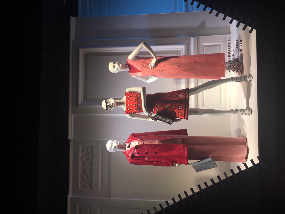
Figure two is a window display that is located at Saks Fifth Avenue, New York. The window displays three mannequins dressed in similar colors and different styles. The first mannequin on the left is dressed in a glossy leather trench coat over a pink silk dress with a wrist clutch. Second mannequin is dressed in sleeveless short dress with white, open high heels, sunglasses and wrist clutch with studs on it. Lastly the third mannequin is wearing a tea length shift dress joined with an open, backless, short heeled shoes. The opened, zipper like window, welcomes the viewer inside and puts the spot light on the mannequins. The composition of colors, shapes, lines and the arrangement in the window display are displayed in a certain way because they are delivering an unseen message.
Composition
Composition is the organization or grouping of parts or elements to achieve a unified whole (Bell, 2012). The composition of objects in Picasso s Girl Reading at a Table painting is very well put together to make the girl in the painting stand out. The bold colors and the soft curves, and the modification of the objects are used to deliver Picasso s hidden message through this painting of his lover. The unification of colors, the brush strokes, and the tinting in the painting brings significance to the story that is portrayed. It is the composition that is used that makes the painting divergent, and unique.
The composition of shapes, colors, lines and arrangements in figure two (window display that is located at Saks Fifth Ave) is also arranged in a way to allow the viewers to reflect. The mannequin in the middle is placed closer to the viewer where as the other two mannequins are behind her. Possibly because her outfit if more revealing than the others which is consuming more of the viewer s attention. It is clear that the creator of this window display chose to use warm colors for dressing the mannequins.
Hue
Hue of signage says more than words and it creates mood. As the viewer can see Picasso used complementary colors like red and green, possibly to show the love he had for his model and mistress Marie Therese Walter, and also how alive she made him feel. The color red is stimulating, loving, powerful, and assertive where as the color green represents being alive, cool and growing (Bell,2012). The hues on her face are tinted by adding white to the colors, making her face look softer than everything else in the room. The pinks on her face shows her youth, beauty and innocence. The color yellow represents sunshine, happiness, and optimism. Hence the yellow light on the table that is shining over her face could be portraying the happiness Picasso sees in her. Her sitting in this dark room with the light could mean that she is the light to his darkness. Picasso uses many hues like primary and secondary in this painting.
Where as the window display at Saks Fifth Ave uses only a couple. The hues of reds and pinks are used repeatedly on the garments placed on the mannequins. Different shades and tones are being used in this window display by tinting. The color red is making the first and the second mannequin look powerful where as on the third mannequin the red is reflecting love. The pink against the white background and the white mannequins are creating softness through out the display. This softness is created by using lighter colors on the garments.
Texture
Texture is defined as the surface treatment or feel (Bell, 2012). The face of the girl in Picasso s painting looks much smoother, appearing lighter by flat brush strokes. Where as the room itself is painted with rough brush strokes appearing heavier and darker. The juxtaposition (which according to Bell (2012) is the fact of two things being seen or placed close together with contrasting effect) of the two making the girl s face stand out more than everything else. The contrast between the girl and everything else in the painting is clearly portrayed in this painting by the different brush strokes used and it creates a mood for the viewer.
Whereas the juxtaposition of the leather trench coat and the satin dress that is placed on the first mannequin in the window display reflects an irony message for the viewer. This is because leather is rough and rough portrays masculinity (Bell, 2012). Where as the silk dress underneath the leather trench coat represents femininity (Bell, 2012). This gives the viewers the message that woman can look feminine and powerful at the same time. The sheer pink shift dress with the heart shapes that is placed on the last mannequin looks like a maternity dress because it is loose and comfortable looking. Lastly the mannequin in the middle is dressed in a cotton dress with circle shapes and lines portraying power and femininity at the same time just like the first mannequin.
Line
Line is a direction, the way they are arranged determines the effectiveness of the presentation (Bell, 2012). The legs of the table appear to be vertical lines representing strength, height, pride, majesty, and dignity (Bell, 2010). In this case the height of the legs of the table could be used to show Marie-Thérèse Walter s height and youth because her arms barely reach the table like a child was sitting at the table. Horizontal lines can be seen under her arm as the table, also through out her arms moving the viewer s eye from object to object, representing femininity. Diagonal lines represent action, forcefulness, strength and dynamic (Bell 2010). A diagonal line can be seen on the right top corner of the painting, in this case portraying the action in the room.
Horizontal lines and the curved circle lines on the dress that is placed on the second mannequin that is in the middle of the visual display symbolizes femininity, even though the vertical lines on her shoulder and the color red symbolize masculinity. Also the way the mannequin has her one arm in a horizontal and the other arm in a vertical line plays a big role portraying the message to the viewer of a woman can be as powerful and strong as a man. Vertical and horizontal lines are also seen through out the first and the second mannequin portraying the same message.
Balance
There are two types of balance in Elements of Design. Which are symmetrical and asymmetrical. Symmetrical means balance is weighted and it is same on both sides, whereas asymmetrical means sides of equal weight but not exact replicas (Bell, 2012). This painting appears to be asymmetrical. The top half appears to be much lighter, tinted by white brightening the painting whereas the bottom half which looks heavier because darker colors are used and there are more shapes and objects.
Hence the display is balanced, the window display with the three mannequins at Saks Fifth Ave is also asymmetrical due to the fact that each mannequin has different amount of items on that are in different styles. The first mannequin looks the heaviest because of the red leather trench coat and the wrist clutch. Next heaviest is the second mannequin, because of the color red, the wrist clutch with the studs, the sunglasses and the patterns on the dress. As though there is a hint of a red on the third mannequin the soft pink and no accessories makes the mannequin look so much softer and lighter than the other two. Which leads us to dominance.
Dominance
Dominance insists on some element being dominant through out. In Picasso s painting the girl s youth and peaceful presence is dominant and is carried through out the painting by the floral crown, her alabaster skin, blonde hair, the height of the table showing her height, and the light shining on her. Picasso was able portray the girl s youth successfully for the viewer through out his painting. However, this is accomplished by using different shades of hues, which in this painting, the color green seems to be dominant through out.
The creator of the window display at Saks Fifth Ave was also successful at portraying a message for the viewers to reflect. The tones of red and pink were persistent in the window display. Each mannequin had different shades of the same hues joined with horizontal and vertical lines, which were dominant throughout the display. These elements helped this window display to portray and send out a message that women can be strong and powerful yet soft and feminine at the same time.
Proportion
Proportion is the relationship, size, scale, weight among elements (Bell, 2012). The girl s head in Picasso s painting is larger than everything else in the painting. Which grabs the viewer s eye and forces the viewer to focus more on her. The plant is also modified and is almost as tall as her, possibly representing her growth and youth. As mentioned before the legs of the table are elongated more than usual to show her height.
Where as all the mannequins in the window display are all the same height. Although, the objects like the red trench coat and the bag are much larger, making the first mannequin appear heavier. The bare long legs of the second mannequin make the mannequin appear taller and powerful. The long arms with the hands on the waist of the third mannequin makes the mannequin appear elegant and feminine and smaller than the others.
Repetition
Repetition is an idea or motif that is repeating or reiterating (Bell, 2012). Marie-Thérèse Walter s youth is portrayed over and over in Picasso s painting. It is understandable why Picasso was portraying her youth over and over in this painting considering she was only seventeen years old when they met and he was forty-five years old. She was twenty-five years old at the time Picasso painted this painting of her.
The idea of femininity and being a powerful is repeated throughout the mannequins that are in the window display. Femininity is repeated by the hue soft pink on the first and the third mannequin s dresses, where the idea of power is repeated by the hue red on all of the three mannequin s outfits. The idea of femininity is also repeated by the horizontal lines on the mannequins, where as the idea of power is repeated by vertical lines. The symbolization of powerful, strong, beautiful women in New York City is repeated through out the mannequins in this window display for the viewers.
Rhythm
Rhythm is the self contained movement from element to element, leads the viewer s eye from dominant object to subordinate (Bell, 2012). Which in Picasso painting the girlsl s face is the dominant object therefore that s the first thing that catches the viewer s eye. Then slowly goes down her hair to her curved body sitting at the curved chair, then to the elongated legs of the table, to the plant then to the light and lastly to the backdrop. Moving the viewer s eye from the most important thing to the least important thing in the painting.
The first thing the viewer s eye captures automatically is the mannequin that is in the middle because it is placed in the center front of the the window. The second thing the viewer s eyes grasps on is the first mannequin on the left, because of its red, long, leather, trench coat, moving the viewer s eyes down the dress, down the clutch to the studs on the clutch to the glass window where there is the zipper like picture opening to the other side of the zipper and lastly going upwards towards the third mannequin, which appears to look the softest.
This assignment was very helpful strengthening one’s knowledge of the elements of design and analyzing art and visual displays in detail. Art reflects life as well as life reflects art. Picasso s engaging painting of Girl Reading at a Table could be art reflecting life. The girl in Picasso s painting could be reflecting the young woman in todays world getting education symbolizing liberty. Her floral crown, her book under her hand and the light shining also encourages the viewer think of the Statue of Liberty which symbolizes freedom. Women had to work hard, and be strong to be able to get where they are now in todays world. Back then women were good for cooking, taking care of the house and the kids. They had no power, no rights and were not allowed to vote. Nevertheless, the woman in the world today has so much power and freedom. The power of strong, hard working, loving woman is reflected by using the elements of design through out the mannequins in the window display that is located at Saks Fifth Ave, New York.
References
Bell, Judith A. (2012). Silent Selling: Best Practices and Effective Strategies in Visual
Merchandising. New York: Fairchild Publications.
Figure 1. (2000). Girl Reading at a Table. Retrieved from http://www.metmuseum.org/toah/works-of-art/1996.403.1/
Figure 2. Yildiz, C. (2017). Window Display. Saks Fifth Ave New York.
Voorhies, J. (October 2004). Pablo Picasso 1881-1973. Department of European Paintings, The Metropolitan Museum of Art. Retrieved from http://www.metmuseum.org/toah/hd/pica/hd_pica.htm

