Find JOY in the journey

Author: Carmen Diaz (Page 2 of 3)

project 4 summery and pictures Entry # 24


Posted on December 8, 2017 by carmendz073

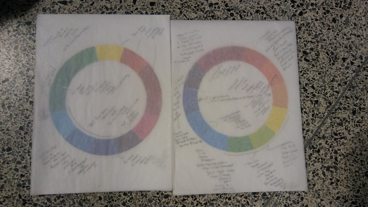
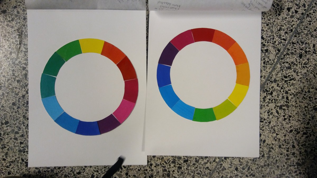
This project was by far the most difficult. Not only was it handed in late but also it was not completely finished. one of the hardest things to do was the mixing of the colors to get a specific color. in the beginning i didn’t even have the paint that i needed to make the colors. so the red, yellow and oranges in both color wheels were made with different paints. When making blue that was the hardest part i felt like it was always too dark and when i tried to make it lighter it would look to watery. in the end though i managed to make blues that were good enough to put in my color wheel. Another thing about the project that i eventually figured out was that the ryb color wheel was not supposed to be as light as i had made it also i think i added more colors then i should’ve. in the end i didn’t really learn much besides mixing i feel like color in general is a very broad topic ill learn over time.

post for broadcast entry #26

honestly i thought this cast would be about colors or something but when i heard it it was the complete opposite as i continued to read after the 2 minutes it became very hostle i stopped hearing it and well yea…

Visual Hierarchy found in subway train stations

In this Tuesday, March 8, 2016 photo, commuters walk past an ad for “The Muslims Are Coming” film at the 23rd Street subway station, in New York. A series of humorous ads promoting the film about Muslims are appearing in subway stations five months after a federal judge ruled the ads should go up. (AP Photo/Mary Altaffer)


This is the visual hierarchy that I found mostly on subway stations on the internet. The first photo was taken by me. Most of the posters I’ve seen have a lot of emphasis on specific images or drawings that give the over all meaning of the poster which I found pretty interesting. Most of the time I’ll see bold letters,and big words next to smaller size words like shown in the active wear poster. overall visual hierarchy is shown everywhere!
links
http://www.dailymail.co.uk/wires/ap/article-3484079/Humorous-Muslim-film-ads-NYC-subway-stations.html
http://clearchanneloutdoor.com/products/commuter-rail/

Rhythm found on http://www.coroflot.com entry #10


I found rhythm a bit difficult to find. i ended up looking more for patterns instead.Although these images were interesting again, I love looking at lot of interior design projects and I found two that I thought had rhythm. Then the pair of converse were something that really caught my eye with the way it was done with the colors and stitches it looked like rhythm.

contrast examples entry #9

when looking at this website i found it a bit difficult to find images that have contrast. maybe i was over thinking it but couldnt really find perfect examples of contrast. Although i managed to find 3 that i believe have contrast. one has to deal with the contrast in shapes while the other deals with contrast in color(light&; dark).then finally one with contrast in size.

« Older posts Newer posts »