COMD1127-D124 Type & Media, SP2019

This is a foundation course in typography with an emphasis on using type for a multiple of industry related applications ranging from print to interactive.

Page 3 of 5

My World of Typography

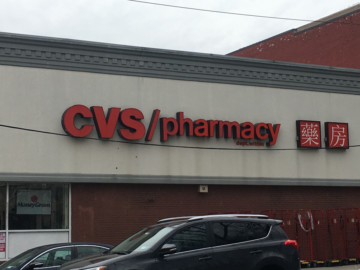
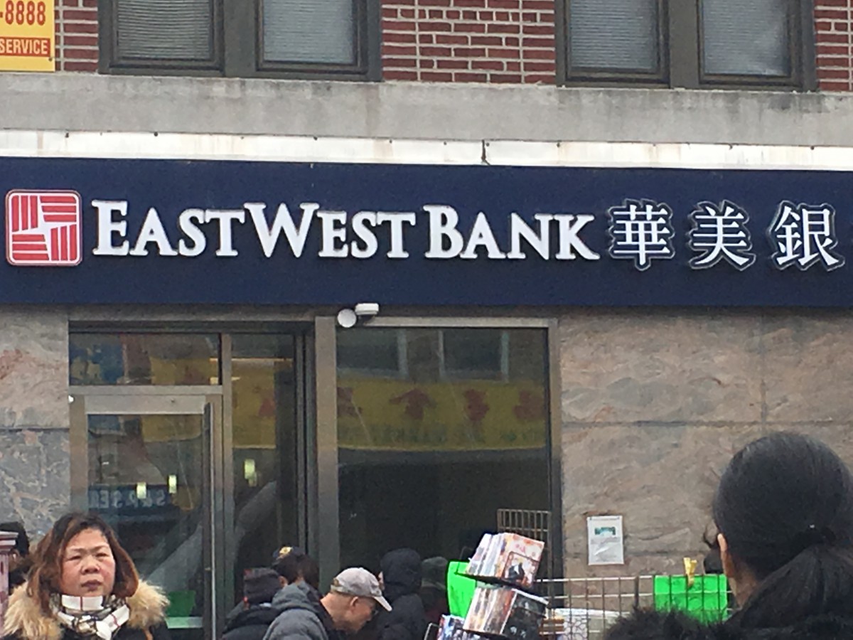
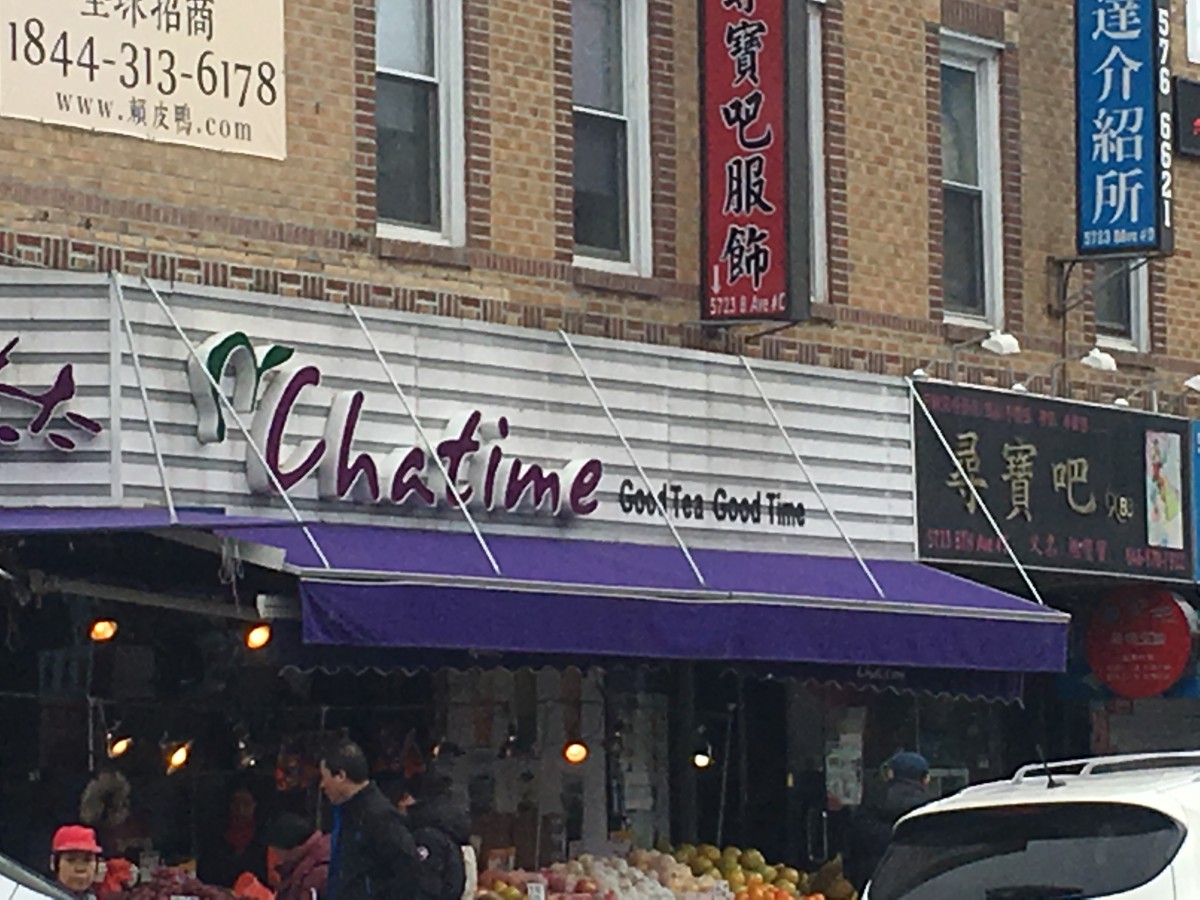
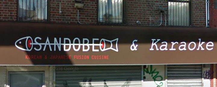
I have been living in my neighborhood for as long as I can remember. Usually when I walk around the area, I never thought about how typography is used to make my neighborhood the way it is. To me the letters on every single banners of the stores or buildings were literally just words that were there to inform me what the building is or what they sell. I never actually stopped to analyze the way each and every individual letter was presented or why this store decided to go with this particular font. Then I was given the assignment to go out and take pictures of how typography was involved in “My World.” I have come to realized that the use of different fonts and colors of the letters gives the word more meaning and characteristic of the building. From using fonts with serifs or san serifs, to using fonts that lean towards hand written calligraphy, it gives the reader an idea of what the company or store wants to portray to the world as them.  Below are some pictures of stores that I’ve took around my neighborhood. I hope these pictures can allow you to see the characteristic of each letter as it did for me.

Through the Streets of Bed-Stuy


The typography of my neighborhood shows that things are constantly changing and I feel that my neighborhood is entering the modern times. These three pictures are proof of that especially the one that says 865 Willoughby, which is a new apartment building that was built a year or two ago. The typography on the building shows that Bed-Stuy is getting a whole new look to it and welcoming new people into our neighborhood. I’m glad to see that Bed-Stuy is changing because once in a while there are things that need to be renovated. That way people can have an easy shift when visiting Bed-Stuy, either to shop here, eat here or live here. I can’t wait to see what else Bed-Stuy is going to add to the neighborhood.

Class 4 Recap – Introduction to Adobe InDesign CC

During class we reviewed letterspacing/tracking and kerning. We also began to explore the working environment of Adobe InDesign.

Areas covered:

  • Creating a new document
  • The InDesign workspace
  • Working with text boxes, fonts, point sizes, leading alignment
  • Leading, measurements, kerning
  • Installing fonts using Font Book software
  • Font Squirrel

We also discussed increments of measurements:

  • type is measured in points (pts)
  • 12 pts = 1 pica
  • 6 picas = 1 inch
  • 72 pts = 1 inch

If you missed the class, or need a review, here is a video that might help you with getting started in InDesign. It is a bit long but pretty thorough in helping your get started:


Homework — Due Wed, 2/15/17

  • Reading Assignment in textbook: pgs 151-173
  • Complete the Letterform worksheets
  • Complete your tracing assignment
  • As you walk through your neighborhood, take 2-3 photos of different typography in your neighborhood—billboards, storefront signage, posters, graffiti, etc. On this website write 1-2 paragraphs in a post describing what these examples of type say about your neighborhood. Do you see more modern or old style typefaces? Be sure to upload the photos (no more than 3).

Class 3 Recap – Kerning, Tracking and Letterspace

The main topic of the discussion was kerning, tracking and letterspace. We also did an introduction to the InDesign workspace. As a review of the Five Families of Type, here’s a link to an added resource. Navigate through the links highlighted in yellow: Designing with Type

Kerning vs Tracking

Do you know the difference between kerning and tracking? You need to make sure you understand.

kerning = adjustment of the space between two letters to improve the appearance. Kerning is more specific than tracking. Kerning becomes more important with large or display type.

tracking = adjustment of the space between letters for the a whole word, sentence, page or document.

Continue reading

Class 2 Recap – The History of Typography

Wed, Feb 1, 2017

Let’s review some of the things we learned during our second session:

Introduction to the Five Families of Type

Old Style – Garamond
Transitional – Baskerville
Modern – Bodoni
Egyptian or Slab Serif – Century Expanded
Sans Serif – Helvetica

You need to become very familiar with these families/categories and the characteristics of each.
Download lecture slides

Continue reading

I’ve switched majors three times…

Hey, my name is G. 

So I guess I’ll start off by saying that my name is Gianna Paola Jimenez. But I really prefer being called ‘G’. It’s simple and easy to remember. I am 19 years old and a few months away from being 20 and I’m not too sure how I feel about it. My major is, of course, Communication Design. That being said, I’ve changed my major three times since I’ve been at City Tech and I think I’ve landed right where I’m supposed to be. Before City Tech, I went to the Art & Design High School in East Midtown, Manhattan. I majored in Photography for a year and then finished off my high school career as an Architecture major (yes, there’s a trend here). I loved photography but I felt like I already knew and understood everything that was being taught to me, so I switched over to architecture because I wanted a challenge. And it was definitely a challenge but I made it through and absolutely loved it, but not enough to major in it in college and that is why I am here now.

Continue reading

The Man, the Artist, the Gamer

It is a pleasure to meet you, my name is Jovannie Charles. I am a 21-year-old artist who’s trying to make his way into the gaming for animation industry. I come from a humble family and have a lot of experience in various things. In my free time I like to draw, play video games, or hang out with my friends. One of my favorite sports is soccer, reason being that I was raised on it by my parents. The type of video game I typically play mostly consist of fighting, RPG, or shooters. In my free time I do listen to music, and my favorite genre would be Hip Hop, rap, pop, and sometimes rock and roll. I look forward to learning and growing in this field during this semester.

My Introduction, Call Me Bill

Hello, my name is BingJi Wu, however, I prefer people call me Bill. First of all, I am glad to join in this course as well, because I always can feel my passion for art never dissipate as the time goes by.

I started painting when I was a kid. Probably this is why I am interested in something that relates to art which is this course. Also, the reason why I chose to major in communication design is because I am inspired by the unmatched combination of specialized curricula for the students. Some of the combinations of these courses include the Bachelor of Fine Arts, Bachelor of Science, and Master of Arts. These are some of the careers that I am interested in. It is also worth noting that the institution has several qualified and experienced professors. These are individuals who can steer my career to greater heights of success. Therefore, I am confident that this is the place that will help me to excel in my passion of majoring in design.

In Fact, I used to be an art student when I was in China, which mean I have some art background I guess. So, I think I will have a lot of fun in this course in this year. Let’s work together, I believe our goal is untouchable if we work hard.

🙂

The Plain, Timid Rookie of Typography

Hello! My name is Amanda and I’m a Communication Design Major here at City Tech. I transferred here back in Fall 2015 after obtaining an associate’s degree at Kingsborough. I have been doing art since high school when we mainly worked with a variety of traditional mediums from charcoal to oil paint.

It wasn’t until college when I started to learn how to work digitally. While I have experience with InDesign, I haven’t really worked with it in a while so I’m a little rusty. Typography is a sub-topic of graphic design I find myself struggling with. I hope by taking this class I can better understand how it works and how to use it in an effective manner.

When I’m not at school or at work, I’m on the computer going through social media, playing video games or improving my drawing skills.

Picture done by Tyra

Completely Original Introduction

Hello my name is David Andrew Perez, but I usually go by Andy. I am a junior now and my major is Communication Design. I love everything that has to do with art from traditional to digital. I love listening to music. It inspires me to do more with my artwork. I’m always spending time with my friends and family, but I really enjoy peace and quiet. Even though I like to keep to myself, I love meeting new people and making more friends. I enjoy playing video games, so much that it’s what I would like to do with my life. I want to be a character designer for video games and shows. I am a huge Spider-Man fan, just wanted to put that out there for no particular reason. I really look forward to gaining a new respect for designing with type because I don’t like it and I want that to change. It is very nice to meet you all and I look forward to working along side you lovely people.

« Older posts Newer posts »