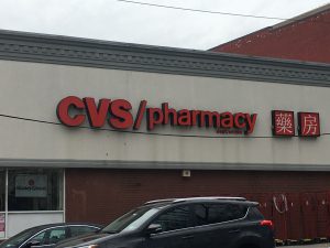
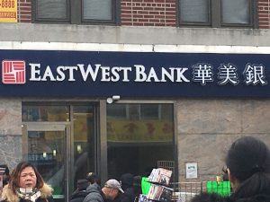
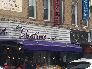
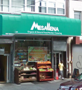
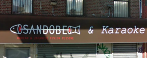
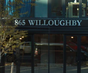
I have been living in my neighborhood for as long as I can remember. Usually when I walk around the area, I never thought about how typography is used to make my neighborhood the way it is. To me the letters on every single banners of the stores or buildings were literally just words that were there to inform me what the building is or what they sell. I never actually stopped to analyze the way each and every individual letter was presented or why this store decided to go with this particular font. Then I was given the assignment to go out and take pictures of how typography was involved in “My World.” I have come to realized that the use of different fonts and colors of the letters gives the word more meaning and characteristic of the building. From using fonts with serifs or san serifs, to using fonts that lean towards hand written calligraphy, it gives the reader an idea of what the company or store wants to portray to the world as them. Below are some pictures of stores that I’ve took around my neighborhood. I hope these pictures can allow you to see the characteristic of each letter as it did for me.
Category: Typography (Page 2 of 2)
The typography of my neighborhood shows that things are constantly changing and I feel that my neighborhood is entering the modern times. These three pictures are proof of that especially the one that says 865 Willoughby, which is a new apartment building that was built a year or two ago. The typography on the building shows that Bed-Stuy is getting a whole new look to it and welcoming new people into our neighborhood. I’m glad to see that Bed-Stuy is changing because once in a while there are things that need to be renovated. That way people can have an easy shift when visiting Bed-Stuy, either to shop here, eat here or live here. I can’t wait to see what else Bed-Stuy is going to add to the neighborhood.


Recent Comments