There seems to be some confusion about what is included in your finished Type Book. Every type book exercise is to be included. The list that was handed out in class was based on the titles on the assignment sheets. Some of those handouts included more than one exercise. Hopefully this list will offer a bit of clarity.
Front Cover
Anatomy
5 Families (5 pages)
Variations (6 pages)
Alignment
Alignment2
Leading (2 pages)
Tracking (2 pages)
Kerning
Type on a Path
Legibility (in color)
Type Color
Hierarchy
Grid (2 pages)
Pattern
Embellished Quote
Logotype
Putting it All Together Poster (a poster design that incorporates everything you have learned about typography. In the fifth column, the Title will be Putting it All Together. You will use columns 1-4 only for your design)
These books will be printed out and bound along the short left edge, where we left space for such details. They should have a clear vinyl front cover and a black vinyl back cover with spiral binding along the left side.
The finished books are to be submitted no later than Monday, April, 4, 2016.
The mid-term exam is scheduled for Monday, March 28th. It will cover all that we’ve learned so far. Please take the time to review your notes, the reading assignments and the updates that have been posted on this website.
You may also want to download this document, Adobe Type Primer, which contains most of the information about typography that we’ve covered.
We took a look at the various formats of text alignments and how text is affected. Here are some the things we noticed:
flush left/ragged right – when using this text alignment, we are given a bit of breathing room, or negative space. This makes the page seem less crowded with text and allows places for the eyes to rest. In our culture, we read from left to right, and setting type flush left gives the reader an exact starting place on each line. The reader isn’t slowed down by trying to find the starting place for the next time.
flush right/ragged left – when using this text alignment, the reader is slowed down because the eye has to find the starting point of each line. Have the left margin set as ragged means each line will begin at a different location. It is ok to use this very small amounts of type such as for captions, but you wouldn’t use this for large bodies of type.
center alignment – not a good choice for large bodies of text. Again, each line of text has a different starting place and this slows down the reading. Poetry and songs often use this alignment.
justified alignment – both sides of the type are justified and line up evenly. Because of this, type is pushed out which can cause excess word spacing, which can cause rivers. In order to fix the word and letter spacing problems, each line may need tracking. Another problem that may arise might be too many hyphenated words. InDesign will try to fit as many words on each line as possible but so justified text can also fit more text on a page.
Homework – Due Wed, 3/2
Type Book – Type Alignment exercise. You can download the pages of instructions here.
Type Book – Type Alignment2. This packet contains the rest of the exercises for alignment, leading, tracking and kerning. Download that file here. Both assignments are due Monday, 3/7.
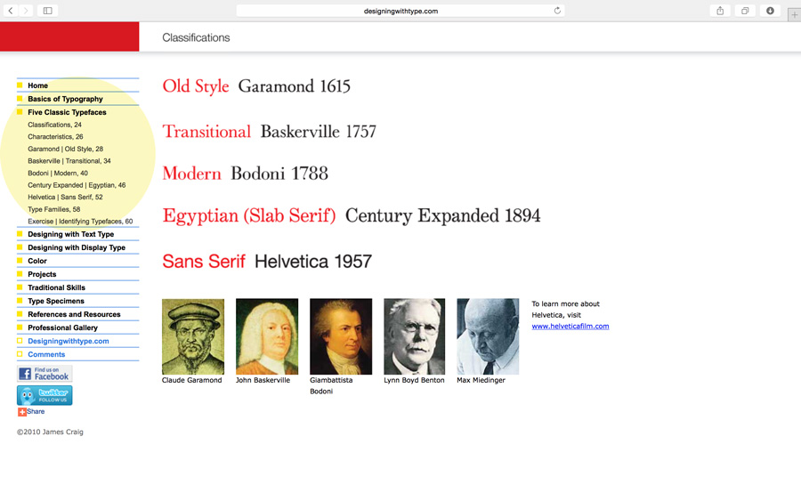
The main topic of the discussion was kerning, tracking and letterspace. But as a review of the Five Families of Type, here’s a link to an added resource. Navigate through the links highlighted in yellow: Designing with Type
Kerning vs Tracking
Do you know the difference between kerning and tracking? You need to make sure you understand.
kerning = adjustment of the space between two letters to improve the appearance. Kerning is more specific than tracking. Kerning becomes more important with large or display type.
tracking = adjustment of the space between letters for the a whole word, sentence, page or document.
Other Terms We Covered
points – unit of measurement in typography: 72 points = 1 inch. All type is measured in points.
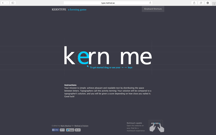
To help with the concept of kerning, we played The Kerning Game online. If you didn’t get a good score during class, give it another try: www.type.method.ac
Video Tutorial – Kerning and Kerning Pairs
We didn’t use this video in class but I think it’s helpful.
Homework Due – 2/10/16
Reading Assignment in textbook: Tracking: Kerning and Letterspace pgs 90-93; Letters, Words, Sentences pgs 52-79. Also, the reading that was due on Monday should be completed. Be prepared to for a quick one question quiz about the reading assignment.
As you go through your daily travels, take one photograph of an example of good letterspacing/kerning; then take one photograph of an example of bad letterspacing/kerning. Upload each of the photos to this website by creating a your own blog post. Write two or three sentences for each photo describing why the type is either good letterspacing or bad letterspacing. The examples you photograph can be of sign, posters, flyers or anything you see with type on it.
Finish the type renderings your began in class if you didn’t get to finish.
Let’s review some of the things we learned during our second session:
The Five Families of Type
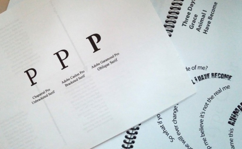
Old Style – Garamond Transitional – Baskerville Modern – Bodoni Egyptian or Slab Serif – Century Expanded Sans Serif – Helvetica Download class notes
Typographical Anatomy
This document was handed out in class, but if you need a new copy, you may download from here. You should study this sheet and refer to it often throughout the course.
During class we reviewed some of the parts of letterforms. Here are a few terms introduced during class. Make sure you know these and begin using them in your typography references:
points – unit of measurement in typography: 72 points = 1 inch. All type is measured in points.
leading – refers to the linespace between the lines of type. The term originated in the days of metal type. During hand-typesetting, thin strips of lead were inserted into the lines of type to increase the distance.
sans serif – a typeface that does not have serifs.
font – one weight, width or style of a typeface.
typeface – the letters, numbers and symbols that make up a design of type. A typeface is part of a type family of coordinated designs. For example, Helvetica Bold is the typeface and is a part of the Helvetica family of type (Helvetica is the type family, Helvetica Bold is the typeface).
type family – the full collection of typefaces that were designed together and intended to be used together. For example, Garamond font family consists of roman, italics, semi bold, and bold weights. Combined together, these make up the Garamond type family.
Homework – Due Monday 2/8/16
Complete the Letterform Drawings for next Monday. Read the notes on each page and be neat in your presentation.
Reading Assignment in textbook: Basics pgs 1-15 & Development pgs 16-50 (If you haven’t been able to get your book yet, Derek posted a link to a PDF of the book which can be found here.
Please bring your tracing pads and pens and other materials for class.
Here are some videos to help with this lesson:
Type Anatomy and Terminology
Short Letterpress Documentary
After watching the two videos, share your thoughts on the evolution of typography in the comments below.
The topic of our first class of the semester was letterform. This was a brief history of the definition of letterform and the evolution to our current alphabet. In typography, epigraphy, paleography, calligraphy and even graffiti, letterform refers to the shape and design of individual characters—the way the characters are drawn.
A few words we learned:
typography — the arrangement of text, letters, characters to make words visible; the art of arranging type; the design and use of letterforms/letter shapes; designed with metal letterforms or computer.
epigraphy — the study of letterforms carved in stone or other permanent material.
paleography — the study of writing in ancient and medieval manuscripts.
calligraphy — the art of decorative writing, usually with pen and ink, sometimes a brush may be used.
serif — the line attached to the end of a stroke in a letter or symbol. They look a bit like feet.
You can download a copy of the slide presentation here.