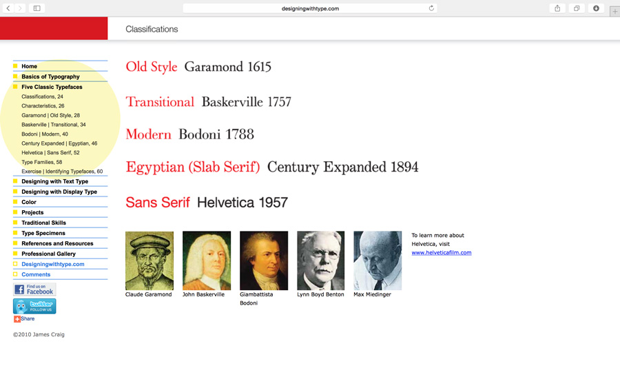
The main topic of the discussion was kerning, tracking and letterspace. But as a review of the Five Families of Type, here’s a link to an added resource. Navigate through the links highlighted in yellow: Designing with Type
Kerning vs Tracking
Do you know the difference between kerning and tracking? You need to make sure you understand.
kerning = adjustment of the space between two letters to improve the appearance. Kerning is more specific than tracking. Kerning becomes more important with large or display type.
tracking = adjustment of the space between letters for the a whole word, sentence, page or document.
Other Terms We Covered
- points – unit of measurement in typography: 72 points = 1 inch. All type is measured in points.
- pica – typographic unit of measurement: 12 points = 1 pica; 6 picas = 1 inch; 72 points = 1 inch.
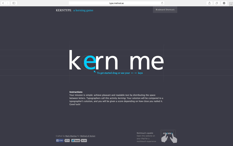
To help with the concept of kerning, we played The Kerning Game online. If you didn’t get a good score during class, give it another try: www.type.method.ac
Video Tutorial – Kerning and Kerning Pairs
We didn’t use this video in class but I think it’s helpful.
Homework Due – 2/10/16
- Reading Assignment in textbook: Tracking: Kerning and Letterspace pgs 90-93;
Letters, Words, Sentences pgs 52-79. Also, the reading that was due on Monday should be completed. Be prepared to for a quick one question quiz about the reading assignment. - As you go through your daily travels, take one photograph of an example of good letterspacing/kerning; then take one photograph of an example of bad letterspacing/kerning. Upload each of the photos to this website by creating a your own blog post. Write two or three sentences for each photo describing why the type is either good letterspacing or bad letterspacing. The examples you photograph can be of sign, posters, flyers or anything you see with type on it.
- Finish the type renderings your began in class if you didn’t get to finish.

