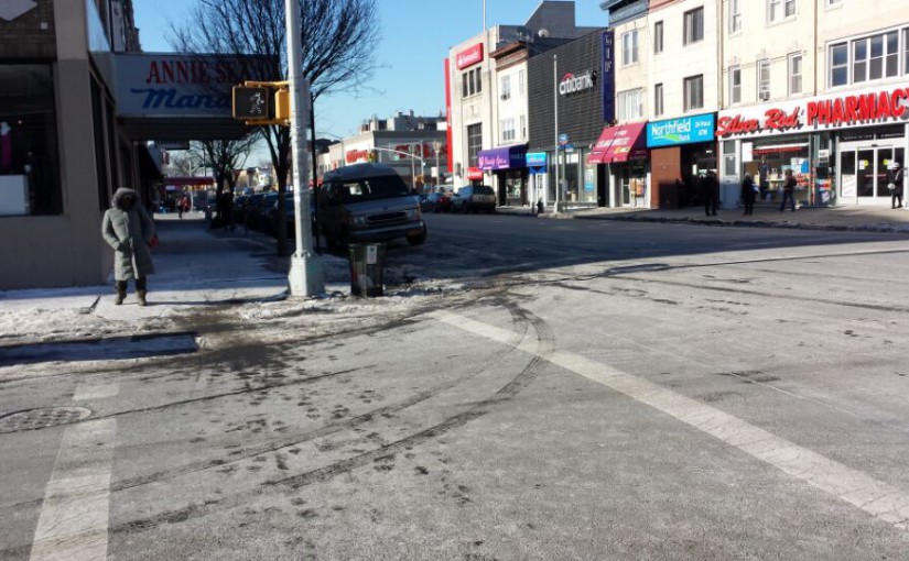
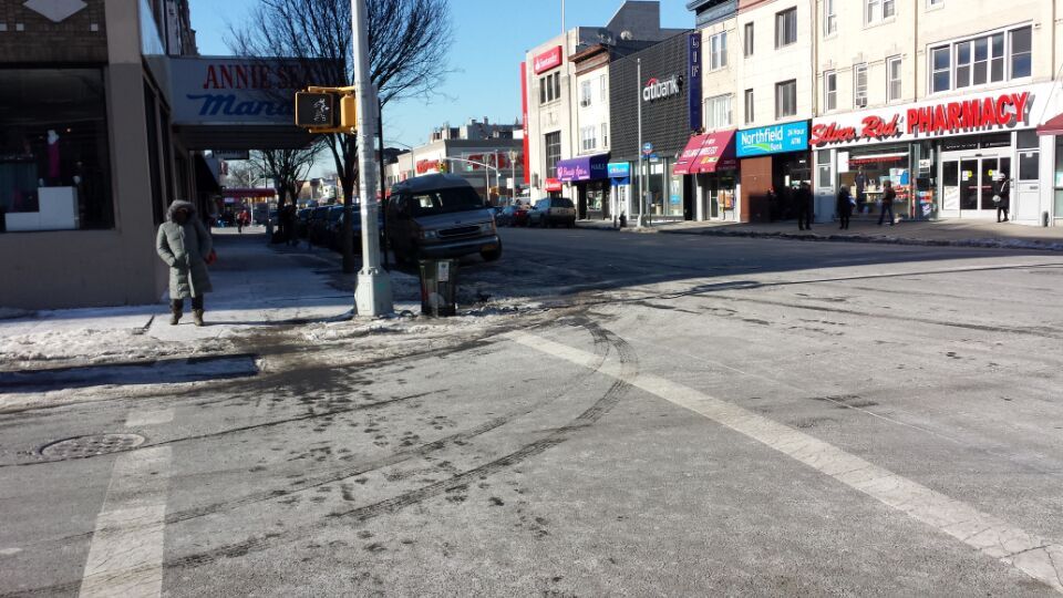
The pharmach at the right side uses two different style letters on the billboard, because of it uses different letters on the billboard so the kerning between the letters also differents.

In my opinion, the arrangement on this poster is very well. The kerning of the letters are very neatly and clearly.

