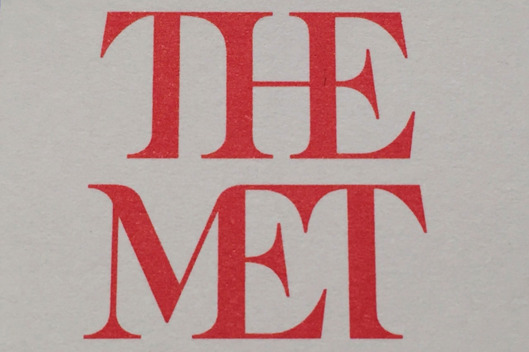
It seems the Metropolitan Museum of Art is about to introduce a new logo, but it isn’t getting rave reviews. In the article, Why Is the Metropolitan Museum of Art’s Brand New Logo Already So Unpopular? (which appears online at artnet.com) a critic is quoted as saying:
“the whole ensemble looks like a red double-decker bus that has stopped short, shoving the passengers into each other’s backs.”
Read the article and let me know what you think. Is this a successful redesign or a failure? Why?


I strongly disagree with the change in the Metropolitan Museum of Art’s for several reasons. One reason being that because the logo created has been present since 1971, it shows how far they have come since then. Second reason is I believe it really gives it an artist feel as it brings the a certain typeface layout into play. Also what is the significance of making it red? Third reason is it is making it look like the logo is trying to hard to merge and connect into the other letters. I don’t approve with this change at all.
The old logo was much more pleasing for my eyes, it is more creative and it is very unique in its own way. The new logo it’s very distracting for my eyes and it feels like its dragging my eyes everywhere which i do not like personally, that red color is vibrating. Maybe if the letters were not glued together like that then i would say that it is pretty good .
I got mixed feelings about this logo. I like the font. The color and texture are also very beautiful and pleasant to look at but the kerning is very poor. It doesn’t quite goes with the font and makes the font look weird.