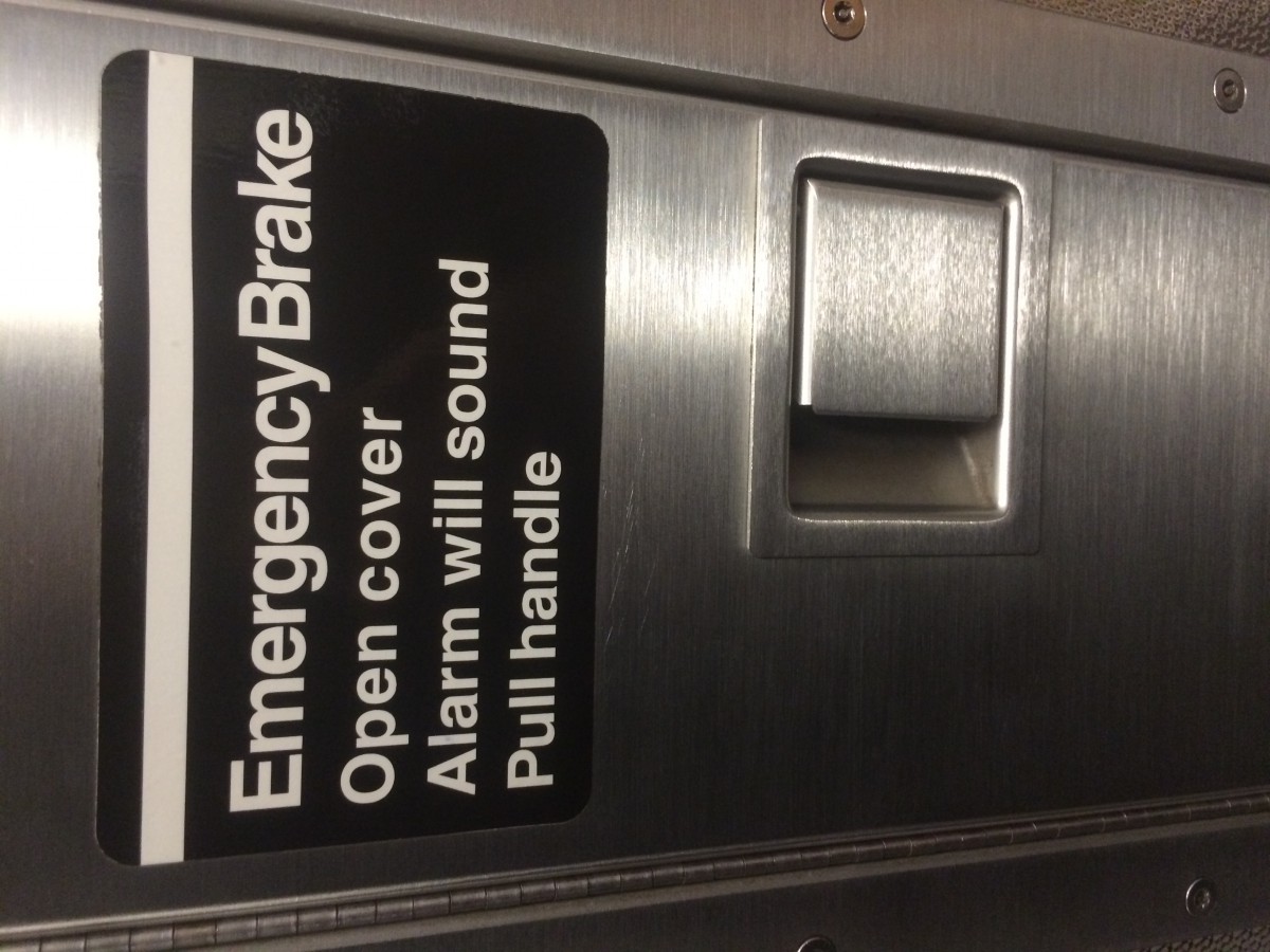
I seen this sign while in the train. It does not show good letter spacing. In the word Brake, the letter “e” is very close to the letter “k”. Also there is very little space betweeen the words Emergency and Break compared to the spacing between the words bellow it.
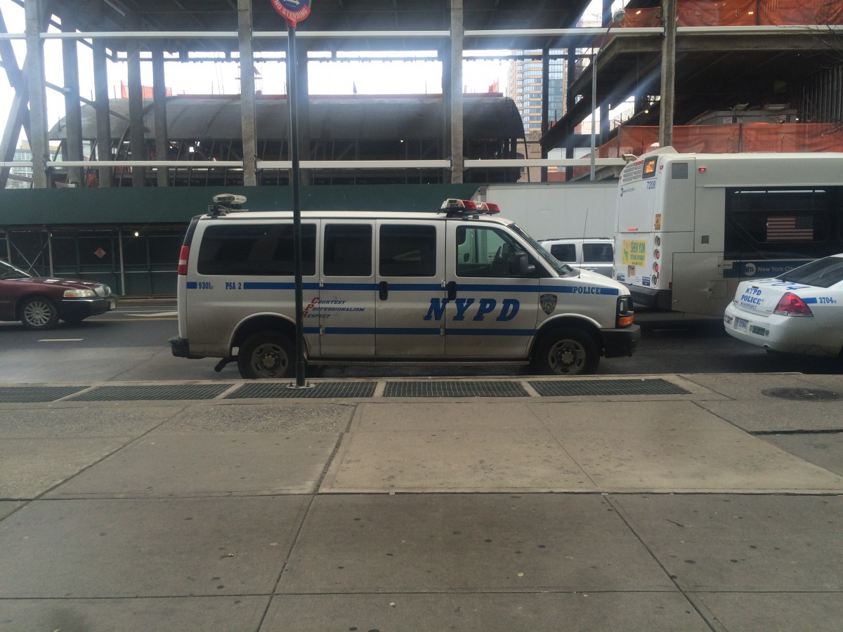
The NYPD car is an example of good letter spacing. If u look at where it says NYPD, the spacing between the letters is perfect. The letters are all evenly apart from each other.


I definitely agree with your first comment above – the letterspacing throughout the words “emergency brake” are very compressed, especially the ‘k’ and the ‘e’.
I definitely agree with your first comment above – the letterspacing throughout the words “emergency brake” are very compressed, especially the ‘k’ and the ‘e’.