Websites with beautiful designs

http://gentlemen-barberclubs.de/

Even though this website is a German website I love the way everything is set up. The typography and the choice of colors are amazing. The pictures speaks to the audience. Nothing it over crowded. It’s not basic like other website. This company decided to take the risk of trying something new and it’s working.

http://jh-behne.de/

i simply love this website. Everything is working together. They have little animations on their website which looks very cool. The creator of the website is a 27-years-old Designer/Animator from Hamburg, Germany. The work looks very sophisticated and simple. Even though the website has very little information you would still want to keep looking at it.

http://12musketeers.com/

I picked this website because Didot is one of my favorite font. I love the way everything is set. The background pictures and the articles matches with each other. Everything is very organized.
3 Good Websites for Fonts!

Dafont (dafont.com)

Dafont.com, even though it looks shady or very untrusted, it actually has a variety of fonts that you can choose from. They show you fonts that are created by different artists and these fonts are all fonts for fun, meaning if you are going to need a font for some sort of theme that is not really that serious, this is it, this is the website you are looking for. My favorite font from the website is Zenzai Itacha.

/r/Typography (reddit.com/r/typography)

Reddit for Typography exists! Reddit is known very well because it is a blog kind of website where there is Reddit for everything, literally everything. In this Reddit I see people posting their own created fonts, you can also look for guides and videos related to typography, and people can help you by giving you ideas on the font, corrections, and even help you on your designs on some sort of project.

Psych & Psych (psychnpsych.com)

This website is really eye catching, it is inspiring for me. I really like how typography is used to give information and adding those little gif images there makes it more interesting. Since I like things related to psychology this makes it really interesting for me, typography plus psychology makes a pretty good combination apparently. This website although it has a lot of design, it is not focused on design elements but on psychology and mental health.

Type Book Assembly

There seems to be some confusion about what is included in your finished Type Book. Every type book exercise is to be included. The list that was handed out in class was based on the titles on the assignment sheets. Some of those handouts included more than one exercise. Hopefully this list will offer a bit of clarity.

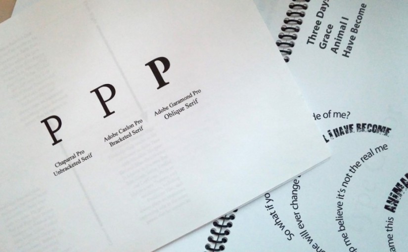
  • Front Cover
  • Anatomy
  • 5 Families (5 pages)
  • Variations (6 pages)
  • Alignment
  • Alignment2
  • Leading (2 pages)
  • Tracking (2 pages)
  • Kerning
  • Type on a Path
  • Legibility (in color)
  • Type Color
  • Hierarchy
  • Grid (2 pages)
  • Pattern
  • Embellished Quote
  • Logotype
  • Putting it All Together Poster (a poster design that incorporates everything you have learned about typography. In the fifth column, the Title will be Putting it All Together. You will use columns 1-4 only for your design)

These books will be printed out and bound along the short left edge, where we left space for such details. They should have a clear vinyl front cover and a black vinyl back cover with spiral binding along the left side.

The finished books are to be submitted no later than Monday, April, 4, 2016. 

Mid-Term Exam

The mid-term exam is scheduled for Monday, March 28th. It will cover all that we’ve learned so far. Please take the time to review your notes, the reading assignments and the updates that have been posted on this website.

You may also want to download this document, Adobe Type Primer, which contains most of the information about typography that we’ve covered.

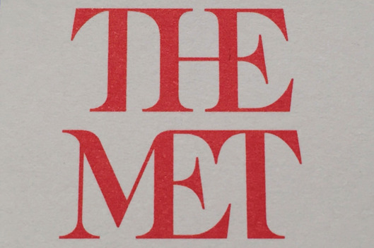
Is the Metropolitan Museum of Art’s New Logo a Win or a Fail?

It seems the Metropolitan Museum of Art is about to introduce a new logo, but it isn’t getting rave reviews. In the article,  Why Is the Metropolitan Museum of Art’s Brand New Logo Already So Unpopular? (which appears online at artnet.com) a critic is quoted as saying:

“the whole ensemble looks like a red double-decker bus that has stopped short, shoving the passengers into each other’s backs.”

Read the article and let me know what you think. Is this a successful redesign or a failure? Why?