Most of the time during was spent learning to use the PEN TOOL in InDesign and creating type on a path. After an in-class demo, the class had an opportunity to experiment with the type on a path. The PEN TOOL in InDesign is very similar to the one in Photoshop and Illustrator. Once you learn to control the curve, it is easier to master to tool. The more you use the tool, the better you get with it. For help, here are a few videos:
How to Use the Pen Tool in Adobe Illustrator, Photoshop and InDesign
Correct Way to Format Type on a Path with InDesign
Homework – Due Monday, 3/7
Complete the Type Book – Alignment & Alignment2 assignments.
Textbook Reading – Type and Color, pgs 80-87. Be prepared to discuss.
Online Reading – Basic Rules of Good Typography. This article will help with to reinforce the concepts we’ve discussed over the last few weeks.
We took a look at the various formats of text alignments and how text is affected. Here are some the things we noticed:
flush left/ragged right – when using this text alignment, we are given a bit of breathing room, or negative space. This makes the page seem less crowded with text and allows places for the eyes to rest. In our culture, we read from left to right, and setting type flush left gives the reader an exact starting place on each line. The reader isn’t slowed down by trying to find the starting place for the next time.
flush right/ragged left – when using this text alignment, the reader is slowed down because the eye has to find the starting point of each line. Have the left margin set as ragged means each line will begin at a different location. It is ok to use this very small amounts of type such as for captions, but you wouldn’t use this for large bodies of type.
center alignment – not a good choice for large bodies of text. Again, each line of text has a different starting place and this slows down the reading. Poetry and songs often use this alignment.
justified alignment – both sides of the type are justified and line up evenly. Because of this, type is pushed out which can cause excess word spacing, which can cause rivers. In order to fix the word and letter spacing problems, each line may need tracking. Another problem that may arise might be too many hyphenated words. InDesign will try to fit as many words on each line as possible but so justified text can also fit more text on a page.
Homework – Due Wed, 3/2
Type Book – Type Alignment exercise. You can download the pages of instructions here.
Type Book – Type Alignment2. This packet contains the rest of the exercises for alignment, leading, tracking and kerning. Download that file here. Both assignments are due Monday, 3/7.
This class was dedicated to the variations in type styles that are available. We discussed the differences in type — width, weight, posture, stress, serifs, and contrast. We also did several classes to help the class understand how to use the type variations to create emphasis and expression.
Today’s class we went through the process of creating a multi-page document and using master pages. If you missed today’s class, use the following videos for help:
How to Format Master Pages
How to Override Master Page Items
Vocabulary Terms:
drop caps – capital letter at the beginning of a paragraph that drops down at least 2 or more lines of text.
master pages – when you have a multipage document, a master page is a non printing page used in InDesign that serves as a template for the rest of the pages. Master pages can contain text and graphic elements, such as photos, headers, footers or page numbers, etc.
dummy text – placeholder text that is use in place of the real text.
Homework Due Wednesday 2/24
Type Book – Complete the 5 Families of Type exercise. You can download the instructions here.
After a few exercises to review letterspacing, tracking and kerning, we began to explore the working environment of Adobe InDesign.
Areas covered:
Creating a new document
The InDesign workspace
Working with text boxes, fonts, point sizes, leading alignment
Leading, measurements, kerning
Forms of text alignment:
flush right (aka flush right/ragged left) = the text is aligned on the right edge and the left edge is ragged
flush left (aka flush left/ragged right) = the text is aligned on the left edge and the right edge is ragged
center = lines of text with the midpoints aligned
justified = the right and left edges are aligned
If you missed the class, here is a video that might help you out. It is a bit long but complete in helping your get started:
Homework — Due Wed, 2/17/16
Reading Assignment in textbook:Grid System pgs 177 -221 (be prepared to answer one quiz question on this topic)
Typography in your neighborhood – As you travel through your neighborhood, look and the typography and take photos of the different type you see. Write 2 paragraphs explaining with the typography in your neighborhood reflects about your neighborhood. Use Google Docs and add the photos to the document. Use no more than 4 images. The typography might be seen on signs, storefronts, buildings, etc.
Spend a some time reviewing the articles posted by your classmates and leave comments.
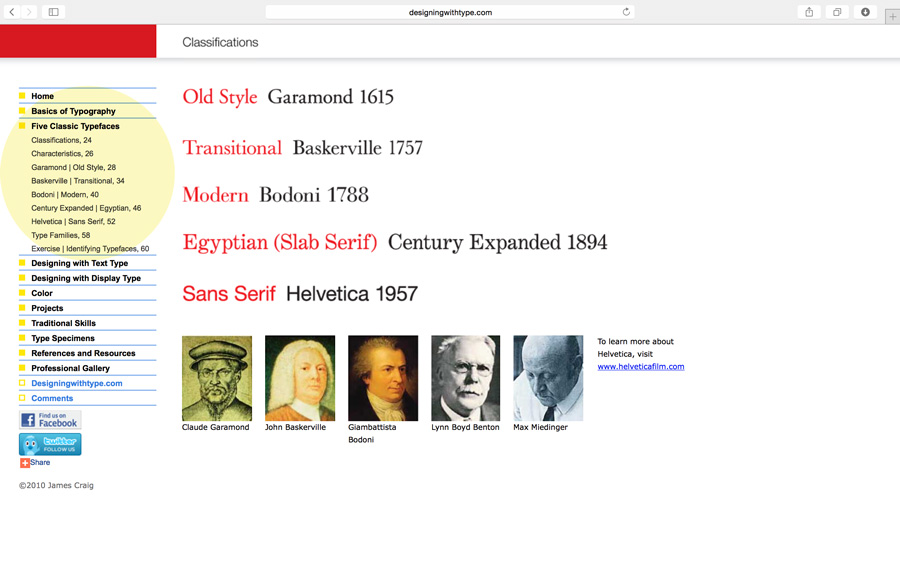
The main topic of the discussion was kerning, tracking and letterspace. But as a review of the Five Families of Type, here’s a link to an added resource. Navigate through the links highlighted in yellow: Designing with Type
Kerning vs Tracking
Do you know the difference between kerning and tracking? You need to make sure you understand.
kerning = adjustment of the space between two letters to improve the appearance. Kerning is more specific than tracking. Kerning becomes more important with large or display type.
tracking = adjustment of the space between letters for the a whole word, sentence, page or document.
Other Terms We Covered
points – unit of measurement in typography: 72 points = 1 inch. All type is measured in points.
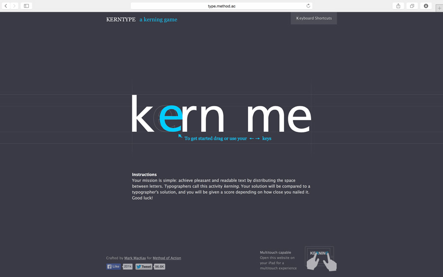
To help with the concept of kerning, we played The Kerning Game online. If you didn’t get a good score during class, give it another try: www.type.method.ac
Video Tutorial – Kerning and Kerning Pairs
We didn’t use this video in class but I think it’s helpful.
Homework Due – 2/10/16
Reading Assignment in textbook: Tracking: Kerning and Letterspace pgs 90-93; Letters, Words, Sentences pgs 52-79. Also, the reading that was due on Monday should be completed. Be prepared to for a quick one question quiz about the reading assignment.
As you go through your daily travels, take one photograph of an example of good letterspacing/kerning; then take one photograph of an example of bad letterspacing/kerning. Upload each of the photos to this website by creating a your own blog post. Write two or three sentences for each photo describing why the type is either good letterspacing or bad letterspacing. The examples you photograph can be of sign, posters, flyers or anything you see with type on it.
Finish the type renderings your began in class if you didn’t get to finish.
Let’s review some of the things we learned during our second session:
The Five Families of Type
Old Style – Garamond Transitional – Baskerville Modern – Bodoni Egyptian or Slab Serif – Century Expanded Sans Serif – Helvetica Download class notes
Typographical Anatomy
This document was handed out in class, but if you need a new copy, you may download from here. You should study this sheet and refer to it often throughout the course.
During class we reviewed some of the parts of letterforms. Here are a few terms introduced during class. Make sure you know these and begin using them in your typography references:
points – unit of measurement in typography: 72 points = 1 inch. All type is measured in points.
leading – refers to the linespace between the lines of type. The term originated in the days of metal type. During hand-typesetting, thin strips of lead were inserted into the lines of type to increase the distance.
sans serif – a typeface that does not have serifs.
font – one weight, width or style of a typeface.
typeface – the letters, numbers and symbols that make up a design of type. A typeface is part of a type family of coordinated designs. For example, Helvetica Bold is the typeface and is a part of the Helvetica family of type (Helvetica is the type family, Helvetica Bold is the typeface).
type family – the full collection of typefaces that were designed together and intended to be used together. For example, Garamond font family consists of roman, italics, semi bold, and bold weights. Combined together, these make up the Garamond type family.
Homework – Due Monday 2/8/16
Complete the Letterform Drawings for next Monday. Read the notes on each page and be neat in your presentation.
Reading Assignment in textbook: Basics pgs 1-15 & Development pgs 16-50 (If you haven’t been able to get your book yet, Derek posted a link to a PDF of the book which can be found here.
Please bring your tracing pads and pens and other materials for class.
Here are some videos to help with this lesson:
Type Anatomy and Terminology
Short Letterpress Documentary
After watching the two videos, share your thoughts on the evolution of typography in the comments below.
The topic of our first class of the semester was letterform. This was a brief history of the definition of letterform and the evolution to our current alphabet. In typography, epigraphy, paleography, calligraphy and even graffiti, letterform refers to the shape and design of individual characters—the way the characters are drawn.
A few words we learned:
typography — the arrangement of text, letters, characters to make words visible; the art of arranging type; the design and use of letterforms/letter shapes; designed with metal letterforms or computer.
epigraphy — the study of letterforms carved in stone or other permanent material.
paleography — the study of writing in ancient and medieval manuscripts.
calligraphy — the art of decorative writing, usually with pen and ink, sometimes a brush may be used.
serif — the line attached to the end of a stroke in a letter or symbol. They look a bit like feet.
You can download a copy of the slide presentation here.