Good and bad example of letterspace and kerning

IMG_5228

In my eyes this is a good example of typography because everything in the page is very organized. The first thing you see on the page is the word BRISTOL. This is the focus or the main character. There’s visual background, foreground and mid-ground created in the page by using the same font but different size.


IMG_5227

In my eyes this is a bad example of typography because overall it’s look very messy. The block-type letters barely has any space between them. The kerning could be much better.

good & bad letterspacing/kerning

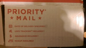
The photo below is an example of “good” letterspacing/kerning: “Priority Mail.” The type below provides an appropriate amount of spacing within each letter. The letters are not touching or overlapping eachother. The adjustment of space between the letters are thoroughly balance and share proper amount of spacing below/above the two words.

IMAG1643

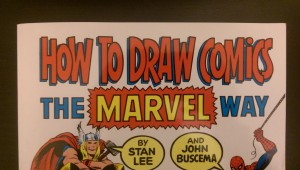
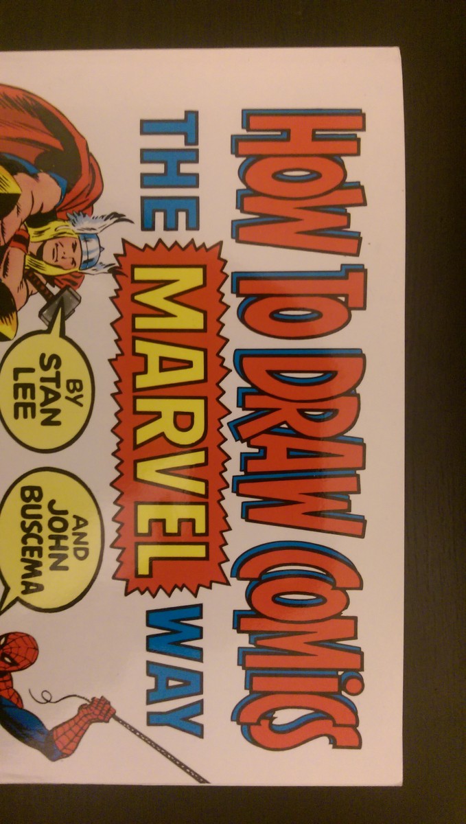
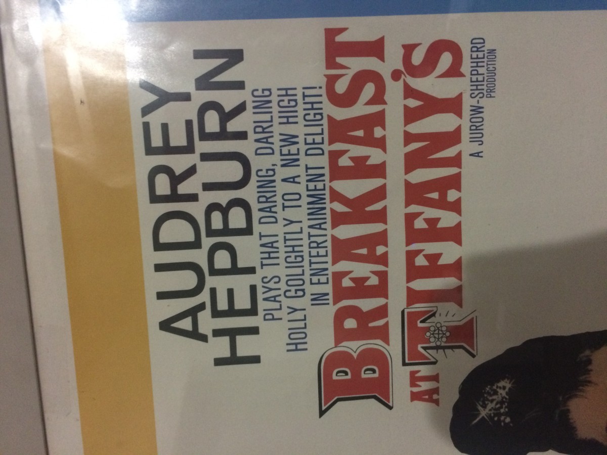
The photo below is an example of “bad” letterspacing/kerning: “How to Draw Comics.” The type below provides an inappropriate amount of spacing within each letter. The letters are touching and overlapping each other. Although the style of the typography seems appropriate for the material in this book, the letters are extremely tight and compressed and could use letterspacing. The words would be completely illegible and lost without the dark black stroke and blue shadows.

IMAG1641


Good/Bad LetterSpacing_hw_Dhruvp

image


I seen this sign while in the train. It does not show good letter spacing. In the word Brake, the letter “e” is very close to the letter “k”. Also there is very little space betweeen the words Emergency and Break compared to the spacing between the words bellow it.

image

The NYPD car is an example of good letter spacing. If u look at where it says NYPD, the spacing between the letters is perfect. The letters are all evenly apart from each other.

Good Letter Spacing Vs. Poor Letter Spacing

20160209_160917

  1. This Bicycle shop sign is an example of poor letter spacing. The name of the shop, Tong Lida, is spaced so far apart that it feels disjointed. This is made more clear as the other text on the sign isn’t spaced very far apart. This juxtaposition of the text only makes the Name of the shop look worse.

photo16

2. This Oscar insurance ad is an example of good letter spacing. The text, “The doctor will see you now,” is evenly kerned together to make the text stand out. This makes the advertisement flow as your eye is drawn to read the text and then look at the picture followed by the name of the company and info on the bottom. The letter spacing makes this ad more effective in catching your attention.

Good vs Bad Kerning/letterspacing

As I crossed the street I came upon a message on a piece of wood with bad kerning. The reason it is considered bad kerning is because the P and O in the word ‘POST’ seem to be right on top of each other, as well as the S and T are fusing together. Yet the O and S are not connecting in any way. Also the I and L in ‘BILLS’ have space to spare but the B is right on top of the I.

good


In the city there is a Dunkin Donuts shop with a sign outside listing the flavors of coolattas. The kerning in this picture is sharp as well as the letter spacing between the individual flavors. Therefore making this a good example of kerning/letters pacing

good kerningletterspacing

Kerning Examples

QQ图片20150225070724

The pharmach at the right side uses two different style letters on the billboard, because of it uses different letters on the billboard so the kerning between the letters also differents.

powerball-winning-numbers

In my opinion, the arrangement on this poster is very well. The kerning of the letters are very neatly and clearly.

Good /Bad Letter spacing !- Homework

The following image below is an example of bad letter spacing because if you look closely the first two letter the O,P are much closer together than the P and T. And also at the end the Y is a tad bit further than the R.

BAD LETTERSPACING

The following image below is a great example of good letter spacing because the all of the letter are evenly spaced even though the letters are tightly together. And the spacing between the actual word are evenly spaced as well.

GOOD LETTERSPACING