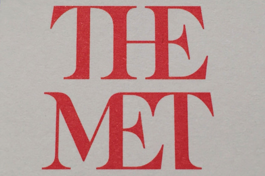
It seems the Metropolitan Museum of Art is about to introduce a new logo, but it isn’t getting rave reviews. In the article, Why Is the Metropolitan Museum of Art’s Brand New Logo Already So Unpopular? (which appears online at artnet.com) a critic is quoted as saying:
“the whole ensemble looks like a red double-decker bus that has stopped short, shoving the passengers into each other’s backs.”
Read the article and let me know what you think. Is this a successful redesign or a failure? Why?


