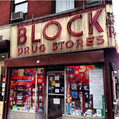
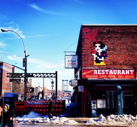
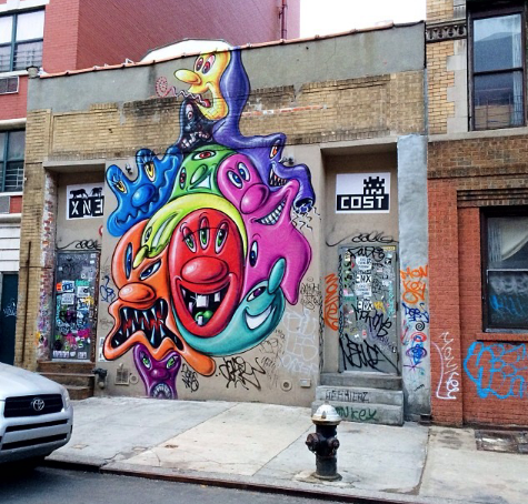
Living in The Lower East Side of Manhattan I see different forms of typography daily. My neighborhood is very diverse. In one end you have the NYCHA buildings where most advertisings are done by the local artist named Chico. Spray painted walls and guerilla art is the cheapest form of getting known around the area. In the other side of town where the more upscale businesses are located the advertising is more “lowkey” or simple. The neighborhood went from being very dangerous grounds to an artsy fartsy hipster welcoming town in a matter of years. My neighborhood definitely is a mix of old school meets new school. Most of the businesses sell to neighborhood people who have been living there for years and are more comfortable seeing simple, modest advertising then modern types and images.


Seems like the neighborhood has a good representation of the old vs the new–the transformation of the times.