We will be using InDesign a bit more during each class. If you need a bit of a refresher on starting a new document or, there is a link to a video tutorial in my last update. (see here).
Topics Covered
How to use kerning and tracking
Setting up new documents
Using the type blocks to understand leading
Setting up guides and columns to create a grid
Using the ruler horizontal and vertical rulers in InDesign
Creating strokes
Filling color
Homework
Take the best and worst prints of stacked words and write a paragraph (about 5-6 sentences) describing why one works well and why the other doesn’t well in terms of leading. For this exercise, you were to concentrate on getting good leading with your 2 stacked words. On Friday the 14th you will have one last time to complete this printing if you need to try it again.
We’re moving right along and I thing everyone is getting the hang of relief printing. We will probably do a few more exercises to give everyone a chance to get the results they want.
Relief Printing
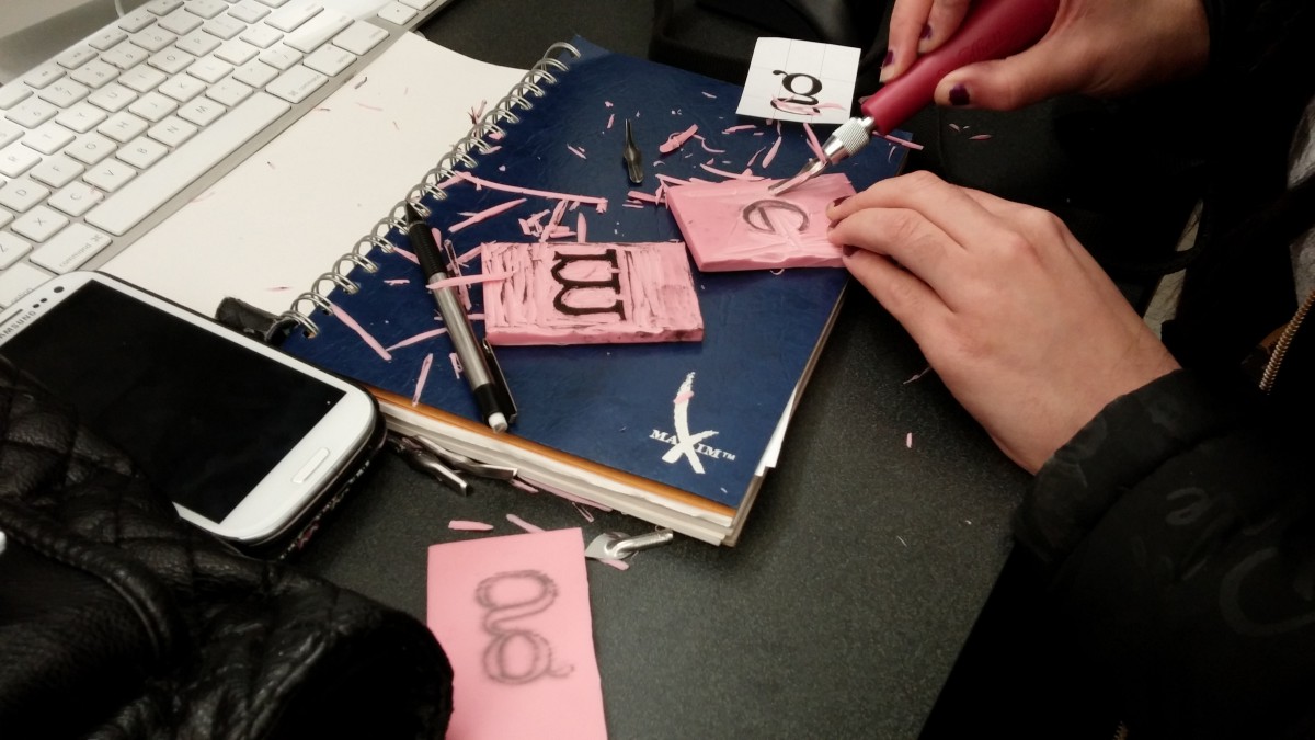
During the last class we were to create one word with the type blocks. The next step is to create stacked sets of word so that you can experiment with linespace/leading. We will finish this on Monday.
Topics Covered
Creating new documents in InDesign
The difference between kerning and tracking
Kerning letter pairs in InDesign
Tracking letters in InDesign
Homework
Creating a Post in OpenLab —Your first homework assignment was to take 20 photos of type and lettering in your neighborhood and then write a one page paper describing what the type revealed about your neighborhood. With this assignment, select 4 -5 of those photos and create your own blog post. You should cut and paste the text from the paper that you wrote. If you don’t recall what I showed you in class, you can use this video to help you.
Finish carving your letter if you haven’t finished in class already.
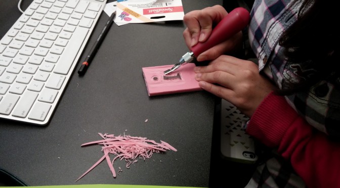
The main project for the class is the relief printing from the letter blocks made in class. One of the goals of this exercise is to help students understand the bounding box, it’s implications in typography and how it affects kerning. Everyone carves at least one letter. Students are encouraged to swap letters to make words. The letters that are carved should be kept to use again over the next few weeks.
Journal: Take your best print of a single work, draw in and neatly label at least 10 parts of the type anatomy. Use the handout from last week as a reference. This item will be added to your Journal that has to be submitted at the end of the semester.
Complete the reading assignment from the last class, The History of Type and be prepared for class discussion.
There are examples of these in the reading assignment listed for homework.
Typographical Anatomy
This document was handed out in class, but if you need a new copy, you may download from here. You should study this sheet and refer to it often throughout the course.
During class we reviewed some of the parts of letterforms. Here are a few terms introduced during class:
tracking – sometimes referred to as letterspacing, it is controlling the space between characters in a block of text.
kerning – the adjustment of letterspace between particular pairs of letter combinations; fitting pairs of letters closer together for a better look.
points – unit of measurement in typography: 72 points = 1 inch. All type is measured in points.
serif – the small finishing strokes that are added to the arms, stems and tails of characters. Serifs can improve the readability by leading the eye along the line of type.
sans serif – a typeface that does not have serifs.
font – one weight, width or style of a typeface.
typeface – the letters, numbers and symbols that make up a design of type. A typeface is part of a type family of coordinated designs. For example, Helvetica Bold is the typeface and is a part of the Helvetica family of type (Helvetica is the type family, Helvetica Bold is the typeface).
type family – the full collection of typefaces that were designed together and intended to be used together. For example, Garamond font family consists of roman, italics, semi bold, and bold weights. Combined together, these make up the Garamond type family.
Videos
The following video serves as a visual aid to the reading assignment.
In class we will be doing a bit of relief printing as we create our own letters. This video on the linocut process will give you an idea of what relief printing is. Be sure to refer to your class handout for the process we are using.
Homework Assignment
Read the PDF document, The History of Typography, which can be downloaded from Dropbox. Be prepared for a discussion for the next class.
Complete the letterform drawing worksheets that were handed out in class. Be sure to read the instructions for each section.
The purpose of this course is to introduce the student to typography, it’s principals, terminology and it’s relationship to the world of graphic design.
During the first class we discussed the history of the letterform and the evolution of the alphabet. You may download the slides from that presentation here.
If you need to replace your syllabus for the semester, you may download a new one at any time from here.
In Class Exercise
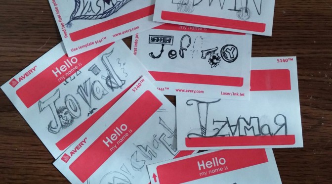
As an exercise in using type as a way visualizing words, students were asked to pair up and interview each other. From the information they learned about their classmate, they created a biographical name tag. The name should be lettered in such a way that it served as a visual description of the person interviewed.
A few of the name tags done in class.
Homework Assignment
Take at least 20 photos of typography or lettering in your neighbor.
Write a one page paper (typed and double-spaced) on what that typography tells you about your neighborhood, and add it to your Journal.