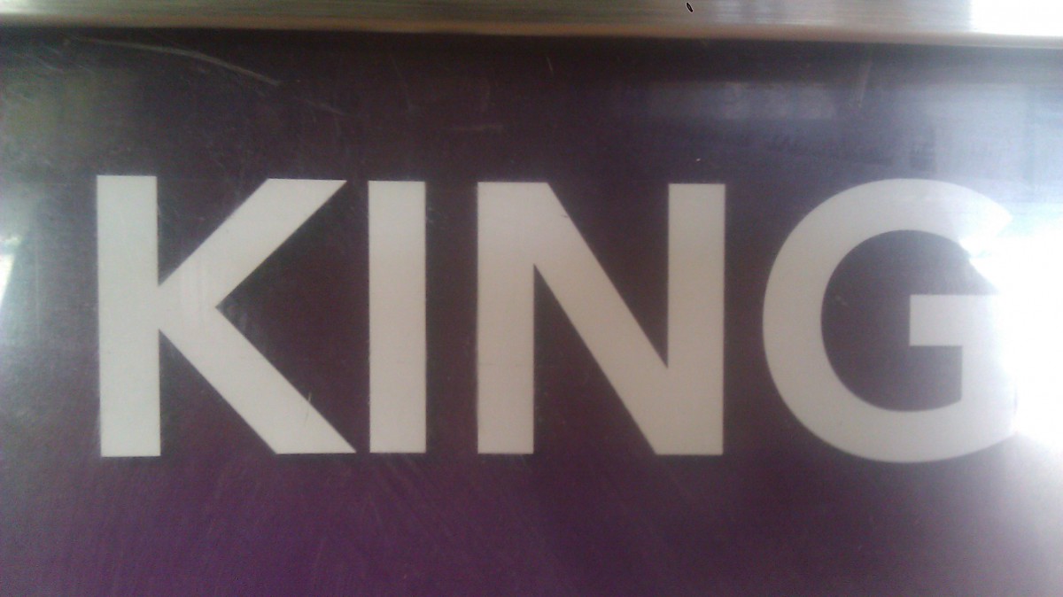


Nice bold san serif font.

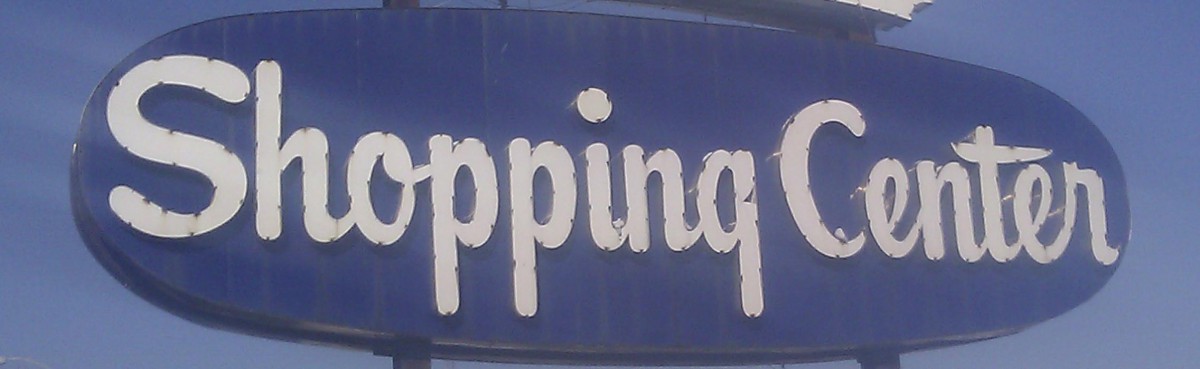
Well designed and lovely scripted font.

Carvel Robinson
Type & Media ADV 1167
1/31/14
Typography is mainly everywhere in this day and age. Not many people notice it but it’s everywhere. In my neighborhood Far Rockaway, there’s not many typography that’s located in that area unfortunately. Apart from stores, supermarkets, hospitals and schools there isn’t much type associated with where I live. When you look around it’s hard to find a place that has a unique kind of type that stands out from the rest. It seems as if everything that’s written in my neighborhood uses the same font, a lucky guess would be Helvetica. Mainly is an easy to read font and it’s used everywhere. The only place that might have a different kind of font is probably the salons/barbershops. Those place try and play around with typography a bit just to show a different type of feel to it. They also can do that because they already of symbols or images that portray what they are. You won’t find a lot of type based design in my neighborhood. The most type based design you would find is graffiti and there’s barely any. I haven’t seen any type in my neighborhood where it stood and that’s memorable. Everything is mostly the same and is somewhat boring. It’s fun to see typography and different type treatments with words on buildings and even build boards, too bad you won’t find that in Far Rockaway. I try looking for symbols, signs or images in type on a lot of different places but could hardly find any. The closet I’ve come to finding image in type is the Key Food Supermarket logo and it just has a key in the name. Not really much of a typography design but that’s the only thing I can say that stands out from the rest. Hopefully in the future there will be more type treatment that goes into making my neighborhood a little more fun when it comes to typography.
The OpenLab is an open-source, digital platform designed to support teaching and learning at City Tech (New York City College of Technology), and to promote student and faculty engagement in the intellectual and social life of the college community.

