Gotham is a typeface that is all around you every day. You’ve seen it but probably didn’t notice it. That is one of the things I like about Gotham. It has a strong, clean and simple design that is not over powering. Gotham happens to be one of my favorite typefaces to use—that is really an understatement. I use it on ALMOST every project I work on. I came across this quick video about the creators of the Gotham typeface and thought it might interesting for you to see the real faces behind some of the fonts you see everyday.
Monthly Archives: March 2014
Classes 9 and 10 – Alignment, Justification, Tracking
Topics Covered
For the last few sessions we have been learning InDesign—creating new documents, creating guides and rule , adding text, kerning and tracking. As we have had the chance to experience digital typography, and we have had the opportunity to deal with variations in typefaces, such as different weights, styles and widths.
One of the new tasks was creating type on a path. Here is a video that will help you if you didn’t quite catch on during our class session. Even though this demo uses InDesign CS5, the technique is still the same.
Journal Items
- Find 3 examples of bad kerning—good kerning, loose kerning, and bad kerning.
Homework
- Complete these type book exercises from last week—Alignment, Variations
- Reading Assignment – Adobe Typography Primer
- Type Book – Alignment/Justified vs Forced Justified: down the handout with the complete instructions if you missed it in class.
ADV1167-Justified
Class 8 – Type Variations
 Topics Covered
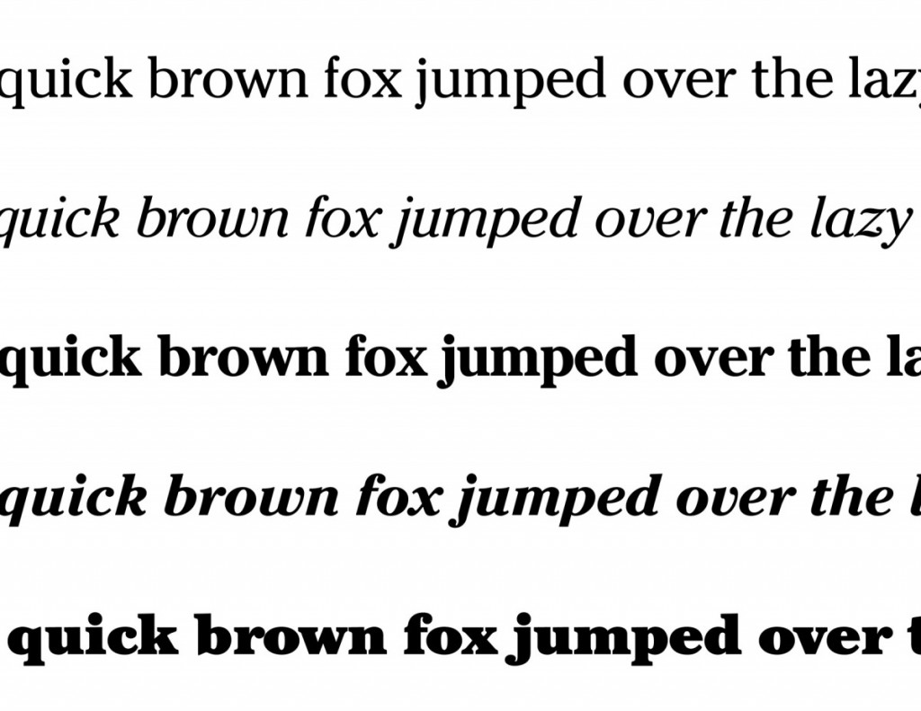
Most typefaces have different variations or styles. These are modified versions of the original or regular typeface. Some common variations are italic, bold and bold italic. Some typefaces also come in condensed or extended (expanded), but may also have other varieties like small caps, outlined, shaded or even more decorative with swashes. A few articles to review on the topic are Variations on a Theme and Styles, Weights, Widths—It’s All in the (Type) Family.
Vocabulary
- Regular, roman, book
- Type width
condensed
extended, expanded - Weight
light, bold - Posture
italic, oblique - Stress
vertical
horizontal - Contrast
extreme
medium
low/none - Serif
bracketed
unbracketed
Homework
Type Book— This type book exercise is based on variations. Create a 6-page document. Each page must show a sampling of 3 character, comparing variations to type within each category discussed in class. The document for this assignment may be downloaded –>ADV1167-Variations


