Journal Entry 7 – A Memorable Mentor

man in gray crew neck t-shirt and black pants standing near black wooden table
Photo by Immo Wegmann on Unsplash

A few weeks into the internship, my team and I were introduced to our design supervisor. We all met during one of our Monday zoom meetings. His mission was to help us complete our design assignments. He is an older man who has many years of professional design experience. His portfolio has many amazing pieces that backs him further.

Our mentor provided us with the explainer video script edits and ideas. We shared the final version of the script, which was more based on our mentor’s suggestions, and it turned out to be a lot more convoluted and difficult to understand. Eventually we agreed to a small 4 line script. After showing him my most recent over storyboard, over google meeting, He agreed it looked great and sent me a couple of examples for my animation part of the video project. That was great of him!

I learned some better presentation technique that I will use for future work!

On another side note he helped stand up for us designers whenever the other supervisors have a preposterous request.

Journal Entry 6 – Self Evaluation

A project I would like to evaluate myself on is my most recent storyboards for the explainer video we are working on after the internship is done and over.

Here we have my take on how I envisioned the explainer could look like. I take a lot of inspiration from other typographic animation videos such as the ones I noted on journal entry 3. I believe I did a good job looking at how certain references did their layouts. My approach was very modern and simplistic. To the point so that the attention is focused on the type. I wanted to create something a bit memorable rather than a mass of animations and colors overtaking a viewer’s eyes. When I presented my work, my teammates and the designer supervisor all liked the simple take. Assumingly because I would be the one who would animate the ultimate piece, they thought it fit well. Because this is my work and I have a prejudge opinion, I would agree it works best. The other supervisors although wanted to see both in action so we will have to see how far we can take these storyboards. Overall I could have completed this faster so my teammates could have seen it before the presentation, but it turned out well otherwise.

Journal Entry 5 – A Collaborative Effort

three people sitting in front of table laughing together
Photo by Brooke Cagle on Unsplash

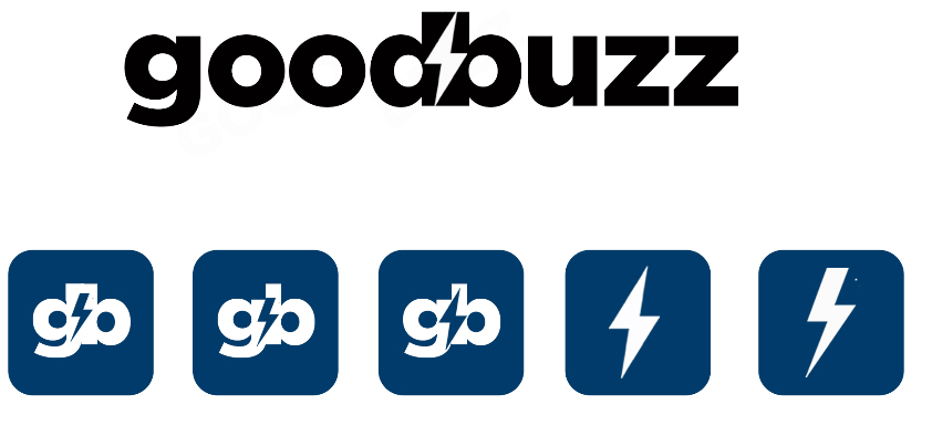
We mainly have been working as a team and have been meeting up every week to discuss projects. Going back to logo design, we had a few disagreements on what the logo should look like. My idea was simply to enhance it for viewer consumption, but the supervisors got every invested in the unique designs we were creating. I enjoyed the bee, but the others had their own style of the bee, they enjoyed more. Then we moved into using other symbols such as buzzing sounds, waves and lightening. I supported their takes as much as I could. It will be up to the supervisors to finally accept one of the designs. My favorite was one of Nina’s final designs with the bright color palette we chose, and our design supervisor’s own take on the lightening design.

Nina’s take on the logo
Design Supervisor’s take on the logo.

Journal Entry 4 – My Day as an Intern

An an average day, I wake up at around 11am to get ready for my day. By the time I am done with breakfast, It should be almost 1pm ready for my to pull up work to do. For my 3rd project, I had the chance to work on these two video interview video edits. I had to go through a 7 minute and then a 30 minute video interview to then cut out dead air and deliver a rounded out video for easier viewer consumption. This took a couple hours to do, but it was an exciting experience for that week. I learned not everyone is perfect and we all can stutter or be a little too quiet, so we can edit them to have them consumable. This assignment is separate from the explainer video but still works under my broadcasting major.

Journal Entry 3 – A Forward Culture

The culture of this organization is a mix of adhocratic and market culture. They encourage our own ideas but have a certain agenda to reach so it can prove difficult to find just the right direction at first. Working from home certainly allows for more time to be allotted to work, and freedom to schedule myself. I dress casually as we all are at home and are not always required to show our live faces on webcam. I work from my room’s desktop with my ac on, my music on low as I work on projects. Typical day at work would be monday through friday from 12pm to 8pm.

Conceptualizing the explainer video we have references for animation. I looked at type animation which would also fit my portfolio if we pursuited it. We also took a look at audio design.

The Girl Effect | Party Sleep 19′

Journal Entry 2 – My Role–Responsibilities

My role within the company is, lead video designer and support graphic designer. My experience in video editing convinced my supervisor to have us begin conceptualizing an redesign for an explainer video. They had one where the supervisor simply recorded themselves and had a long drawn out explanation about one of their the company’s social platforms. The owner of the non profit and his manger are my supervisors. My professor suggested to reach out to this place and they had work that fit my major’s focus of video and graphic design. Once I reached out to the manager and asked about the position, they invited me to the first general zoom meeting on Monday June 7th. There were the two supervisors along with one of my classmates and a couple other volunteers. The owner explained to the best of their abilities what his company and brands did in the hour we listened. After it was done, the manager noted down my information skills, and availability and soon we were assigned to our work.

We were assigned to focus on recreating the explainer video. My two other classmates and I had a private slack meeting where we discussed our ideas. I took the initiative in preparing a slide with color palettes, information so that we were on the same page, and I had the first idea to redo the lackluster logo. This logo was already very weak, and adding it to the explainer video would have not been the best for memorability or viewer consumption. This sparked a new conversation in figuring out what the company was about and had my other two teammates begin their process in designing their takes on the logo.

Journal Entry 1 – Secured a Position

person using microsoft surface laptop on lap with two other people
Photo by Windows on Unsplash

Starting out I had no internship when the class started. With the help of my professor, I applied to three different positions. On the second week of internship class, I was able to fully secure myself with a position in a Non-Profit organization. Both supervisors gave me and two other colleagues that were accepted a very warm welcome. The company is relatively small nonprofit that mainly runs through the help of volunteers ran in New York. This privately owned company deals directly with charities and celebrities to garner attention and then funds from fans and others through cause marketing. Cause marketing in short, is when a business supports a charitable cause or a social issue and gets marketing benefits from it. It is important to have strong communication with charity and celebrity clients as they are needed to gain at important connections to donators. The company can split the funds with themselves and then the charity of choice 50% each. The donators and celebrities have a choice on which charity they want their money to allocate towards. The Non-Profit organization was founded in 2012 and worked with nearly 30 causes to convert consumer’s time, attention, and behavior into revenue paid for by sponsors. I was assigned the position of lead video designer, as I had the most experience with video editing, but until then I will work as a support graphic designer alongside my teammates. No articles were found on them.

Ethics Assignment

All research sources are to be cited at end of each response. 

There are to be at least three research sources for each response.

Entry 1:

  1. The design work I am doing handles sourcing of images by using the logo that the company already used. The original GoodBuzz logo was a black colored bee with the letters GB as its “wings.” I took that logo and enhanced it to give better visibility.

From the Aiga reading, “You would be better served to spend your money on something else if you don’t place a high value on what it can achieve.” This can still be applied to the time spent on every design. If I did not see value in updating the company’s logo then I would have to include a very blurry photo in my design work that would honestly hinder any process. “Inconsistency raises doubt, and doubt makes people wary.” Do not make your clients doubt the work, encourage consistently good design. Although the logo does not make the brand, it helps create a memorable one.  

  • I did not have to sign any non-disclosure agreement for this internship site. I had a recent experience signing one for a study but that was not the case at Giving Forward. According to the Aiga reading, “A professional designer treats all work and knowledge of a client’s business as confidential.” No matter if you signed an NDA or not, keeping company information to yourself protects all parties from compromising exposure.  

Entry 2:

  1. In the past, I have used another’s creative work by using a drawing as a base to my own. They had the perspective and proportions that I had wanted. I had it for personal use so there was less of a need to provide a credit. Yet, it is important that if I were to post it say on my portfolio that I would “clearly outline all intellectual property ownership and usage rights.” Creatives work hard for their work to simply be stolen, give credit where credit is due. “An artist’s copyright is owned by the artist and is protected from the moment it is created by the 1976 Copyright Act” Licensing exists for this reason, to protect these artist’s rights. I sadly did not ask for permission to alter original work, this day in age it is very easy for people to post work that they had way less of a hand in. If I do want to feel legitimate in my reference photos, I would use copyright free stock websites such as unsplash.com or even pexels.com for video stock.
  2. My opinion of the arguments and outcome of the Fairey Copyright case is that having a case-by-case basis is important to judge where the line of rights to work is drawn. Remixing is required and is transformative or creatively inspired. Avoid exploitative profit to purchase things unnecessarily. Bootleg rip offs versus celebrated inspiration is an important distinctive. This debate seems to have people between those against profits from stolen art and those who did not want artist to earn a single cent. As a creative, your career should pay for your hard work to flourish and grow. But as creatives we must open ourselves to the possibility that remixing art can in fact being attention back to you when properly credited. There are many pieces of work that do much better in the hands of someone else’s hands and can potentially lead to much more of a boost than ever before.

Fairey showed a huge form of creative freedom and free speech

Source:

https://www.aiga.org/sites/default/files/2021-03/Design-Business-and-Ethics.pdf