During a class presentation, I received constructive criticism from my fellow peers to makes some changes to my designs. After applying these changes, my designs are more clean which helps the concept communicate stronger. One of the major changes was to change the backgrounds of 2 of my concepts since I had a deep blue background for every concept. This change I feel was very effective because I learned to provide other options for a client so that they are not limited when choosing what they like. Here’s a link to the museum of Vincent Van Gogh; who’s quote I used for this project: https://www.musement.com/us/amsterdam/van-gogh-museum-v/?gclid=Cj0KEQiApqTCBRC-977Hi9Ov8pkBEiQA5B_ipVWQtCEkroiqC0iTS45wMH2v6xO0xDAkFiWwDPfiC3UaAuZI8P8HAQ&gclsrc=aw.ds
Visual Quote 1
- Before
- Final result
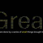
The changes here I feel make the concept tie in with the quote. Since “Great” is already presented, there was no need to add it again to the quote. I made the small in the quote match to a yellow of one of the smalls that makes up the “Great”. Instead of having Van Gogh’s name in the counter of the “a”, it was moved to the crossbar of the “t”. The change in this placement makes the name have more readability. Overall changing the background to black makes each word more easy to read.
PDF of final version:visualquote1-final
Visual Quote 2
- Before
- Final result
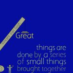
For the Final result, I took out the majority of the “Great’s” because it gave a feeling of being cluttered. All that’s left in the middle is one big “Great” which I feel makes the message standout more and there’s a nice space around it. Like the previous concept, “Great” is already presented so there’s no need to add it to the quote. Also I made the small in the Quote match the yellow of the “Great” in the circle.
PDF of final version: visualquote2-final
Visual Quote 3
- Before
- Final Result
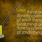
This concept had the most changes done to it, which makes the end result feel like a vast improvement from the previous version. the little construction workers were removed because they felt unnecessary and with only the crane left the message is still there. The building that was made out of the quote didn’t felt like a building. Also the jib of the crane looked more like a ruler so there were changes made there as well. To fix that problem, I made the building taller by adding another stack of the quote. A change that made an impact was making Vincent Van Gogh’s name as the foundation of the building. The background was changed to look like brush strokes since Van Gogh was a painter.
PDF of final version: visualquote3-final


