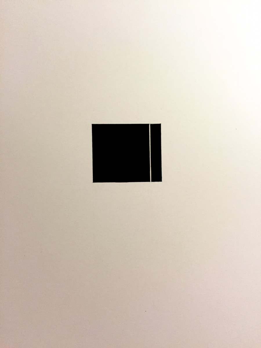
Each side looks equal the top, left and right sides are 5 5/16 in.
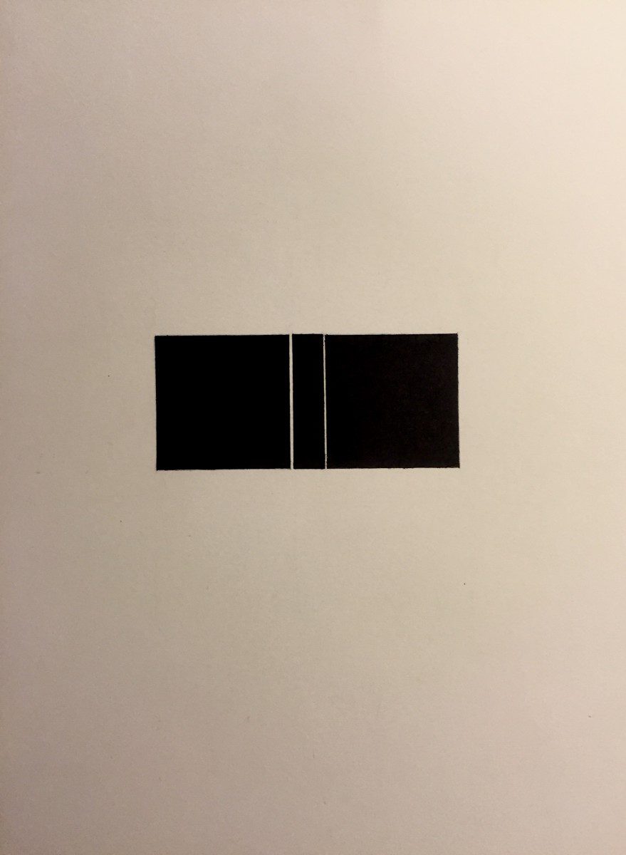
The space between the squares is 1/32 in and half of 1/32 in. The squares are 1 1/2 X 1 1/2 in.
A site for my design courses
Each side looks equal the top, left and right sides are 5 5/16 in.
The space between the squares is 1/32 in and half of 1/32 in. The squares are 1 1/2 X 1 1/2 in.
Before starting this class, I thought we were going to work with the computers. I thought we were going to use Photoshop, InDesign and Illustrator. In Photoshop I thought we would work with colors, in InDesign, work with text and in Illustrator make graphics. I also believed this class would be similar to my color theory class that I took previously. This is because in color theory all we did was work with color and the class name ‘graphic principles’ led me to think we would do the same.
After beginning the class, I was a bit taken back with the first assignment (which was to draw a black square on a page) just before student samples were shown. Although, I liked the fact we had to draw by hand as it was something different, I liked doing this positive and negative space project because I like to draw. These assignments improved my drawing skills. I like to draw abstract drawings using shapes and anything that comes into my mind. When the assignment was explained, what I had in mind for how the result was supposed to look like was different from what was shown. I had to draw a perfect square. What helped, was that I saw exactly what was expected of me with the square as a focal point in a balance of positive and negative space.
When doing the critique, I didn’t think we would be speaking individually in front of the class explaining what needed improvement and describing the contrast, value, pictorial balance, etc. I thought we would just be all talking together and telling each other what we could fix as in my other class. Also I didn’t understand what draughtsmanship was until I looked it up. I’ve never heard of such a term to describe drawing. The critique helped me see what did not and what did work with a project. It helped improve my sensibilities.
I see advertisements in a whole different way. I never knew about “form follows function” or chiaroscuro. I never knew there was a word to describe a black background against a subject. I do not look at ads like a consumer anymore. When I looked at ads before, I used to ignore them and feel like it’s all a false image. I thought it’s a false image because it doesn’t represent ourselves or the masses. Now when I look at an ad, I analyze. I analyze everything from color, to what’s being sold, how the models are posed, and the company or designer selling the product.
I have noticed that I have become more sensitive to color than I have been before this class. Before, I already could tell when color changed but now my perception of color improved a lot. I took a color vision test from X-rite (which is a test that measures how well you see color). In the test you have three rows ranging from one color and slowly transitioning to another that you have to put in order to see if this was really the case and it is. The last time I took that test I had a score of 8 and now it’s a 3. The scores range from 0 (perfect score) to 100 (poor score). I see changes in tone and hues of colors much more clearly now.
On my trip to the Museum of the City of New York I saw the Paul Rand exhibit and visual quotes that relate to New York City.
These two exhibits are presented very differently. The Paul Rand exhibit had a lot of his work formed into a collage. Also some
of the work looked as if it was done right on the walls. The visual quotes were just stuff famous people said in the past about New York,
more specifically the culture, it’s people.
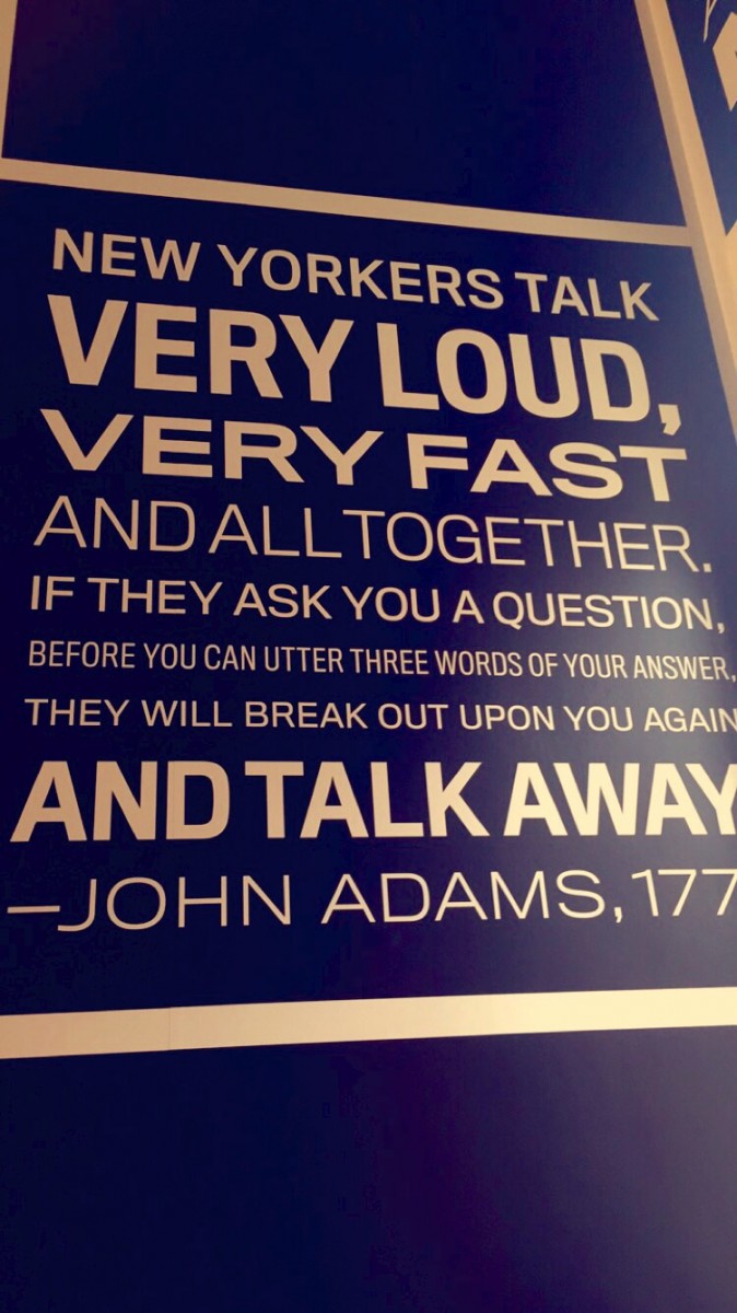
One quote John Adams said about New Yorkers was, “New Yorkers talk very loud, very fast and all together. If they ask you a question,
before you can utter three words of your answer, they will break out upon you again and talk away.” I think this perfectly describes the
people that live in this city. The type here is Sans Serif. ‘Very loud, very fast… and talk away’ is bold. The rest of the quote is regular or
light. Also this quote is written in all caps. The text is reserve type since the text is white and the background is black. (The background
only looks blue because I put a filter on it)
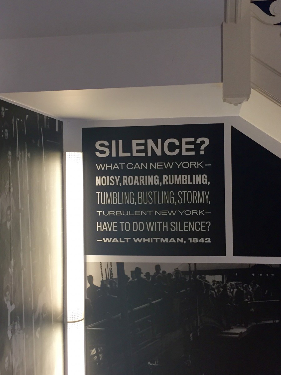
Another quote that was said by Walt Whitman, “Silence? What can New York- noisy, roaring, rumbling, tumbling, bustling, stormy,
turbulent New York- have to do with silence?” This is another very accurate representation of this city. There is always noise and never
any quiet. This quote is also in all caps and reserve type like the pervious one. ‘Silence’ and ‘noisy, roaring, rumbling’ and Walt Whitman
is bold. The rest of the quote is light. ‘Tumbling, bustling, stormy’ is condensed.
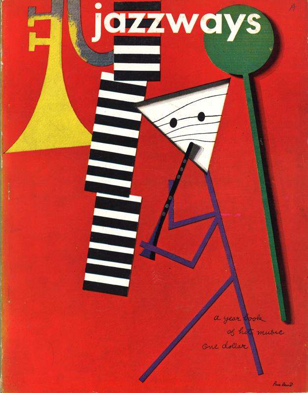
From the Paul Rand exhibit, there is a 1946 cover design of Jazzways Magazine that Paul Rand created. The background is red and
there is a stick figure with a black and white striped triangular head playing a clarinet. On the right of the stick figure is a green stick and on the
left there is a trumpet that is fading from yellow to gray. Next to the trumpet is three rectangles that have black and white stripes. I believe that
it’s supposed to be a xylophone and the green stick is what you use to play it. All of this creates a jazz-like feel which has to do with the magazine
hence the name Jazzways.

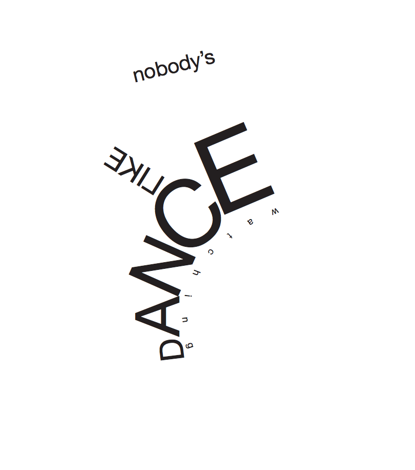
When I created this image, I wanted the person viewing it to get a visual feel of what dance is to me using typography. I was inspired by an assignment I had to do for a pervious class which was a word as an illustration. So since this quote was mainly about dance, I chose a shape of a ballet shoe and it gives you a feeling of a specific type of dance, in this case it’s ballet.
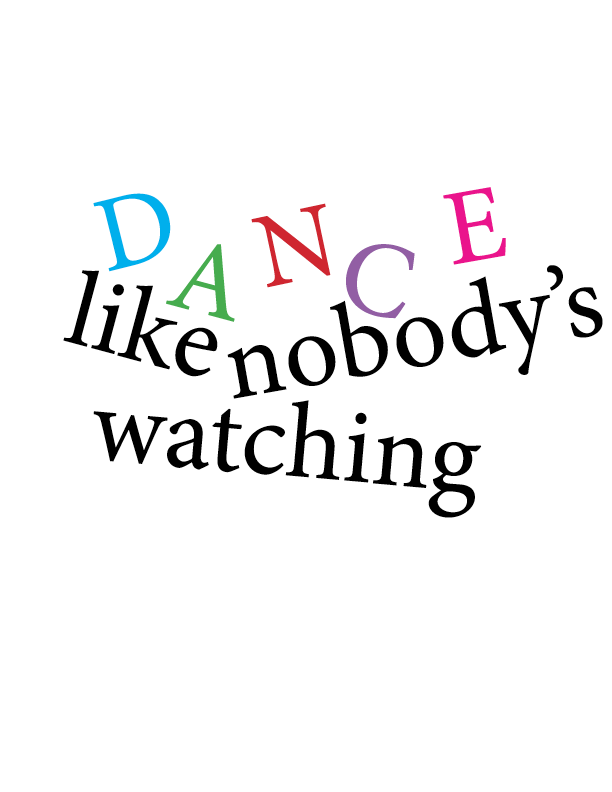
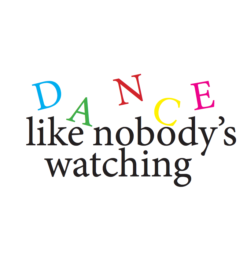
The concept for this image was to give the quote an action, in this case it’s dance. The letters in dance are jumping up and down while the “like nobody’s watching” are slanted. In a way you can imagine the D, A, N, C, and E to be people moving around.
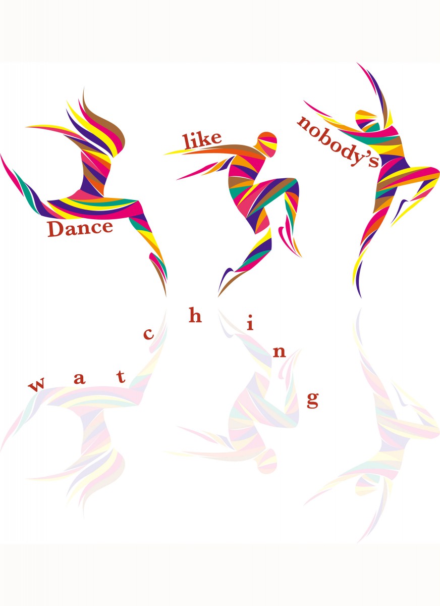
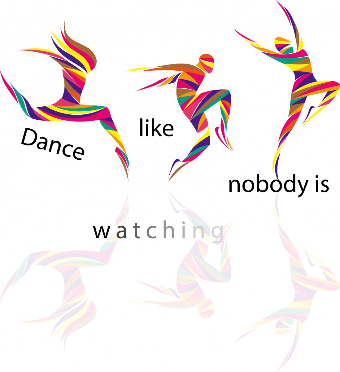
For this image, I used a picture from patch.com and I used the dancer’s bodies as my starting point for placing the words of the quote. I think this concept conveys the meaning of the quote because each word is positioned differently and everyone dances differently when they are alone.
© 2024 Betty's ePortfolio
Theme by Anders Noren — Up ↑
The OpenLab is an open-source, digital platform designed to support teaching and learning at City Tech (New York City College of Technology), and to promote student and faculty engagement in the intellectual and social life of the college community.