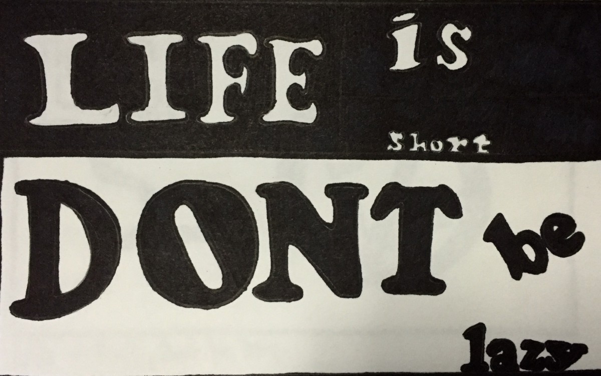
The typeface is Cooper Black, which is a heavy, old style serif. I chose this type of font and style to display my quote, because it gives off an old era type of warning. The word “LIFE is short” is in white because life is bright, and full of potential. Thus “DONT be lazy” comes off as a warning, and threat in capital and all black, in order to wake up the person reading this so they come to a realization that they don’t waste their precious life being lazy.
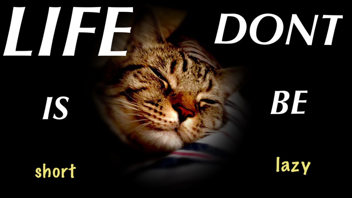
The typeface is Briem Script. I chose this font because it seems very modern and sleek. I chose to write my quote the way i did because of the photo that I have chosen. The background is a photo of my cat sleeping. Thus the words ” LIFE IS short” and “DONT BE lazy” seem to start from the top and go downwards make the reader nod their head up and down as if they are falling asleep but trying to stay awake. This way, the quote plays with the readers head.
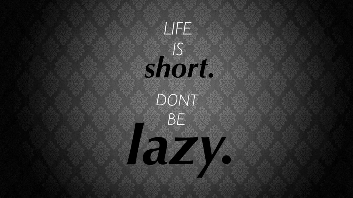
The typeface is Briem Script. This font is very thin which is why I liked to use it to display my quote. The way I visualized the quote on this piece is having the words “short” and “lazy” scream at the reader, but at the same time represent their flaws, being lower cased. In a way this motivates the person to get up and fix their flaws in their life to fulfill their potential.

