
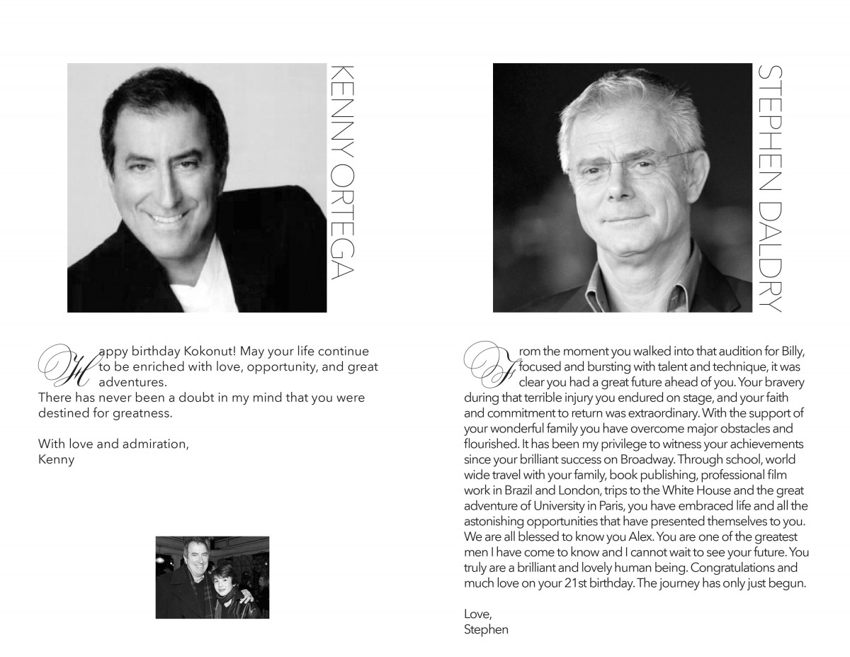
I had a very particular experience, when designing the Soho House Party Booklet at my Internship. My main assignment was to create a booklet, with resemblance of a Broadway playbill that was going to be used in a celebration party for Alex Ko’s 21st birthday, a former Broadway Star. The event was going to be held at he SOHO House, a very exclusive place in Manhattan, and was going to have very prominent people as guests, including the four times academy award nominated director, Stephen Daldry and the Acclaimed Director and choreographer, Kenny Ortega.
I had to design the booklet, in terms of Color, Typography and general mood and feeling. I started as always with a mood board, putting images together in order to have a general idea of the design style we were looking for. Then, I proceeded to do the sketches, I started with a basic idea using the elements that I already had and others that were given to me. I was told to use a script font preferably, and to work with the layout of a typical Broadway booklet. So I was conditioned by the yellow color and boxy design. Also, the specific picture to be included in the design was given to me.

I laid out a grid really quickly, and proceed to place the elements, the picture wasn’t the best quality in terms of composition or quality, so I proceeded to separate the subject from the background, and turned into black and white, in order to make it more dynamic and to make it easier to match the already established colors, and the rest of the layout.
The obvious next step was to add the text, which was divided by visual hierarchy, using script and serif fonts. Every element was scaled and placed according to a twelve columns grid.

The first sample was a hit; Dr. Tammie and her assistant loved the design and proceeded to show it to Stephen Daldry, and Kenny Ortega, who also liked it and didn’t change anything in terms of visual aesthetic, which was very rewarding for me.
The inside content followed the same grid, typography and style of the front in order to form a single unit. Several elements were added later, which made the design a little bit more challenging, but all of them were placed according to the rules of composition. On the back cover, I decided to do a little bit more of research, and I finally used the style of a Birthday greeting Card, adding dynamism with the picture of Alex jumping in a ballet move, a very meaningful image, since it’s the same used in his book cover.

After some comings and goings, that included having to stay almost two hours longer than my normal shift, and having to telecommute from home, in order to send the file to print, the final result was a success, and the party sponsors decided to do a 6f x 4f poster to be placed on a stand at the event salon.

