Personal Banner
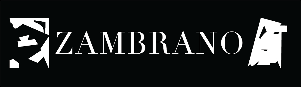
Zambrano is my last name as you can see on the top of the page. Certain individuals have decided to call me by my last name since my first name is too common around the world. For some reason, I get really excited to be called by my last name so it was included in the plain banner because it is significant to me. Apart of my personal identification with the name, Didot was the font being displayed in the imagery above because it provides a sense of simplicity, sophistication and modernism all in one. Aside from this font having a ton of characteristics that I adore, it is my number one in my list. In addition, the banner only utilized black and white. In my mind, these two colours provide me joy so I incorporated them into it. The odd figures on the side are just two abstracted figures that I had previously created and they both turned out looking like faces. One face (the face located at the left) has a wide opened mouth while the face located on the right has a closed mouth and I put them intentionally because you need to be a little bit of both. For instance, knowing when it is the right time to just let free and talk nonstop and knowing when you need to keep quiet.
Quote: “Design is creating order out of chaos”
The fact that two complete opposite words were placed in the same quote stood out to me, this quote was in a powerpoint that one of my professors wrote and all throughout the class I kept thinking about the quote. I was totally fascinated by these seven words.
Visual Enhanced Quote #1
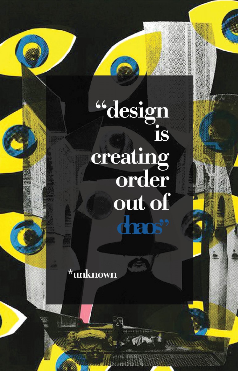
1| First design was highly influenced by the quote itself. The reason for making this particular image its background is because it gives a chaotic feel with the placement of the eyes. In addition to the yellow and blue hue in the photo, I incorporated that same blue colour to the word “chaos” so it would stand out. Bodoni was the font used for this layout because it gave it a sophisticated feel and I wanted to create that balance between crazy and organized.
Visual Enhanced Quote #2

2| This picture speaks a thousand words, the collages of certain body parts being placed on top of one another created a very wacky environment. Due to this, I thought it was ideal to make it its background. As for the typography, I decided to use Century Gothic Bold since this san serif font related to the picture because it felt young to me and young and wacky go hand by hand. I purposely spaced out the words in the quote to even out the wackiness between the image and the type itself. As on the color of it, white seemed the most appropriate against the black background so the legibility would be clear.
Visual Enhanced Quote #3

3| As well as my other designs, its background is a little weird but not as wild as the previous compositions. Since the picture has like flames and lines, I decided to set the font to be Gill Sans because it is a light weight font so it match the background. However, the word order was in Gill Sans bold and I kerned it a lot so the individual characters would have order between one another. In order for the quote to be seen from the background, I placed a navy blue triangle on top of the image and added an effect so you could still view some detail from the photo. After that making the font white made it simpler to be read against the faded blue. In addition to that, I decided to create the triangle shape instead of any other shape because the background itself also has a triangle if you look closely.
Research Paper #1
| The Genius Behind FedEx Logo
Research Paper #2
| A Lettering Expert

