All posts by Ashley Williams

Being in my first year of college and studying in subjects I choose to learn is a new beginning. My interest in Communications ranges through different sections such as web design, packaging design, industrial design and photography; and these are just a few.I've never worked with any Adobe programs yet and hope to come out of New York City College of Technology with more and stronger skills than I came in with. I knew that I wanted to be an artist from a very young age but the amount of different paths I can take in this field is just starting to become real. My influences for choosing Communitions as my major stems from the way that ads and commercials make me feel rather that following up on a single artist. When I come across a web homepage or a commercial that is vibrant and new excitement is too light of a word to describe my feeling. It has influenced me so much so that I now want to become the person that makes the web pages and the ads that excites other people.

George Lois

George Lois has much pride and creativity that he puts into his projects though out career. Lois has dignity and he takes a stand on issues that he doesn’t not agree  with, he is a creative activist and wont remain quite for anyone.  For these reasons and more I decided to write about his works and his accomplishments.

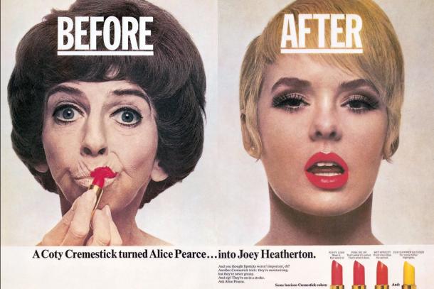
I would say that Lois is one of the most important men in the communication design world because of his approach to his work and his thought process in conveying ideas to the general public. One of my favorite works by him is for Coty, Inc. Cosmetics because of how he plays with the humor of makeup making women look younger, drastically younger. Lois’ capability to take a humorous outlook on certain subjects while being deadly serious with others, without there being a miscommunication between his office and the average person is why he is and will always be important to the communication design world. I think this is where people get caught in creating advertisements and projects for clients; its ideas becoming lost in translation with the developer having one idea and the consumer having another and when when its time to join everyone has completely different outlooks.

In his younger years George Lois attended the Pratt Institute but only was enrolled for a semester before he left to go to work for art director Reba Sochis. After working with her for six months Lois was  drafted into the army to fight in the Korean War. After his time fighting, he went back to his calling working for CBS news DDB Worldwide Communications (a marketing network) and later to form his own advertising agency with associates Fred Papert and Julian Koeing and finally, one on his own.

Lois’ has created many memorable advertisements during his career which includes ads for Tommy Hilfiger, Jiffy Lube and covers for Esquire. Particularly a cover for Esquire that is famous and that has to do with political concern. During his run Nixon was thought to care more about appearances and his appeal to the public rather than how to deal with presidential issues and matters of the state. Poking fun at this idea Lois went ahead an created a visual aide to the thought of how that must look in actuality. As I said before he does a great job at designing humorous imagery while also keeping his political, opinionated side.

It is more than a image, fancy design and words that go into George Lois’ ads and covers, its opinion passion and feeling. His works known how to make it to your mind and make you think, even when they aren’t necessarily meant to do so. I think both the communication design world and the communication management world can learn a lot by learning to not take the conventional route and never be afraid to have a voice, especially when it has your name on it.


Bibliography

Reba Sochis

http://adcglobal.org/hall-of-fame/reba-sochis/

George Lois

https://en.wikipedia.org/wiki/George_Lois#Background

http://www.georgelois.com/bio.html

Bridget Riley (3 interests)

Recently I visited a gallery in Manhattan that amazed me and spoke to my interest, this was a gallery full of some of Bridget Riley’s paintings. Although I didn’t know who she was until this point, it didn’t stop me a bit from admiring how she used color and what she was able to achieve on such a large scale.

The first painting I saw was one of lines and eye popping color. On a computer screen it isn’t half as mesmerizing as it is in person. It was a mix of muted colors and vibrant colors that stood out even from across the room. It took me a few minutes, but looking at this painting made me realize that 2 paintings were not put on one wall because the colors were so vibrant that they would compete with each other.

Adjacent to the painting above was the one below, it was a great example of color and how it can create illusions. The painting below was designed in a fashion that played with color and made it seem as if one color was above the other (like layers in Adobe Illustrator) when in fact it was not.

June.

Another work that was in her gallery was the one below, and while this is a small snippet of it, the size oft the one in the gallery was VAST. It was made of the same triangles below but when you looked at it these small triangles turned into bigger intersecting triangles. No matter where you looked on the canvas there seemed that there were triangles of all sizes and triangles in one another.

Visual Quote #2

“Stay Hungry, Stay Foolish”

I decided on a color that would be similar to yellow if not gold. It is the color of prosperity and wealth and I think that this what this quote is promoting. The font is Adobe Caslon Pro, I choose it for its aesthetic; I believe that it is setting a tone of professionalism although I am not completely fond of the shaping of the ‘T’.

This quote is true in that staying hungry will always keep you looking for more out of life, to feed whatever it is that you feel you are lacking. It is how an artist keeps discovering new ideas and continues to be inspired. Staying foolish hold the same weight, it is being foolish that makes us unconcerned with making mistakes or looking ‘dumb’. Both has its own necessity in anyone’s life, and this is why it speaks to me.

Visual Quote #1

“It is important to use your hands, this distinguishes you from a cow or a computer operator. ”

The type used in the work is Sitka Subheading, this font is clean and read able though I also found it to be more appealing than the conventional typefaces. To me this font looks similar to Georgia, however it does have subtle differences. My goal was to choose a font that looks professional and colors that didn’t compete with the photograph of Paul Rand, all while still putting emphasis on the words I found to be key in his quote.

Personally I took a liking to this quote because I enjoy the seeing hand lettering and illustrations, walking into a store and seeing  a poster or any letter design that has been done by hand gives me a thrill. These works make me stop and appreciate the time that has been put into them, this is the same for digital works as well but hand projects even more so.  I do think that it is still necessary to learn these skills though I’ve meet a lot of people who don’t, but I suppose that has more to do with interest than anything else.


Personal Banner

This quote speaks to my character because it is very hectic in a way; being that there are many lines to it of all sizes. However the amount of lines and the positioning brings it to be clear cut and readable, cluttered yet neat in the same light.

I opted to keep this logo black and white rather than to go with traditional art deco colors because I wanted to keep it simple. I felt that adding color would lead to a mixture of mess as I haven’t learned to put color on illustrations as I would want to yet.

Google Maps Logo Evolution

Logo Research

Google maps is an application that acts as a navigation system for the user. It allows you to plug any street or area and suggest the fastest way to arrive at your desired destination. Users have the option to choose the mode of transportation that best suits them after the app will take your choice and use it as well as your current location to estimate arrival times, possible traffic delays, and possible route changes. The app also allows its users to see street views as well as aerial views of local stores and nearby transit stops to suit your needs.

The logo design of Google Maps is one that, like any other Google logo, has evolved over time; bringing a fresh and modern look to it each time. The first logo was created by two designers, Lars and Jens Eilstrup Rasmussen byt was intended for Where 2 Technologies, a separate company that was later bought by Google in 2004. The logos design has evolved through the years from a type based one to one that is more image based.

The Google Maps logo has evolved from simply saying Google Maps to an icon that is an actual map with a noticeable point on it which would represent your destination in the app. The design continues to update into a simpler, modern look by upgrading into a folded map with a “G” on it as well as the destination point which was carried over from the previous. As the developers kept updating the look of the icon its basic elements (the ‘G’, destination point and the maps layout) but had a new, more modern feel each time.


Bibliography

https://en.wikipedia.org/wiki/Google_Maps