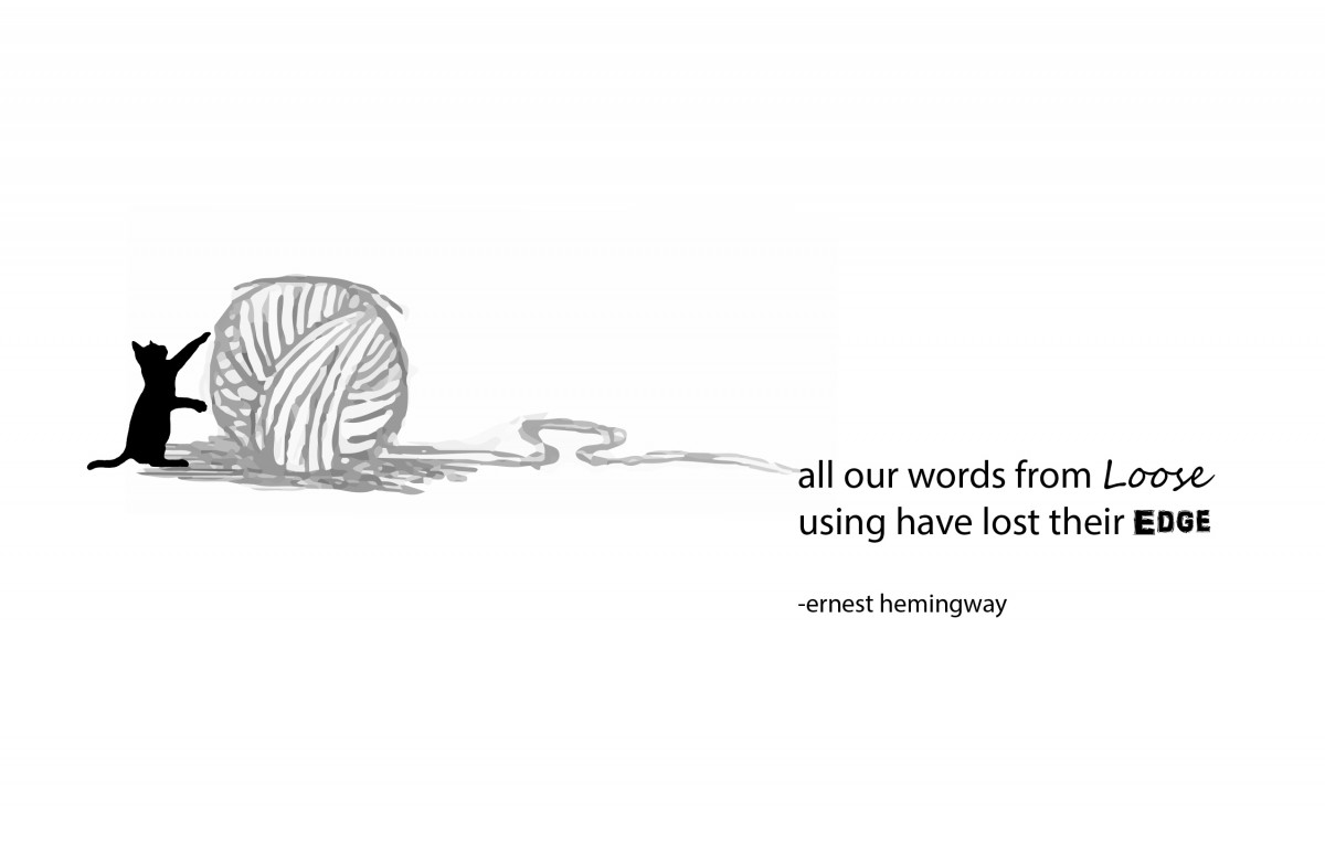
This is my final visual concept. The purpose of this concept was to emphasize the word “loose” and “edge.” All of the words are in lower case to give emphasis to the words “loose” and “edge” which both begin with an upper case letter. I also wanted to add in the physical aspect of both words by changing them to a typeface that would give the feel of something loose and something edgy. The focal point of this concept would be the ball of yarn which I made grey to give it a faded effect. I added in a black cat to make the concept more fun

stack of books in home interior
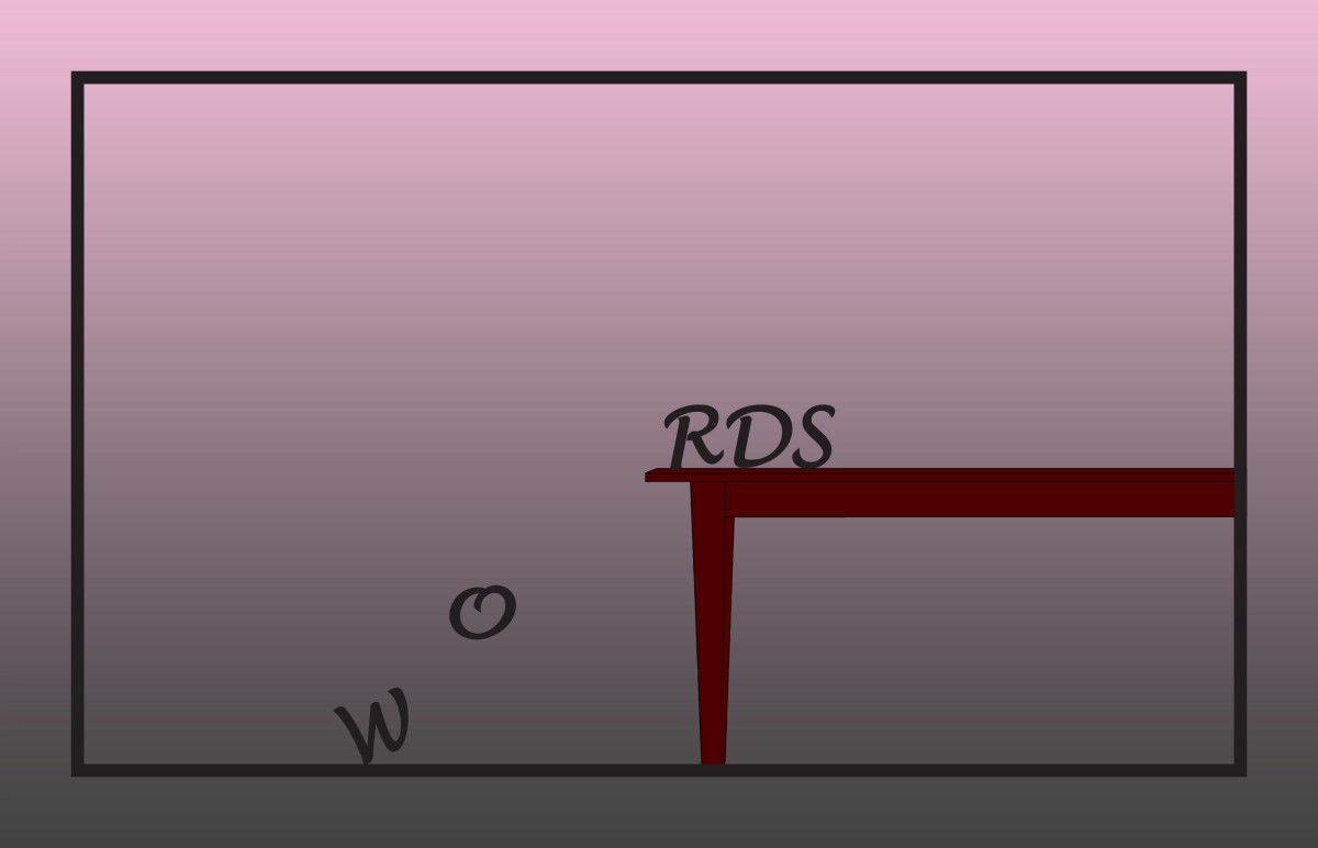
This is my second concept. The purpose of this concept was to intertwine the meaning of “words” with books. Books are filled with words that help the mind grow, wonder, gain knowledge, etc.. I used this typeface to give the concept an old feel to it. I changed the color of the typeface to a dark red to match it to the rims of the teacup and plate.
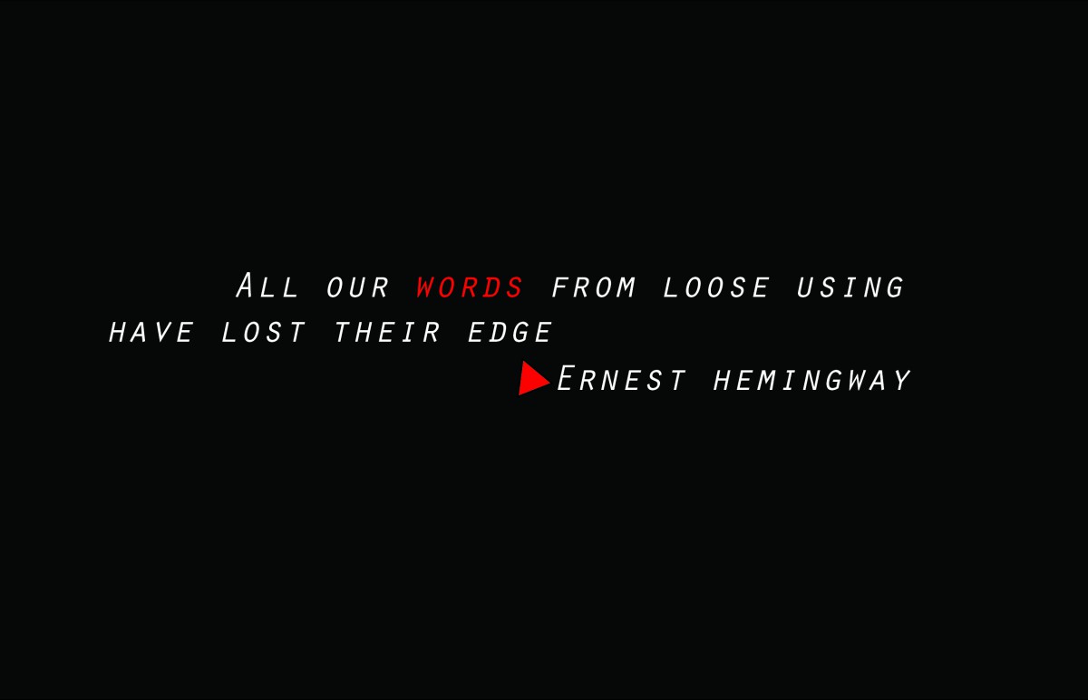
This is my third concept. The focal point of this visual concept would be the word “word.” I changed the font color of it to bring the viewers eyes directly to it. Instead of using an en dash I used a red triangle to make the concept look more interesting and to use repetition of the color red. There is a high value contrast between the white font and black background.
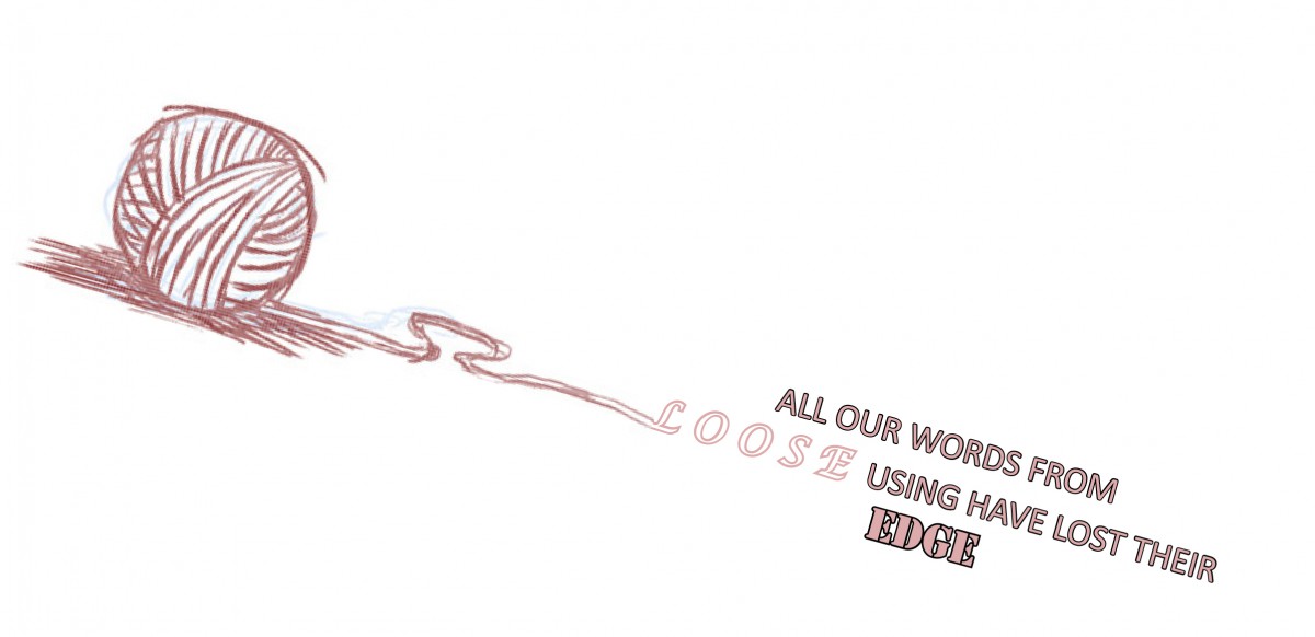
The purpose of this concept was to emphasize the word “loose” and “edge.” The focal point is the ball of yarn which unravels into the word “loose.” The typeface differs from loose and edge to show the physical quality of the meaning of the words.
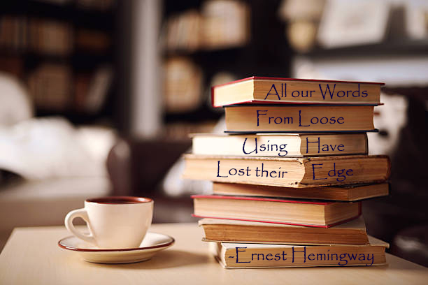
The purpose of this concept was to intertwine the meaning of “words” with books. Books are filled with words that help the mind grow, wonder, gain knowledge, etc..
The purpose of this concept was to emphasize “words” loosing its meaning by showing that it is falling apart.

