 This logo came from my Freshman year. I still like it and appreciate the concept of it.
But it’s time for an update.
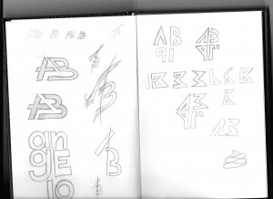 Here are some sketches I’ve done to start the process. I looked at some other logos and typographic designs for inspiration. I didn’t want to stick with my entire name as my previous logo was like that. So this time I wanted to use my initials. I also tried to include my birth year in an attempt to give the logo more content.
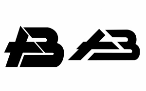 This logo was inspired by Amalgamated Bank’s old logo. I tried to also cut up the characters and combine them. The one of the left is a recreation of the sketch and the one on the right is the logo with perfect 45 degree angles.
 I ended up scrapping the character B because I didn’t want the logo to be seen as a copy of Amalgamated Bank. I tried to use closure to show the half A design by using the black shapes. I also used a red shape to add some contrast to the black. This design would go the face of a business card.
 Here’s what the same logo would look like in a social media banner. The red logo would correlate with whatever website the banner is on.
 I decided to add a texture behind the logo to fill up some of the white space. I didn’t want to pull the viewer’s gaze away from the rest of the deisgn so I used a texture that was geometric and light grey.


