Angel. Brooklyn born Conceptual Artist. I’m infatuated with different styles and techniques. I think it comes from the cartoons I loved growing up. I could walk into the room and tell what was on television just by looking at a single frame just because of how the background was drawn and the characters anatomy. My goal in this field is to develop a style just like that, recognizable and memorable by my fans. To create something the next generation can grow up with and inspire them to enter this field as well.
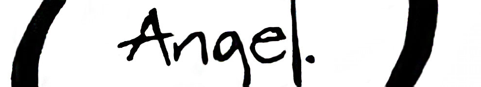
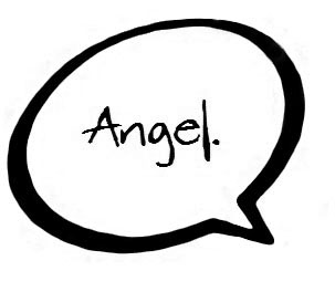 My logo design is a simple concept inspired by Video games and Comics. It’s my name in a classic speech bubble often seen in comics. At first I started designing intricate typefaces and making letters purposely unrecognizable but then I read the assignment again and realized that this wasn’t me. I’m a very casual and simple person. If any logo was going to reflect my personality, it would be this one. I added the period at the end of my name thinking about how people often use exclamations. An exclamation is supposed to signify force and power but I’m laid back so I used a period instead. To me it makes a statement of “This is Me. Take it or Leave it” . I found the speech bubble using Google Images but it was too perfectly curved for my tastes. I like things rugged so I tried to warp the curves a little to make it my own. I found the font at Dafont.com. It looked very inky and sloppy but it was still legible. The A in my opinion looks awesome. As simple as a concept it is, I still adore this logo very much.
 This new logo uses many elements and principles of design I’ve learned throughout the year. When I use alpha numeric type in my logos, I never like them to be obvious. I like to leave just enough of the character for it to be recognizable. I also don’t like them to be contained within borders so I decided to use a closure design to show the letter A. When it was just black and white, the shape was still unrecognizable as a letter. So I added a contrasting red shape that at the bottom slants to the right to mimic the leg of the A. I really like how it almost cuts the logo in half. It’s interesting comparing this logo to my old one as it still falls onto the simple side of design.

