![]()
Coca Cola it is arguably one of the most world renowned company to ever exist. The Coca Cola was stablished in may 8, 1886 in Atlanta, Georgia by John S Pemberton. To this day, the Coca Cola company has manage to stay one of the most prominent and powerful company in the world. The logo has evolved in many different ways for nearly 130 years. There where many tweaks done to the logo but the original concept was never taken away.
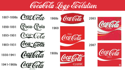
Coca Cola was the name that Frank M Robinson suggested for beverage that was done by John S Pemberton. Frank M Robinson was the bookkeeper of John S Pemberton and the designer of the Coca Cola logo. Coca Cola was originally published with a serif font on the newspaper in 1886. A year later, Frank Robinson managed to design the logo in an script style which was successfully published on the newspapers.
After Coca Cola was published with the original logo, they made few changes throughout the years. The only time that the font of the logo was changed was when they where using Coca Cola for a series of calendars. They changed the type face to a curly font in 1891, followed by a variation of diamonds that where incorporated in the logo in 1892. Afterwards, the logo had minor changes on where they put a trademark on the tail of the letter “C”. The trade mark was always simplified by being in different position of the logo and by being changed to “Trade Mark Registered” to “Trade Mark Reg. U.S. Pat. Off” etc.
The logo was changed visually adding the red circle which signifies the cap of the bottle and the bottle behind the logo. The logo was then put in a fish tail which encouraged a lot of businesses to put the Coca Cola sign outside their store to attract customers. The fishtail logo had the word “drink” in the top Coca Cola which was then replaced by “Enjoy” and a new design for the logo. In 1985, Pepsi was surpassing Coca Cola to the point that a new name came out from the Coca Cola company. They name their new brand “Coke” which made a lot of people upset do to them being used to the traditional Coca Cola brand.
In 1987, Coca Cola went back to the classic “Coca Cola” logo which made the Coca Cola lover pleased to have their classic drink back. Because of the high demand, the company needed to do some damage control by putting the logo back. This time they added a ribbon line across the “O” from “Cola” which made it look more modern. After putting the work and effort on the Coke logo, they managed to put the word under Coca Cola so that they won’t permanently abandoned Coke.
In 2002, the Coca Cola logo was introduced with a yellow ribbon which changed their tradition of always having the logo with white and red. The yellow ribbon give the sense of the company trying to stay modernized but yet stay to their traditional logo. To this day, Coca Cola looks neat and simple like the day Pemberton and Robison first started their journey. The company has stayed true to the origin of the Coca Cola logo and has never changed permanently to another design. The people still love Coca Cola even though its been nearly 130 years, Coca Cola will always be the logo to remember.

