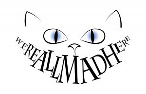
My first design showcases the Cheshire Cat. I used the typeface Charlemagne, which is a thin serif that gives off a dark, Tim Burton feeling. I manipulated the letters into different, irregular sizes to evoke the look of teeth.
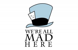
My second design features the Mad Hatter’s hat. Again, I used the serif typeface Charlemagne. I chose to only use the colors black and light blue because these are the colors commonly associated with Alice in Wonderland. I placed the hat above the text to create a hierarchy that leads your eye from the hat down to the quote. I stacked the text into three, even rows underneath the hat to keep a sense of balance throughout the piece.
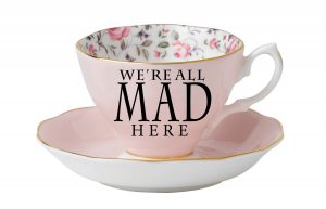
My final design features a teacup because tea is often associated with Alice in Wonderland. In this design, I used the serif typeface Charlemagne. I stacked the text into three, uneven rows to create visual interest. I manipulated the text “MAD” by stretching it taller to give it an irregular look and support the feeling of madness.


