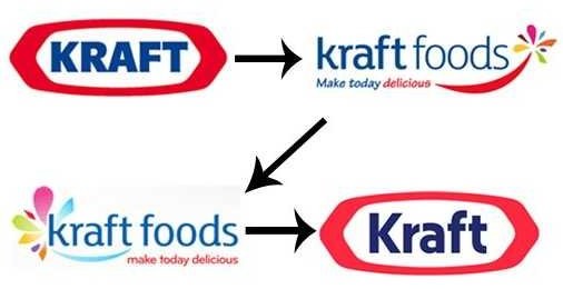
The Kraft logo which was made in 1903, which entails a thick red outline and the word Kraft in capital letters in the middle, this was the logo when Kraft first became a company. (http://inventors.about.com/od/foodrelatedinventions/a/kraft_foods.htm). Ever since then Kraft has been expanding by taking other food product and bringing them into their circle of products. Once the food produce was indorsed by Kraft, wherever the name of the produce was, the logo would be above it. The reason for the logo change was that the company was splitting its company in two, one for global snacks and one for the north American business.( http://www.underconsideration.com/brandnew/archives/kraft_logo_gets_back_in_the_race.php)
The logo has a polygon shape only it is stretched on top to fit the word Kraft in it. The outline is quite thick, and is the color red. The text inside the polygon has changed by instead of Kraft being in capitals only the first letter is and the rest lower case. The logo has only change three times since the original in 1903. (http://www.businessinsider.com/krafts-4th-new-logo-in-4-years-2012-10


