
Dan Rhatigan gave voiceover
The Webinar I watched was on pro tips for picking web fonts. It was so cool to know what kind of fonts are useful for web uses. It actually helped me change the blogs on the open lab. I got useful information from this webinar. The speaker was shelly and then she introduced Dan Rhatigan who took over the voiceover. He works at Monotype and knows a lot about Type Treatments. He explained what kinds of fonts are used and what are technical issues that we face as designers.
Different types of fonts
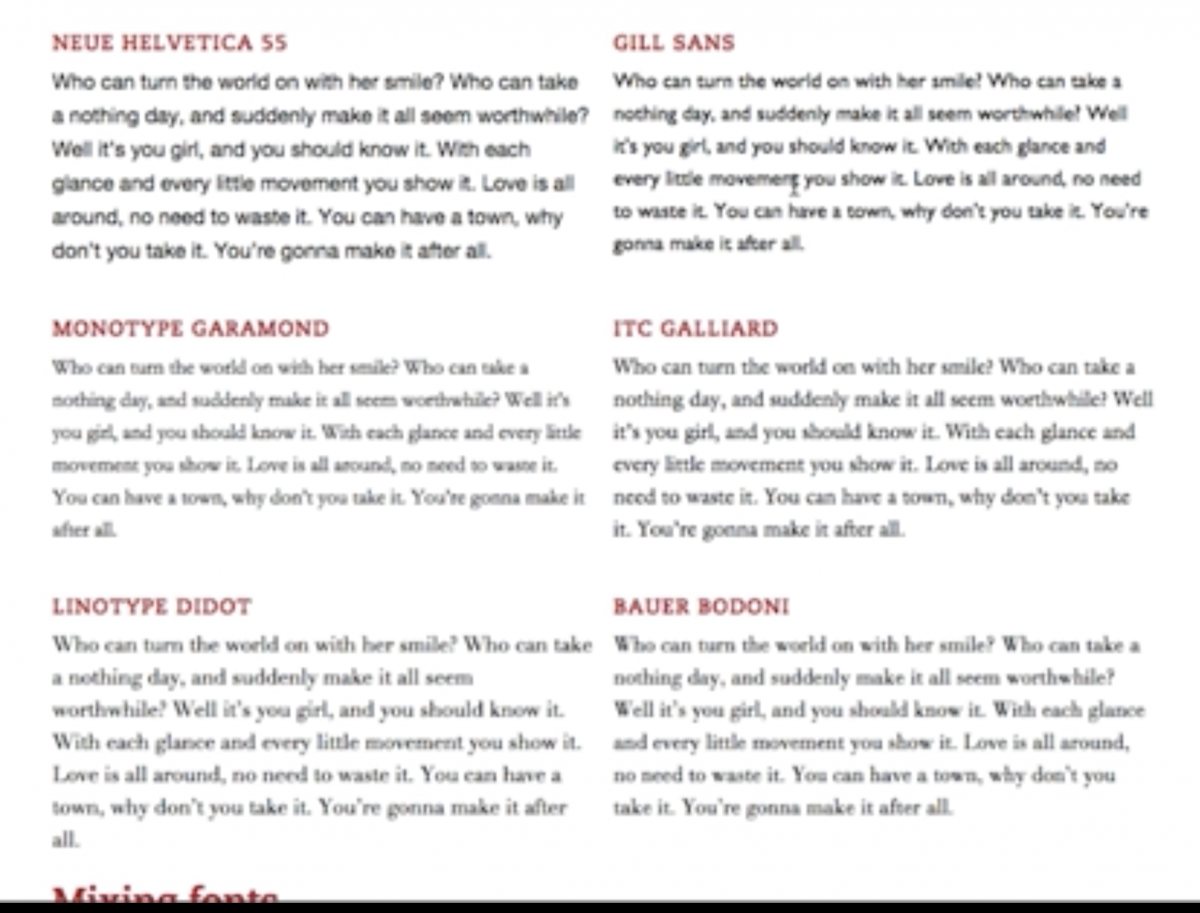
Starting with he explained how we see fonts on the web and how do they look when they zoomed in. It is basically broken down into pixels. He also explained through screen grabs and how pixels work together with type. He talks about vertical proportion and showed the difference between Helvetica and Garamond. He mentioned if you want to use a typeface which has big x-height. It is obvious that it gives less space between lines. The ones with a small x-height give more space in lines. He gave example if you mix font family then do it wisely.
The Right fonts
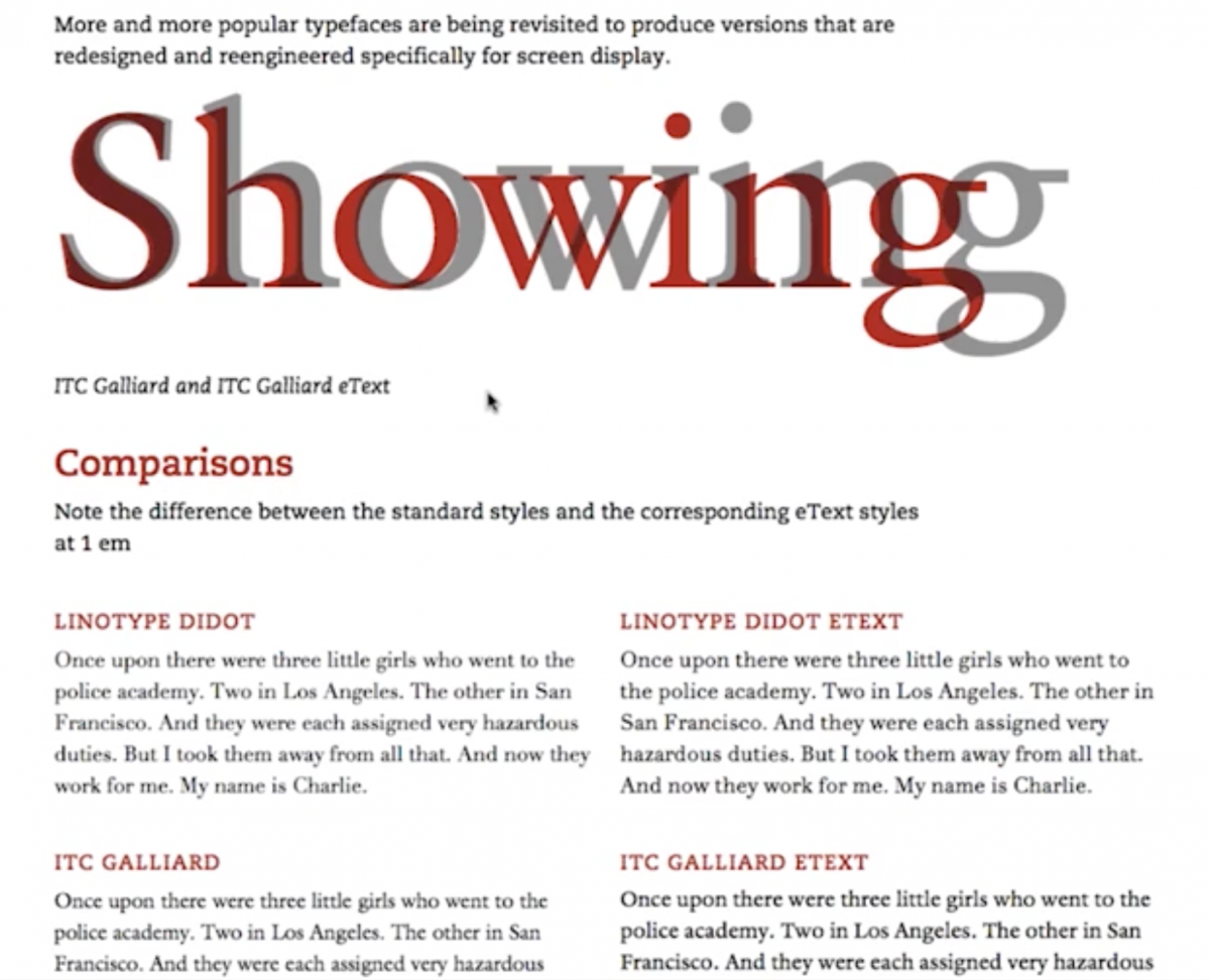
He also said size matter a lot with how to visually see each font. He talked about how does the low-resolution and high-resolution work. However, Optima and Garamond fonts which elegantly detail for the paper. To have fonts for web it is better to have straight lines because of pixels. Choosing fonts wisely is also helps stylize your webpage according to projects. Having superfamilies like Univers is useful to find varies fonts. Colors are most important part of the text and how you want it to be user-friendly. Having different examples of color and background helps to make a decision. Readability is a big part of web usage project because if the user can’t read clearly then all the hard work fails. Leading and kerning are really important to have because you need to balanced spacing. Lastly, using right fonts for the web is crucial and designers are now designing fonts specifically for web usage.

