Transparency Project
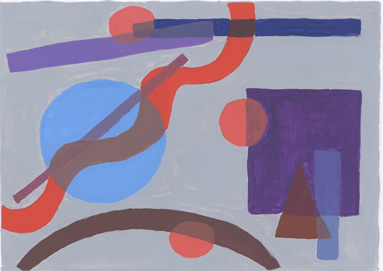
In this project of transparency, I had to select 3 shapes with 2 layers and 3 shapes with 3 layers of overlapping transparency. My main concern for this project particular was that I ran out of yellow paint and I didn’t know how to manage. There was no time to get yellow for somewhere. Therefore, my choices of color became limited. I had Cadmium Red, Primary Blue, Ultramarine Blue, White, and Ivory Black. I also had to use 2 tints, 2 tones and one shade, along with that primary, secondary, and tertiary colors. So having the color choices, it came out pretty decent which created warmth. I took it as challenge that it might work and I was not sure how it will come out. But when I presented to the class everyone was very amazed or curious about how did I put it all together. People had questions about how did I manage without yellow. I told them it was a different experience with limited amount of choices. In addition to that I was happy with my work and it did interest students in class because it was done with limited choices of color.
My color collection just started out with picking tint of red. This color seeks a lot of attention and I decided to use this color on the small circles. If you look at the image and small circles it makes your eye move point to point in the composition which is difficult for the 3 layers of overlapping transparency. Especially the square, triangle, and strip which I worked on first. I managed to get the right color between the three colors. The same situation occurred with big circle, wavy line and a strip could have been more transparent. For the two layers transparency, the curve and circle overlapping could’ve been a bit more convincing in terms of transparency as well. Also, the big circle and wavy line overlapping worked really good. The square and small circle had the transparency. Overall, I did decent work on transparency and composing.

